OVERVIEW
For this project I was tasked with creating a travel website for a particular country. I was given a list of options and I decided to go with Cuba since I didn't know much about the culture and wanted to challenge myself. Through my research, I found that Cuba was like a time capsule in its architecture and transportation, which reflects the 1950s before they became more closed off to outside influence. The culture is so colorful and fun, and it reminds me of my Puerto Rican half.
The Problem
Cuba has been closed off to the world, foreign exchange, and travel for a long time, and thus lacks potential income from tourism.
The Solution
Show off the vacation potential of Cuba through its raw natural beauty, culture, and vibrancy. By making a desktop and mobile site, I can help bring the vision of Cuba to those around the world.
DESIGN DIRECTION
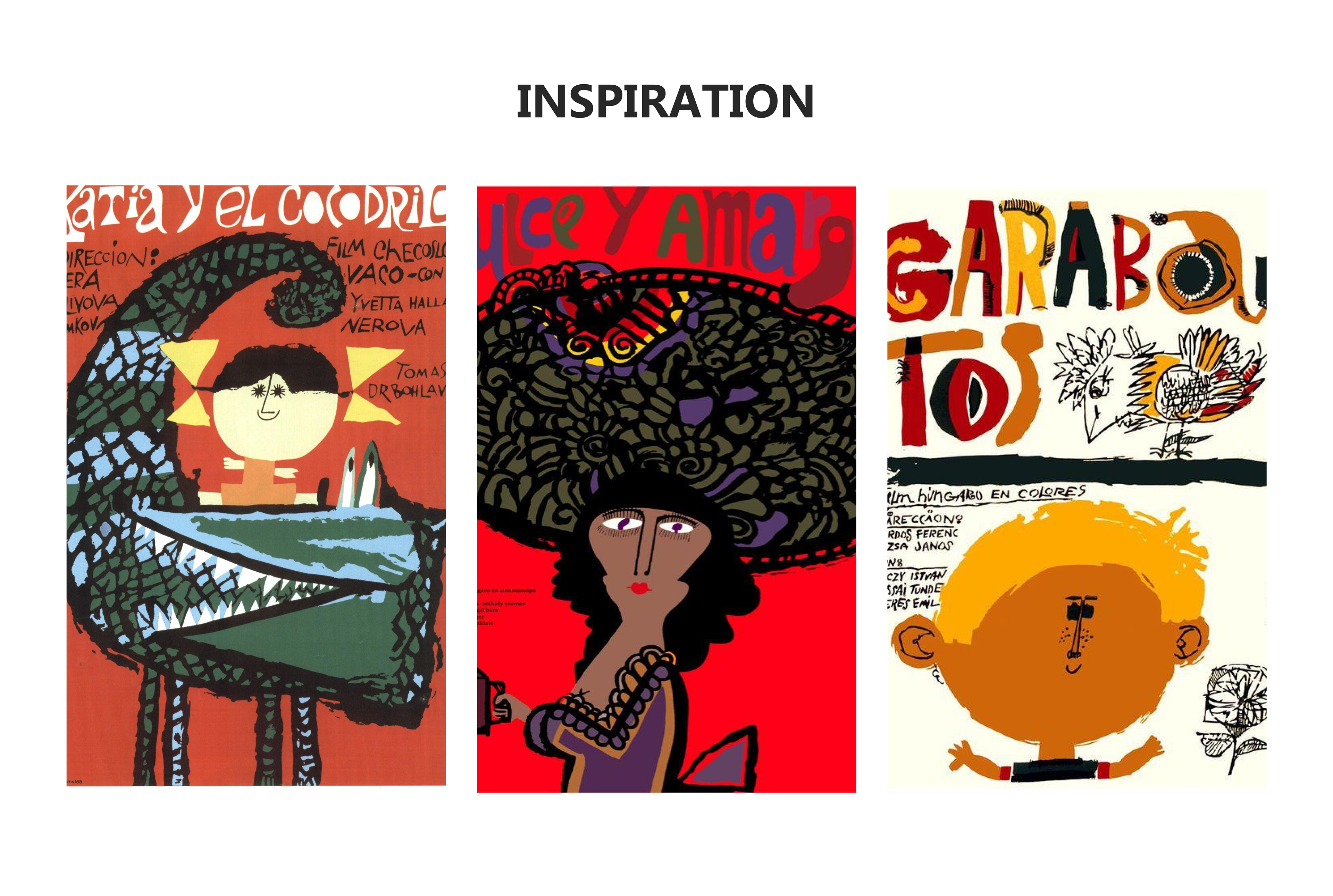
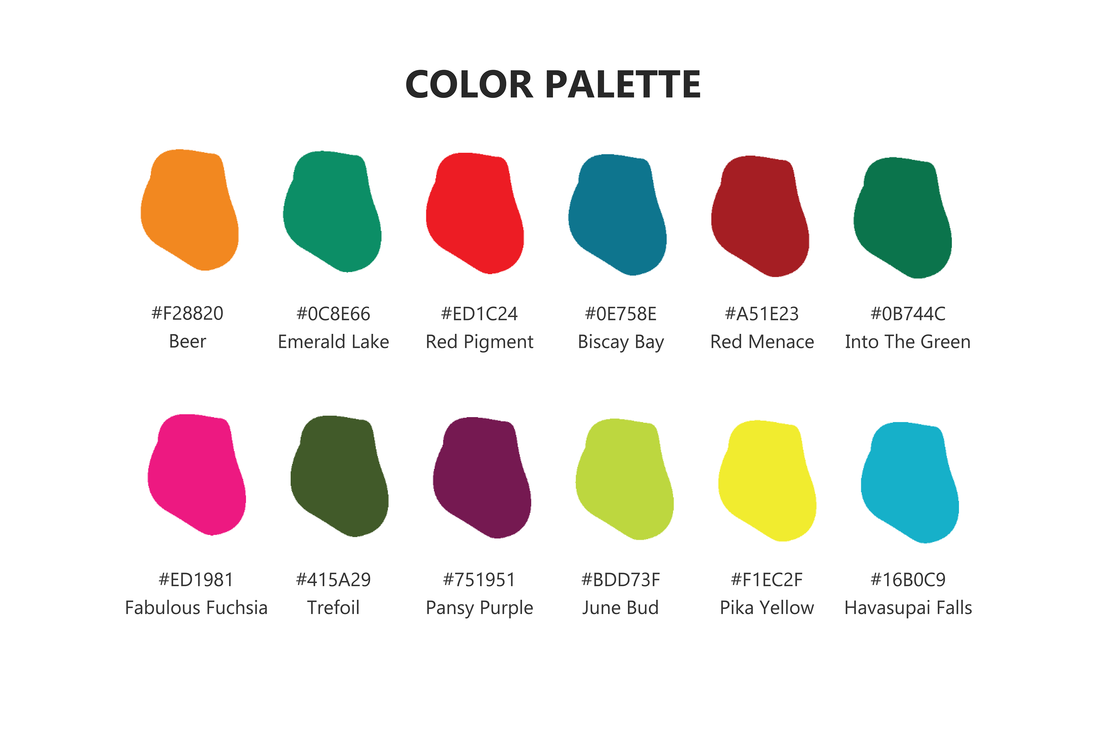
My design direction for this project has been based on days of research on Cuban cinema, art, architecture, and travel destinations. After sifting through the various paths I could choose, I saw that although Cuba was famous for their wartime posters, there were also a lot of artwork with this sort of indie free-form painted style. My color palette was eye-dropped directly from photos, artwork, buildings, so on and so forth from Cuba, so as to keep the aesthetic as close as possible to its source material. The typography was kept simple so as not to take away from the stylistic direction I had chosen.

LOGO DESIGN PROCESS
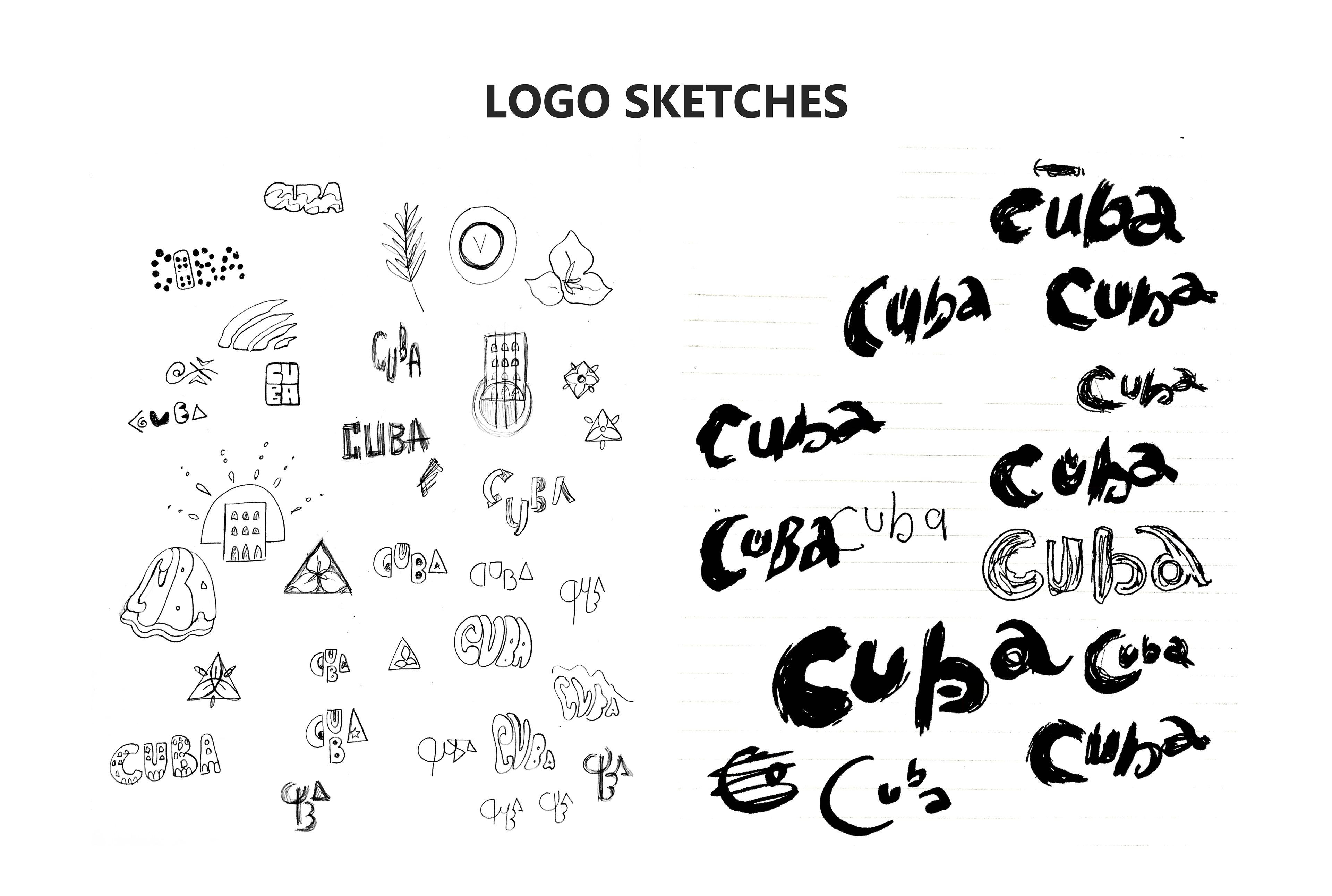
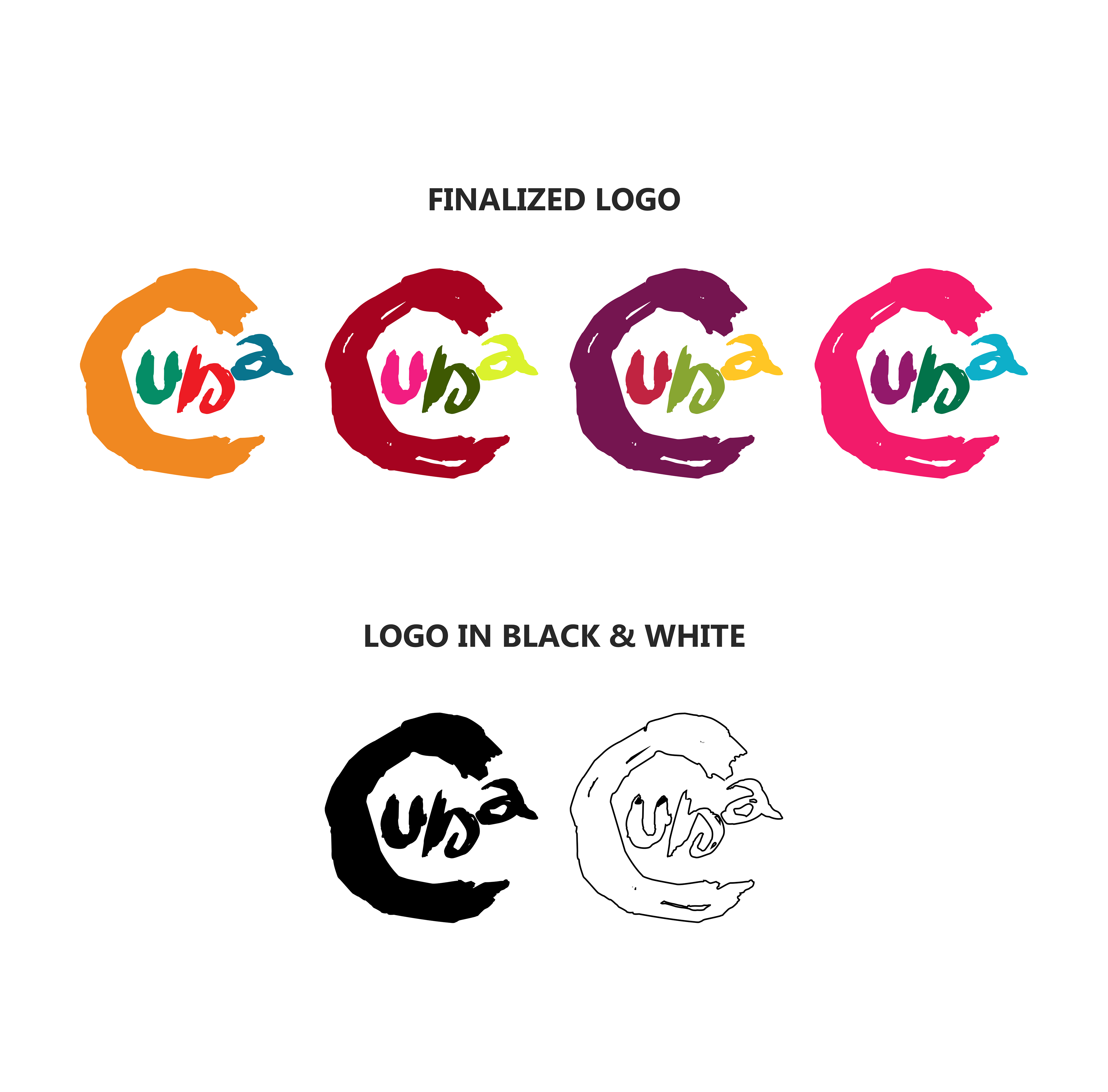
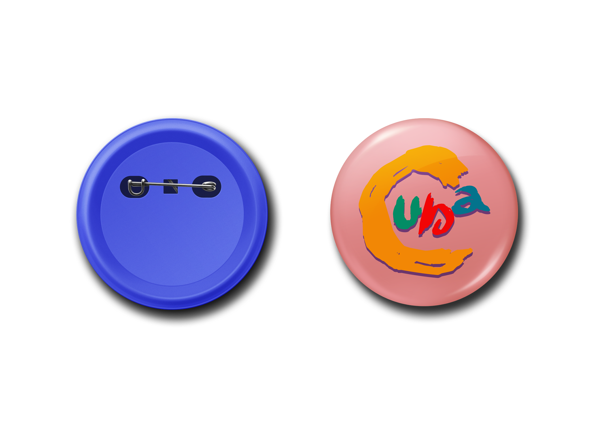
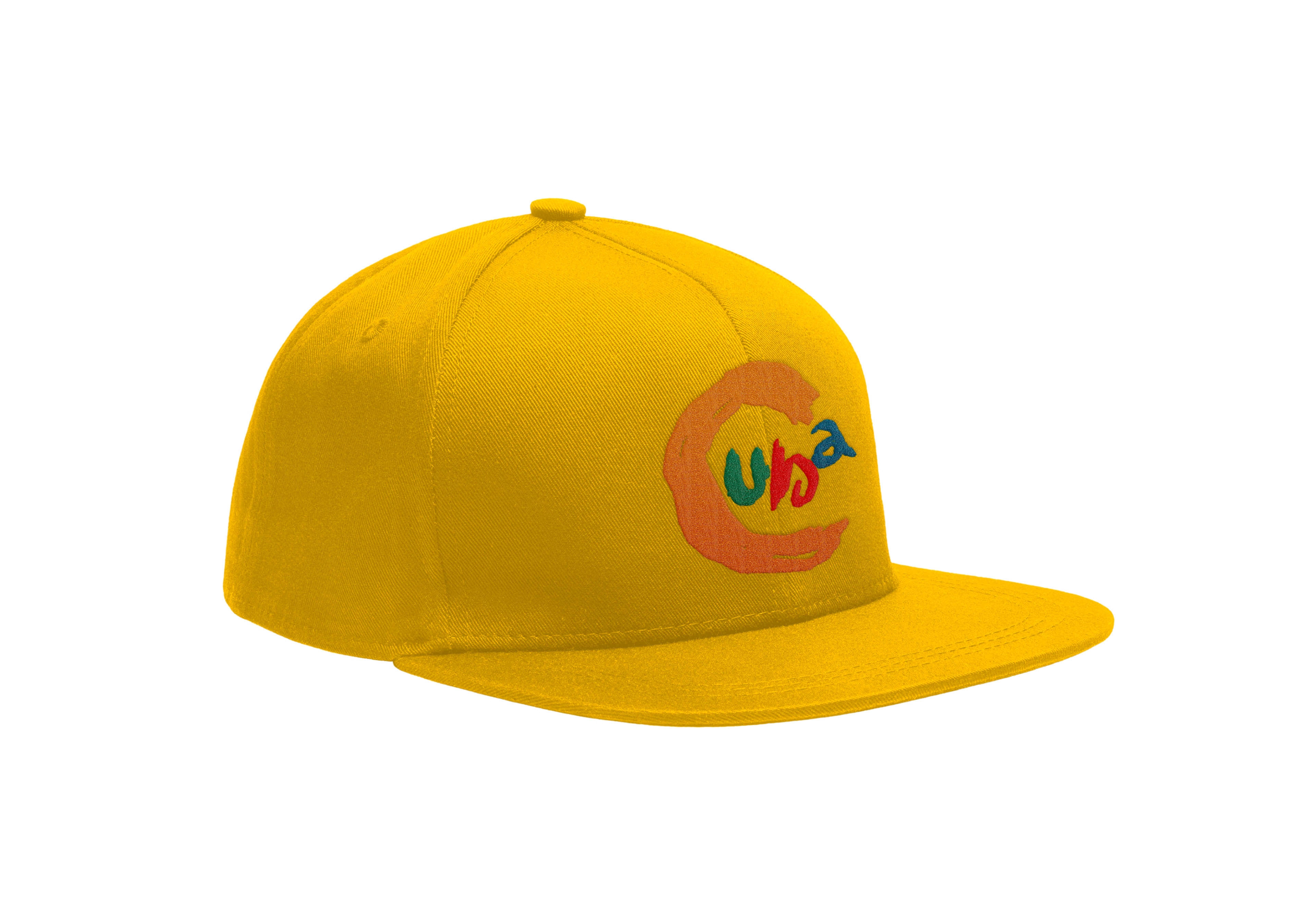
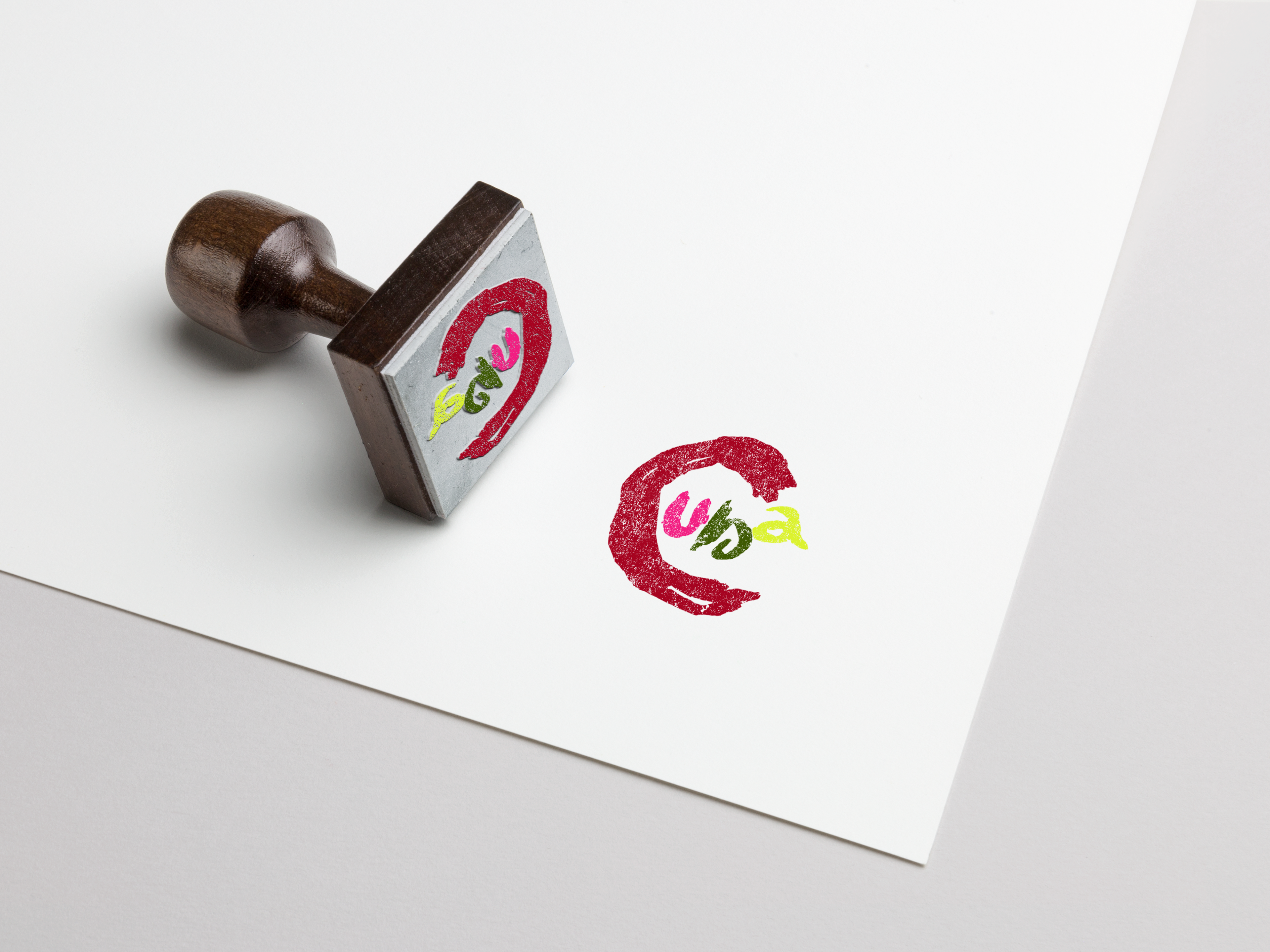
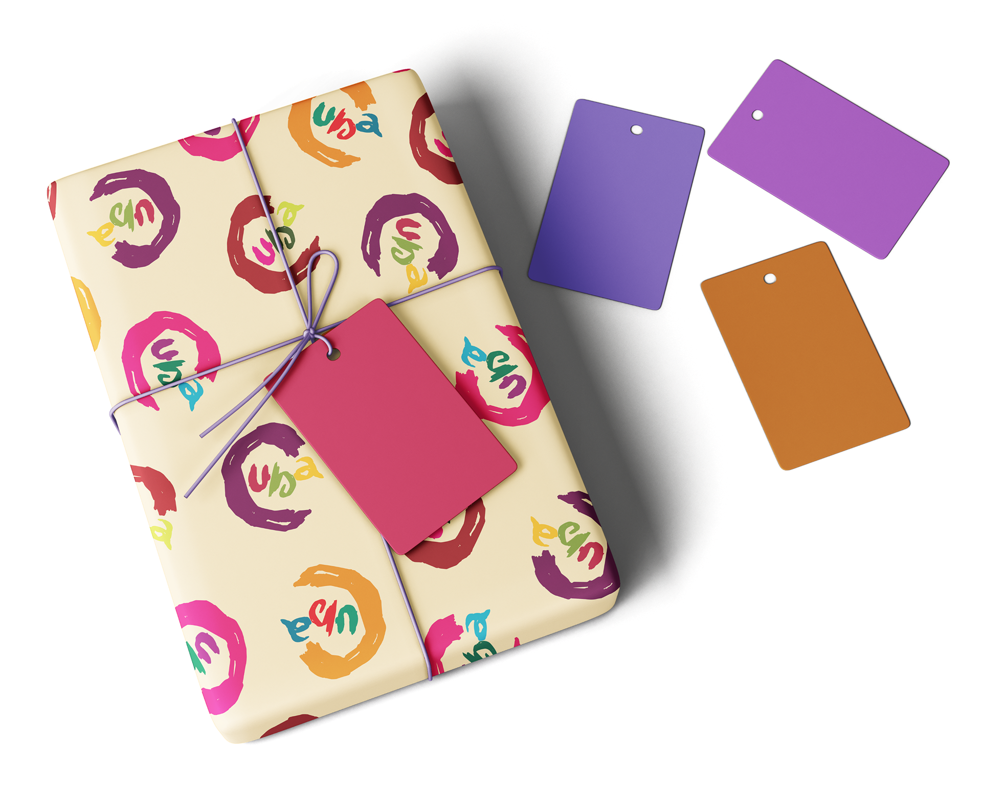
For the logo, I had wanted to go for a hand drawn feeling like the inspiration posters I had found. After playing around with the text, I felt that a painted stroke would look more authentic and free, just like the culture of Cuba. It took me many days of fighting with the logo before I finally felt satisfied with the one I had chosen.

CUBA MERCHANDISE


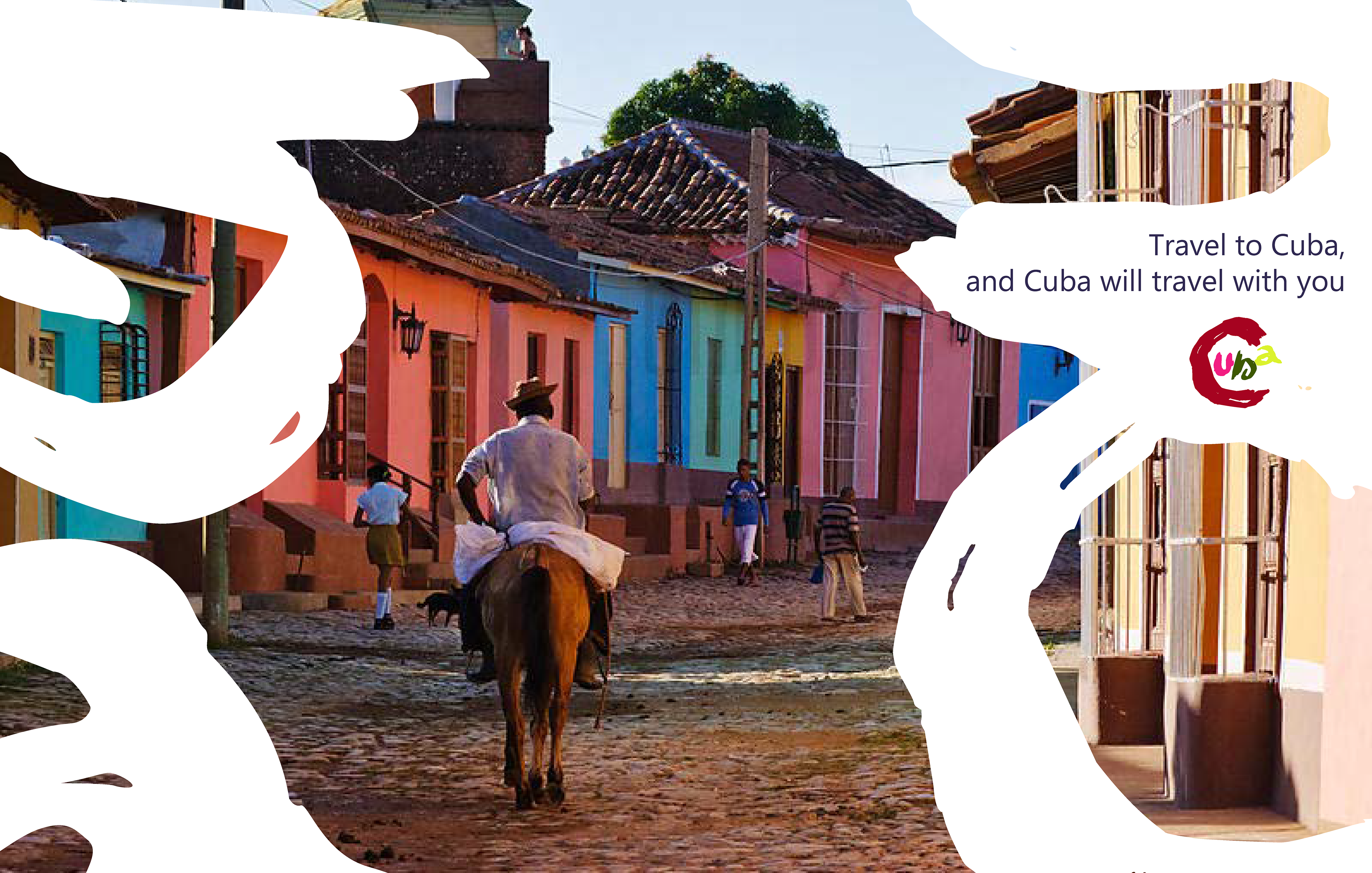
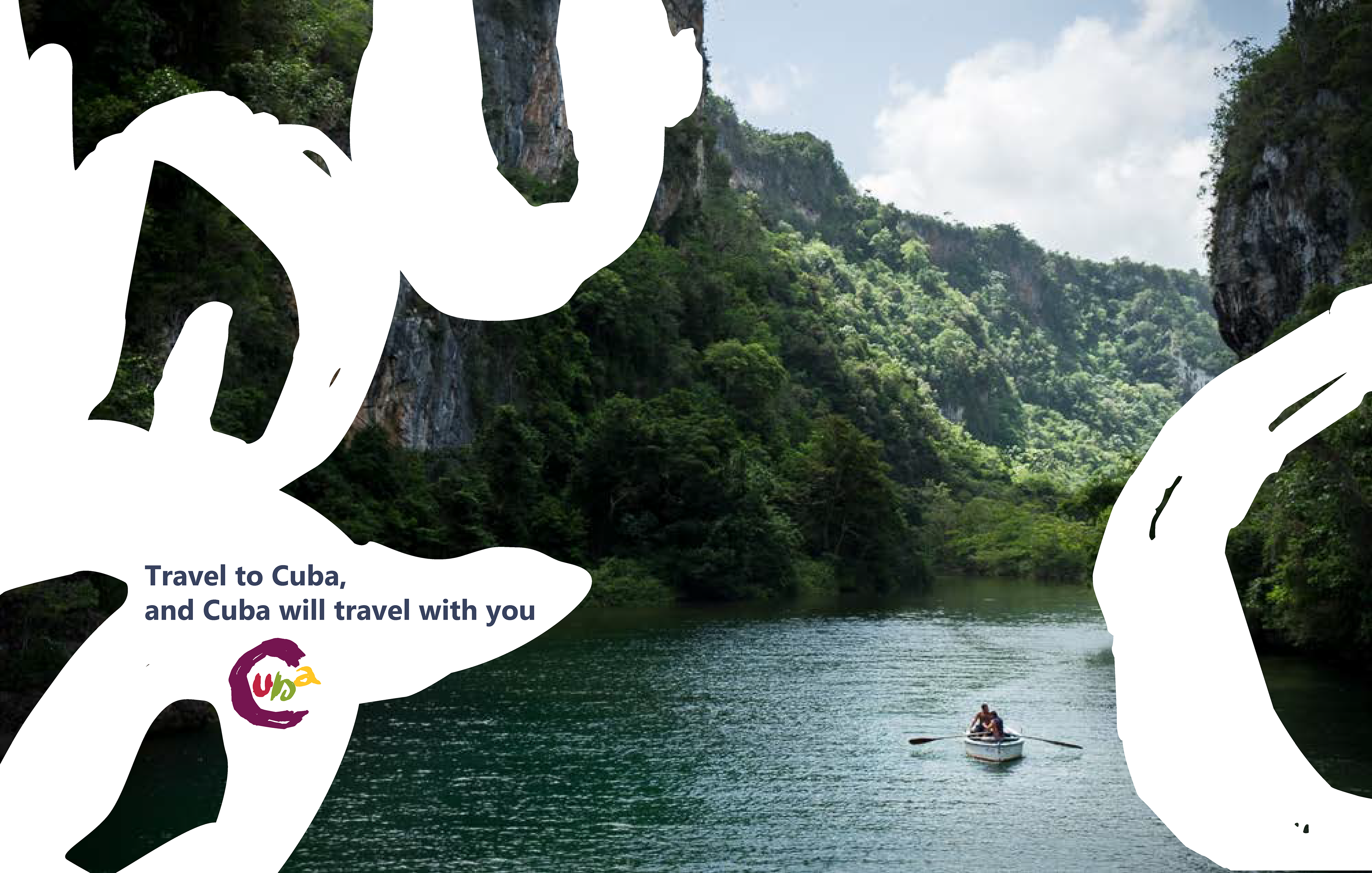
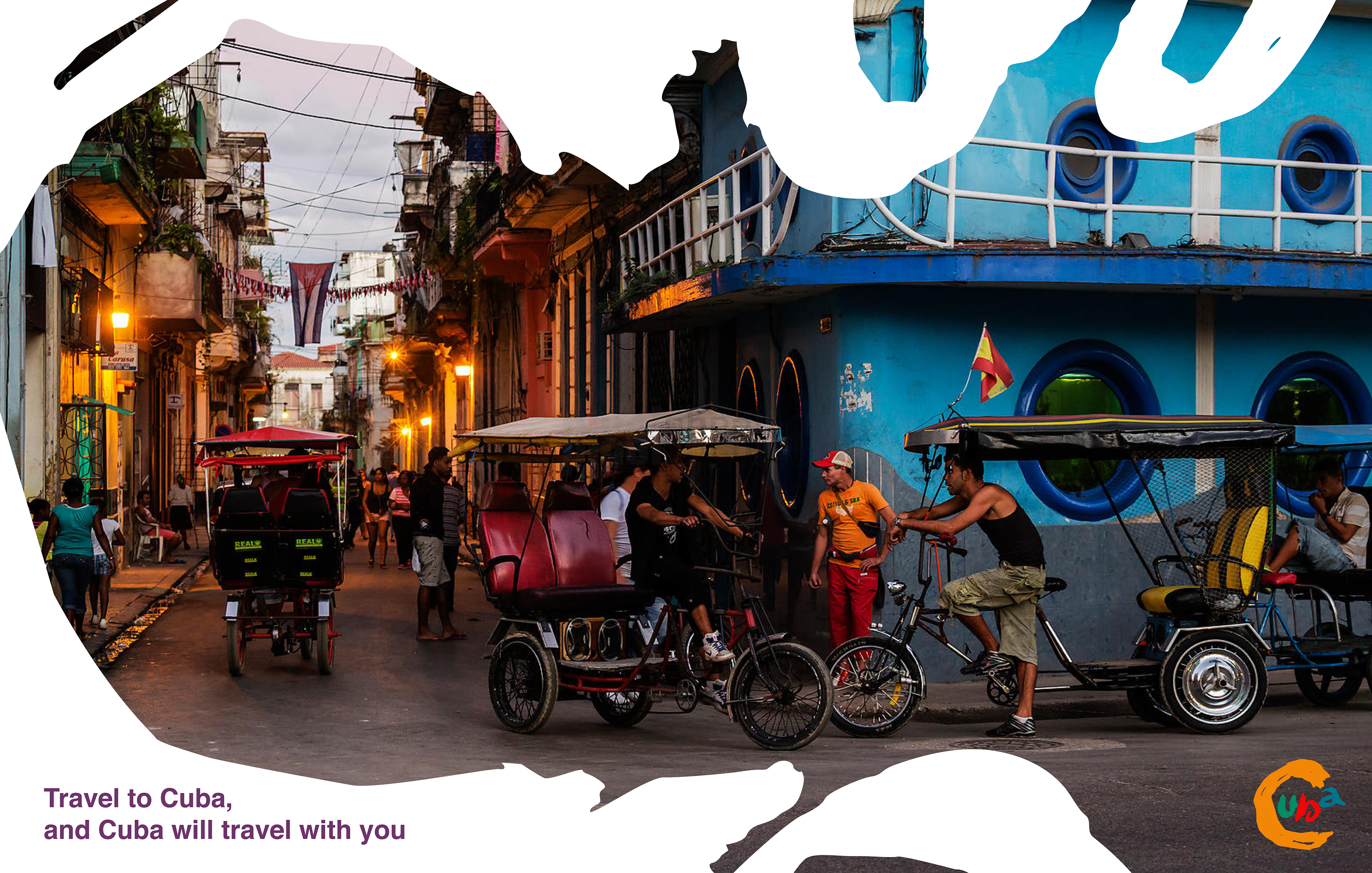
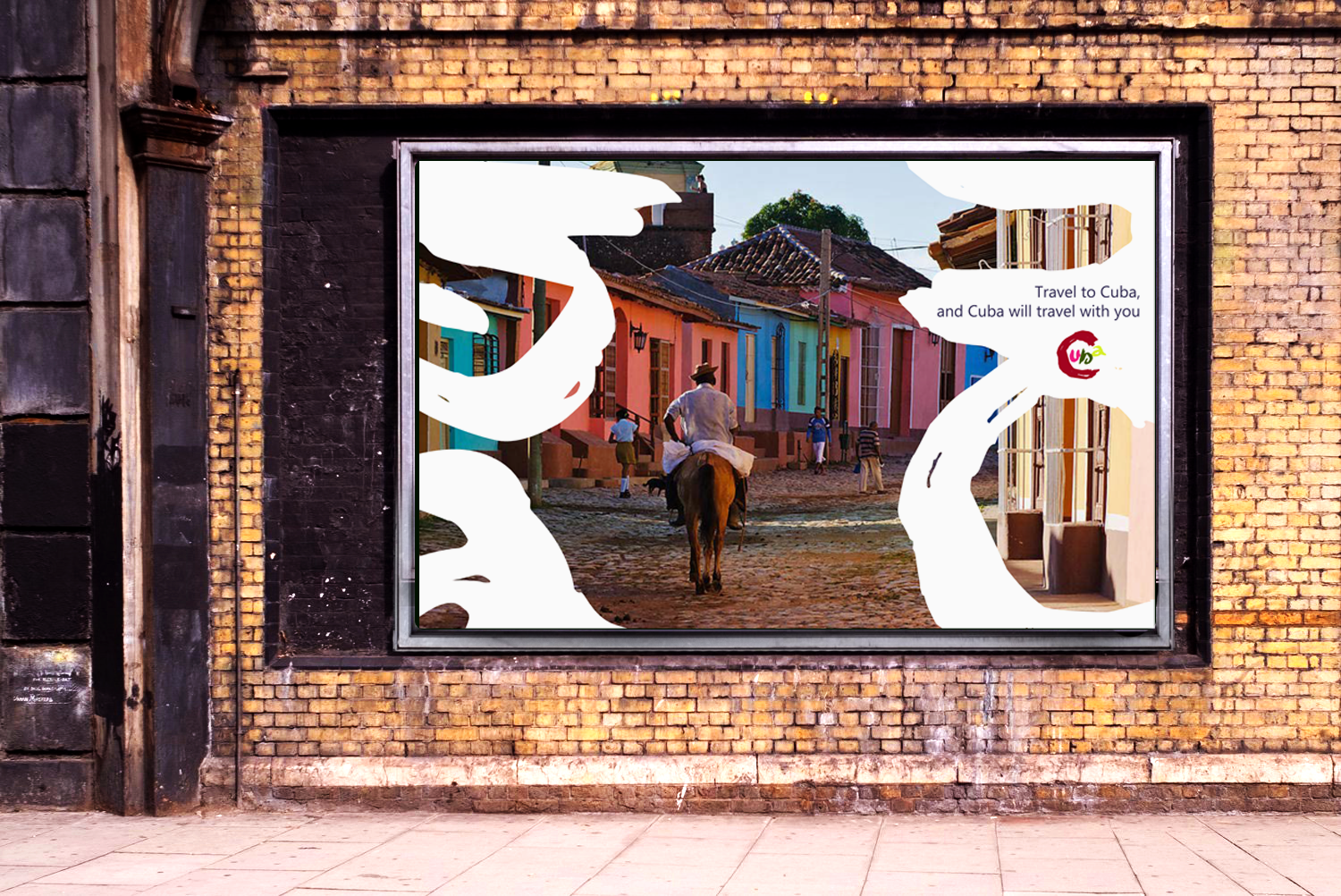
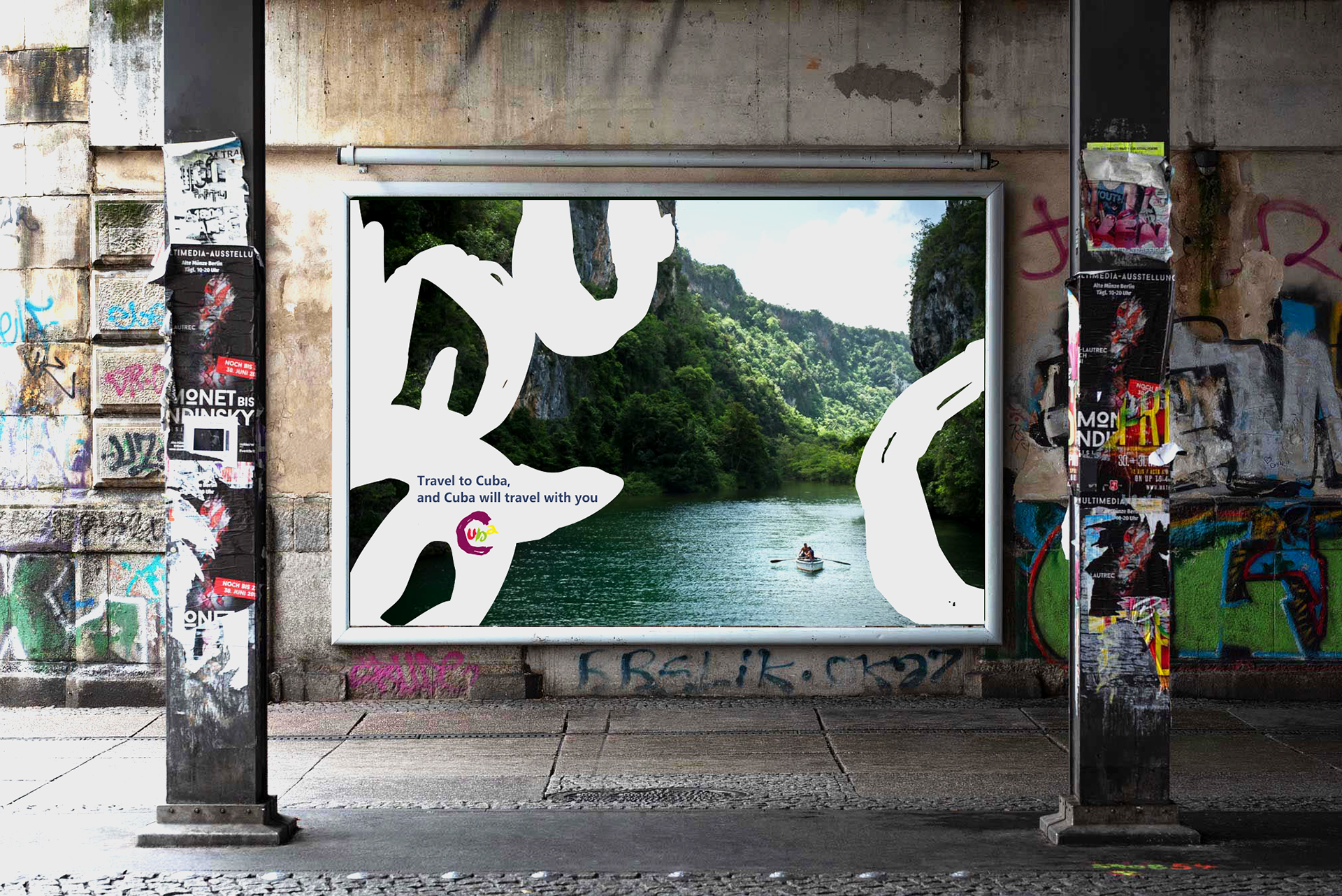
CUBA TRAVEL POSTERS
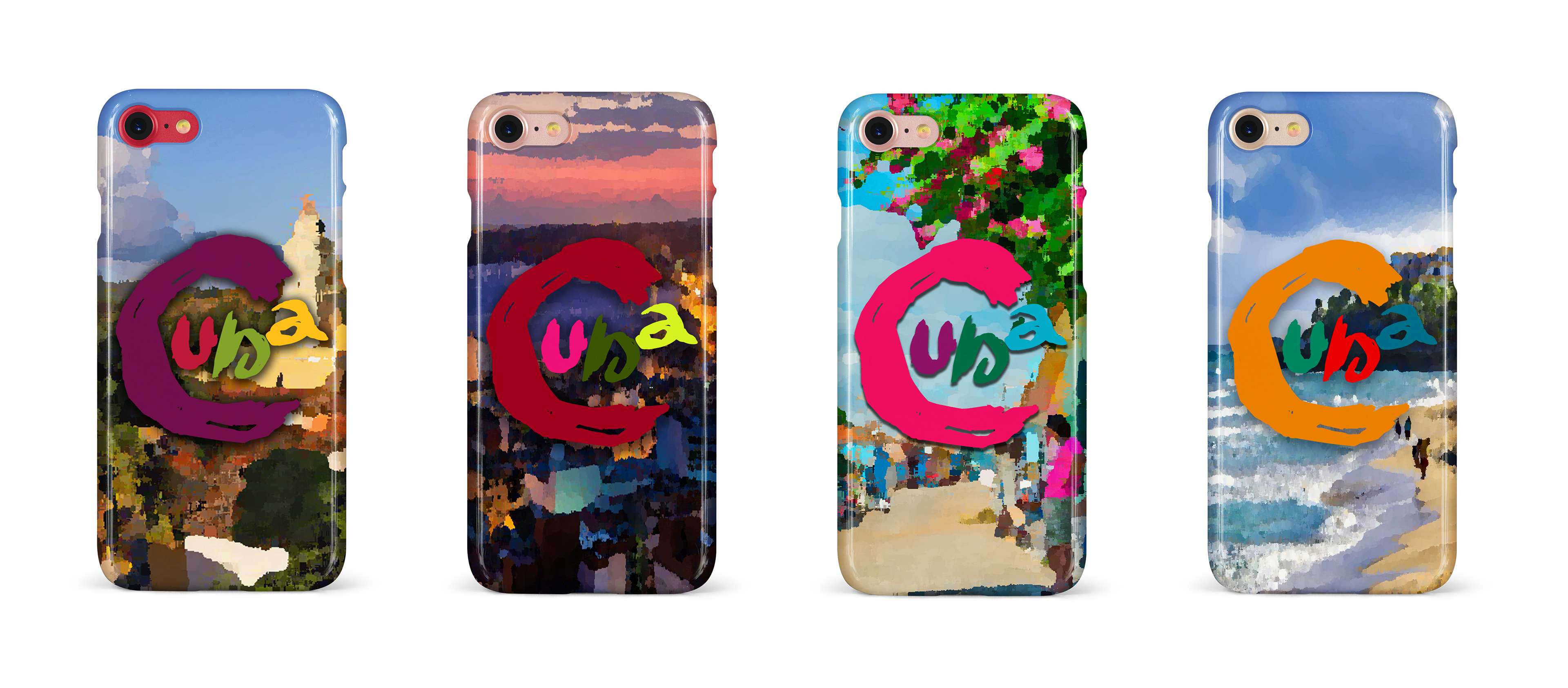
Playing around with the CUBA logo, I experimented with creating travel posters. I found that there was some difficulties with experimenting with the logo, fitting in all the text, and having the logo colors work and stand out against the background, but I think I have somewhat achieved a nice balance.

CUBA DESKTOP & MOBILE SITE


About The Project:
For this project I was tasked with creating a travel website for a particular country. I was given a list of options and I decided to go with Cuba since I didn't know much about the culture and wanted to challenge myself. Through my research, I found that Cuba was like a time capsule in its architecture and transportation, which reflects the 1950s before they became more closed off to outside influence. The culture is so colorful and fun, and it reminds me of my Puerto Rican half.
Difficulties:
During this project I found that I was struggling with adding the words CUBA to the entire website. I wanted to create something as playful and vibrant as Cuban culture and so I went out of the box with my creativity. However it might have been a little too chaotic, as I think it would be a challenge to make it into an actual website. Nevertheless I think I've achieved the color story and aesthetic I wanted to showcase for this project.
VISUAL OVERVIEW OF PROJECT
OUTCOME + REFLECTIONS + NEXT STEPS
I was admittedly worried about how this project would come out when I had started it. I wasn't sure how I would tackle another culture that I was unfamiliar with, even if I'm half Puerto Rican, the cultures are still different. I had even considered backing out and picking another culture, but I stuck with it and I'm glad I did because I love the outcome of this project. It still has its flaws, but I think this project was a big success. I was able to tell a visual story about such an amazing and vivacious country, and I had a lot of satisfaction when I was able to see the completed project. I think if I had to continue to improve this project, it would be to figure out how to make the logo work better throughout the website and posters. Otherwise I am very happy with this outcome!

