The Overview
This project was selected from one of the D&AD New Bloods briefs, which was a partnership between The Case For Her and HeyJane. The brief had asked for a way to make the topic of reproductive healthcare ( including abortion ) for women or those with a uterus, feel less stigmatized. Being that this has become very polarized in our current political climate, partnerships like The Case For Her and HeyJane has become extremely important for the health and well-being of people everywhere.
The Problem
Due to stigma and the aftermath of Roe v Wade being overturned, reproductive healthcare has become harder than ever to access. The Case For Her and HeyJane want to team up to create a system of affordable and safe reproductive healthcare for anyone who needs it.
The Solution
In order to help spread the effort of The Case For Her and HeyJane, they need to have a separate brand to tell this story. I have created Jane's Care, a website which is a hub for those who need access to reproductive healthcare. The website also aims to reduce stigma against those who need to terminate their pregnancies by offering ways to give back to others in need as well.
Case Study Submission
Aesthetic Brainstorming
Art Direction
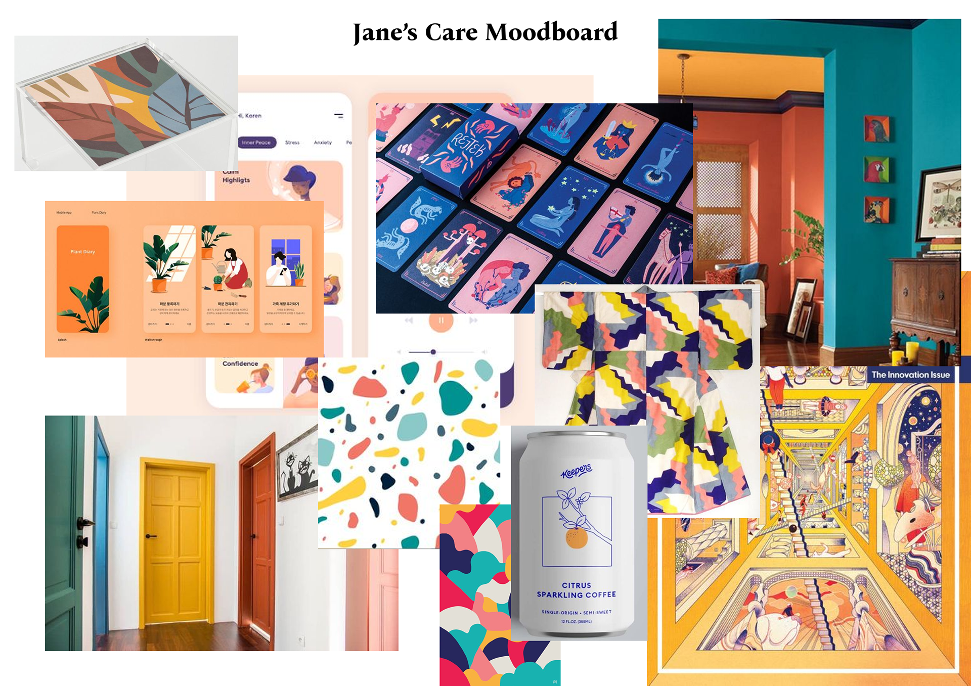
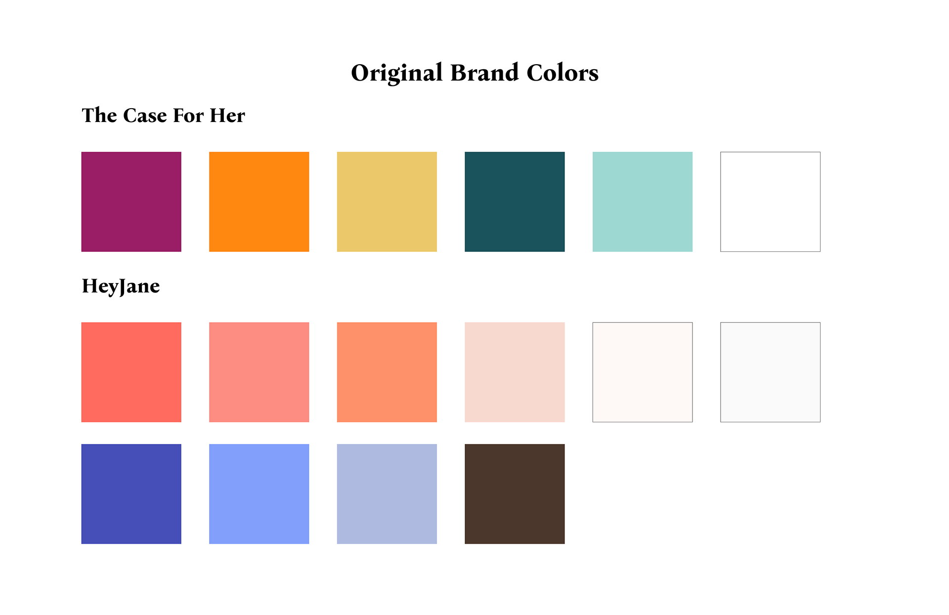
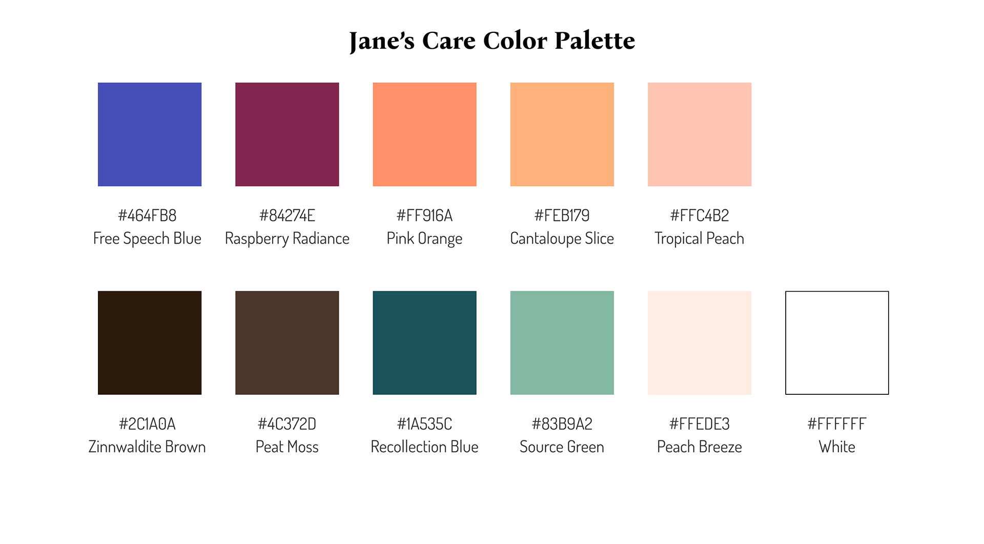
The color palette was inspired by a combination of A Case For Her and HeyJane's color palette. I wanted to make the colors cohesive without making it feel like a mishmash of colors that wouldn't work, so I changed some tones and played around with the colors.
For the typography I went with something that felt more elegant and mature but was simultaneously soft and welcoming.

Logo Design
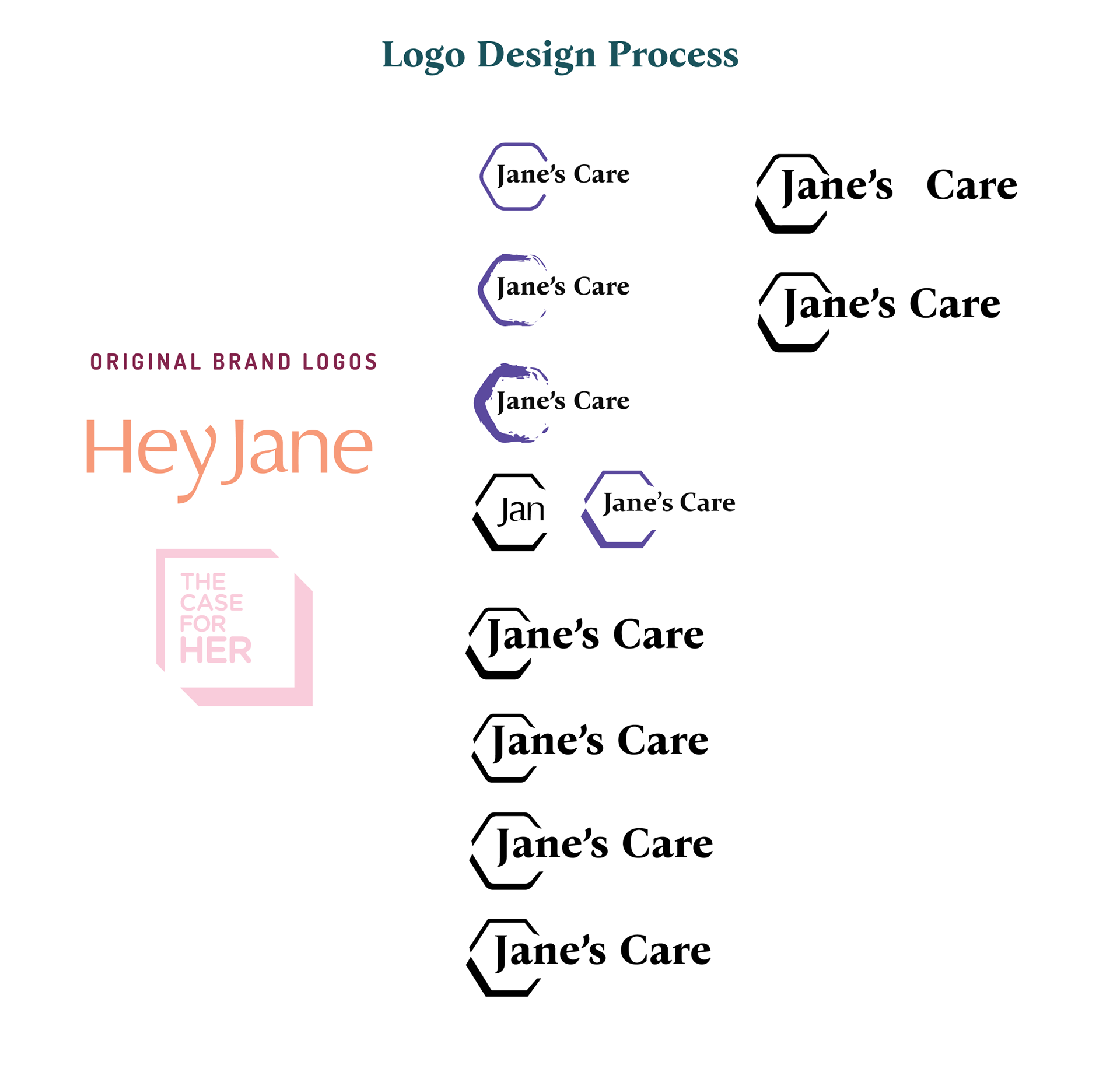
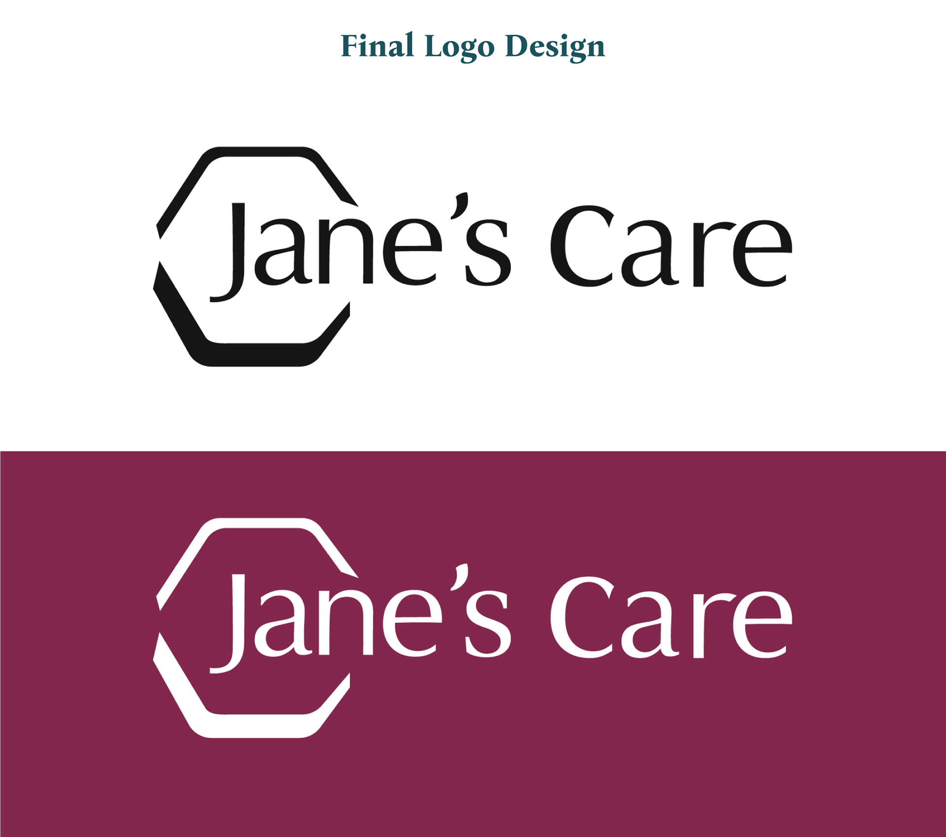
In order to combine The Case For Her and HeyJane on a new platform, there needed to be new branding, a new logo. I had chosen to call the brand "Jane's Care" because of HeyJane and The Case For Her, HER being Jane. Jane represents a person and gives off a personal feeling compared to just saying "her", due to being named. Women, those who identify as a woman, and those with a uterus can also identify with Jane. For the design, I wanted to subtly take the box around The Case For Her and turn it into the same shape as reproductive care pills. I had a difficulty finding the fonts that were used for the logo, so I had taken the font from HeyJane due to the elegance and softer edges, and manipulated them until I had gotten the full logo for Jane's Care. Overall I am really happy with how the logo came out.
Out of Home & Social Media
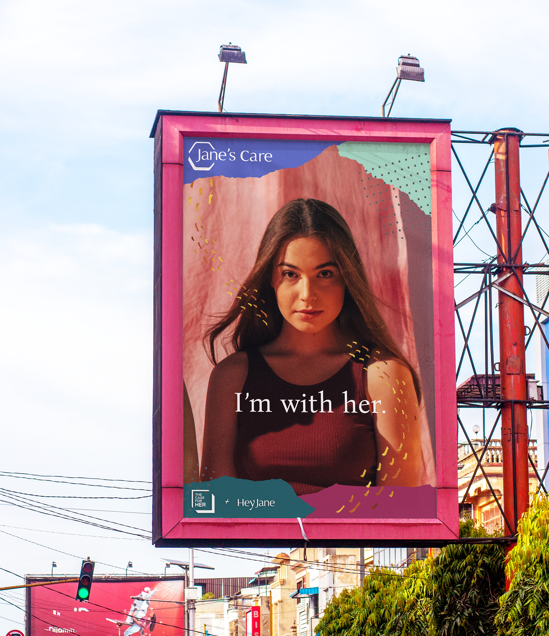
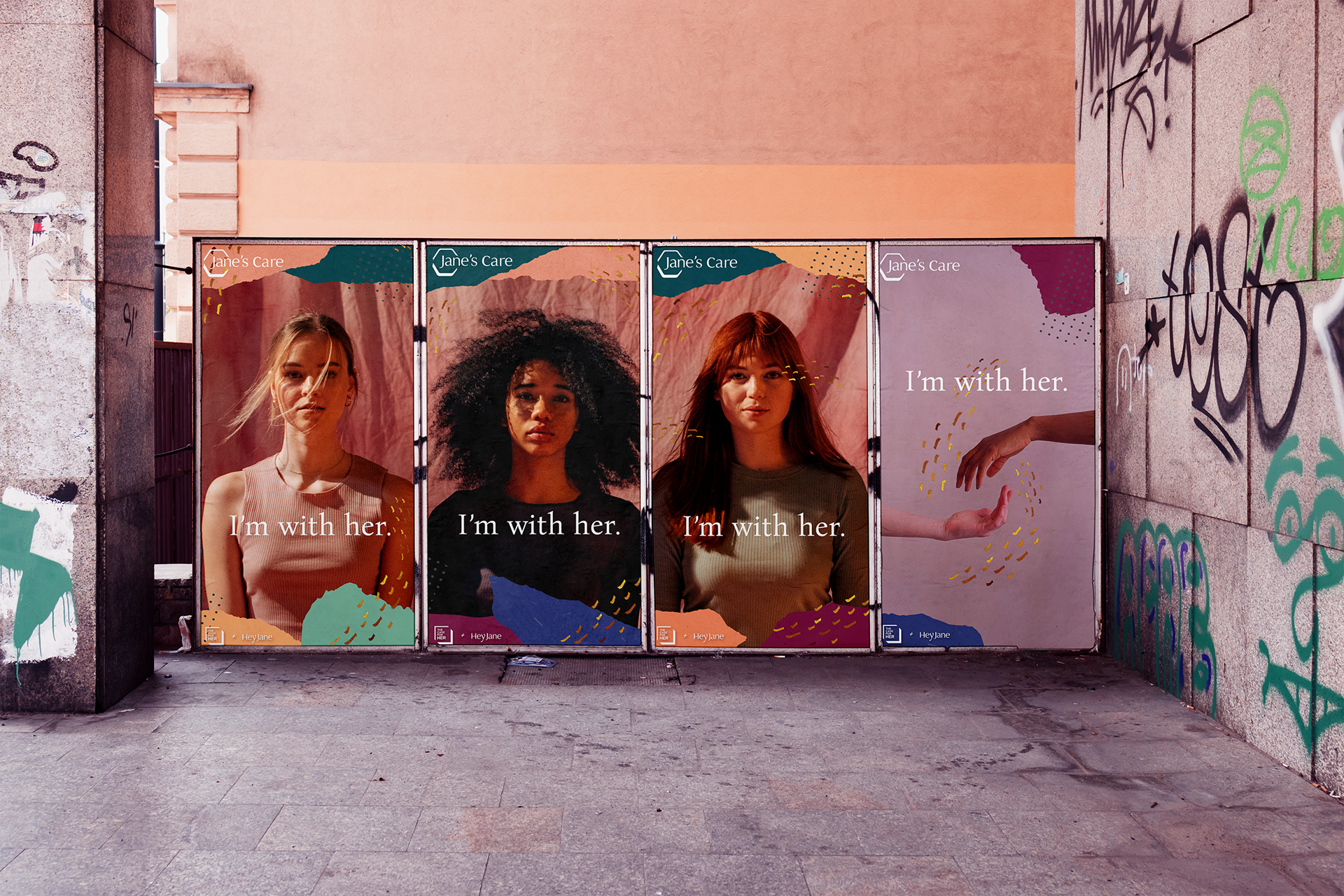
These would be the posters featured as digital ads or on the Jane's Care Instagram. I aimed to give the viewer the feeling that each woman in the ad has a deeper story within her. "I'm with her" makes the viewer feel as if they have the agency to support the woman in the image.

Homepage, About Us, Donation Page
When deciding the design for the website, I thought it would be fun to play around with paper cutouts. Paper cutouts tie back to childhood arts and crafts, as well as books and stories themselves. A mix between texture and flat color help to give the page a grounded, comforting, and welcoming atmosphere.
Homepage: The silhouettes I included can be interpreted as a mother and child, or a woman and her inner child. Hands are an important symbol for Jane's Care, representing togetherness and support, so I made sure to include them wherever I could.
About Us Page: A very simple layout, this page is chock full of information, as well as links to The Case For Her and Hey Jane websites.
Donation Page: Visitors of the website can choose to either donate and help children or women. This ability to donate is different from other women's reproductive healthcare websites because it gives people an option to lessen any psychological guilt they may have had from choosing whatever they felt was best for their health and well-being.


Merchandise, Product Preview, Checkout Page
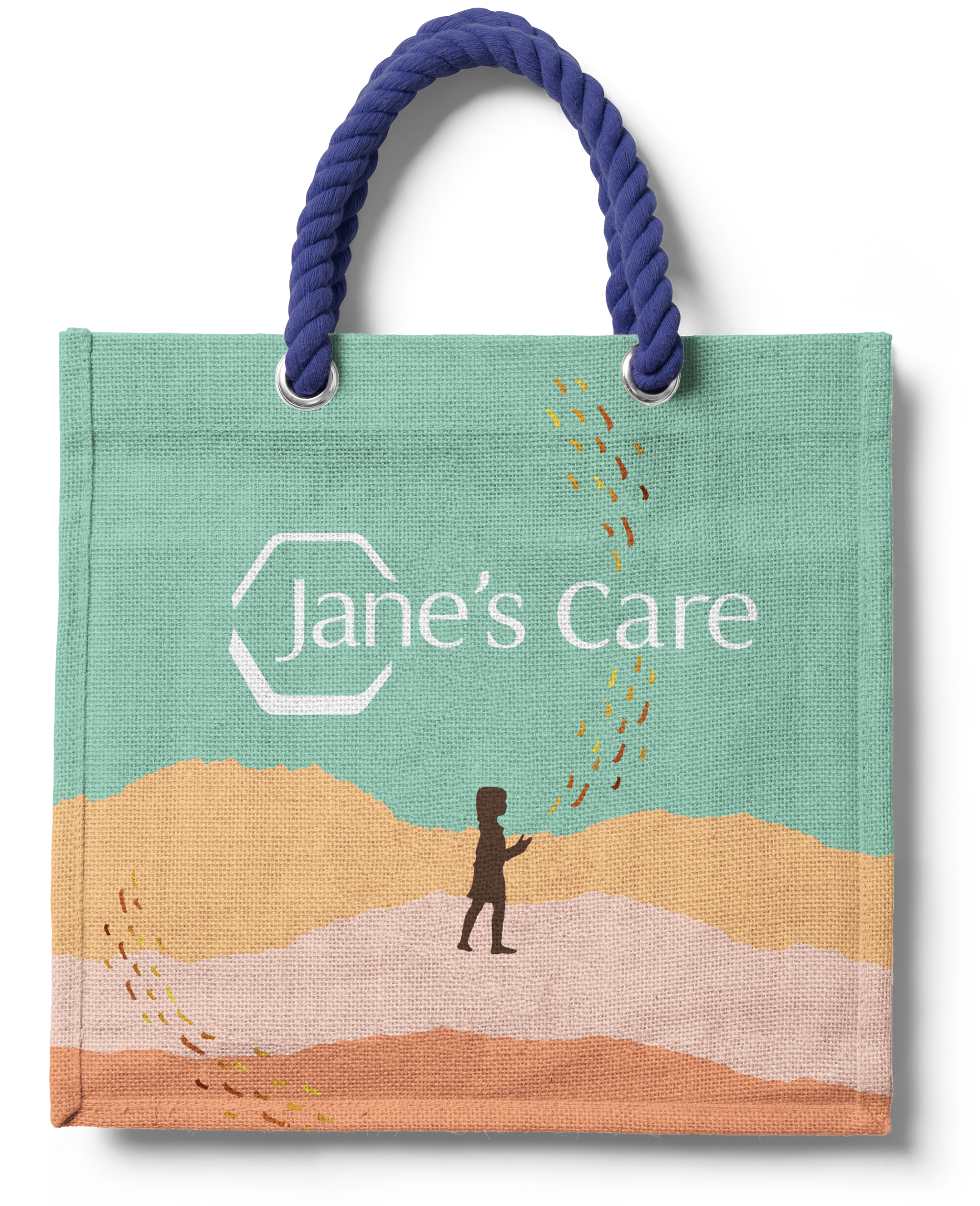
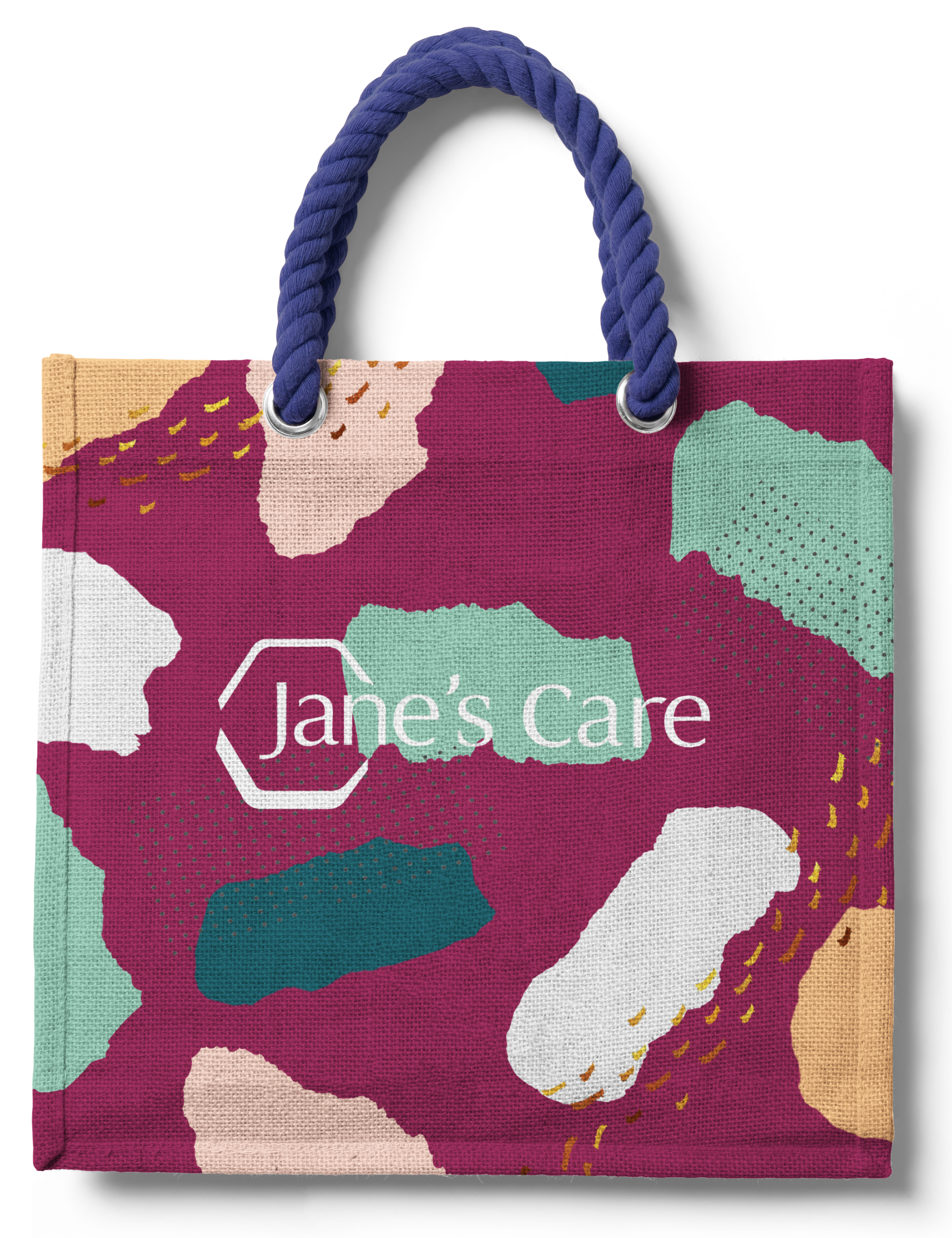
An important part of Jane's Care is a shop where users can purchase products and show their support. The homemade paper-craft aesthetic is also used here.
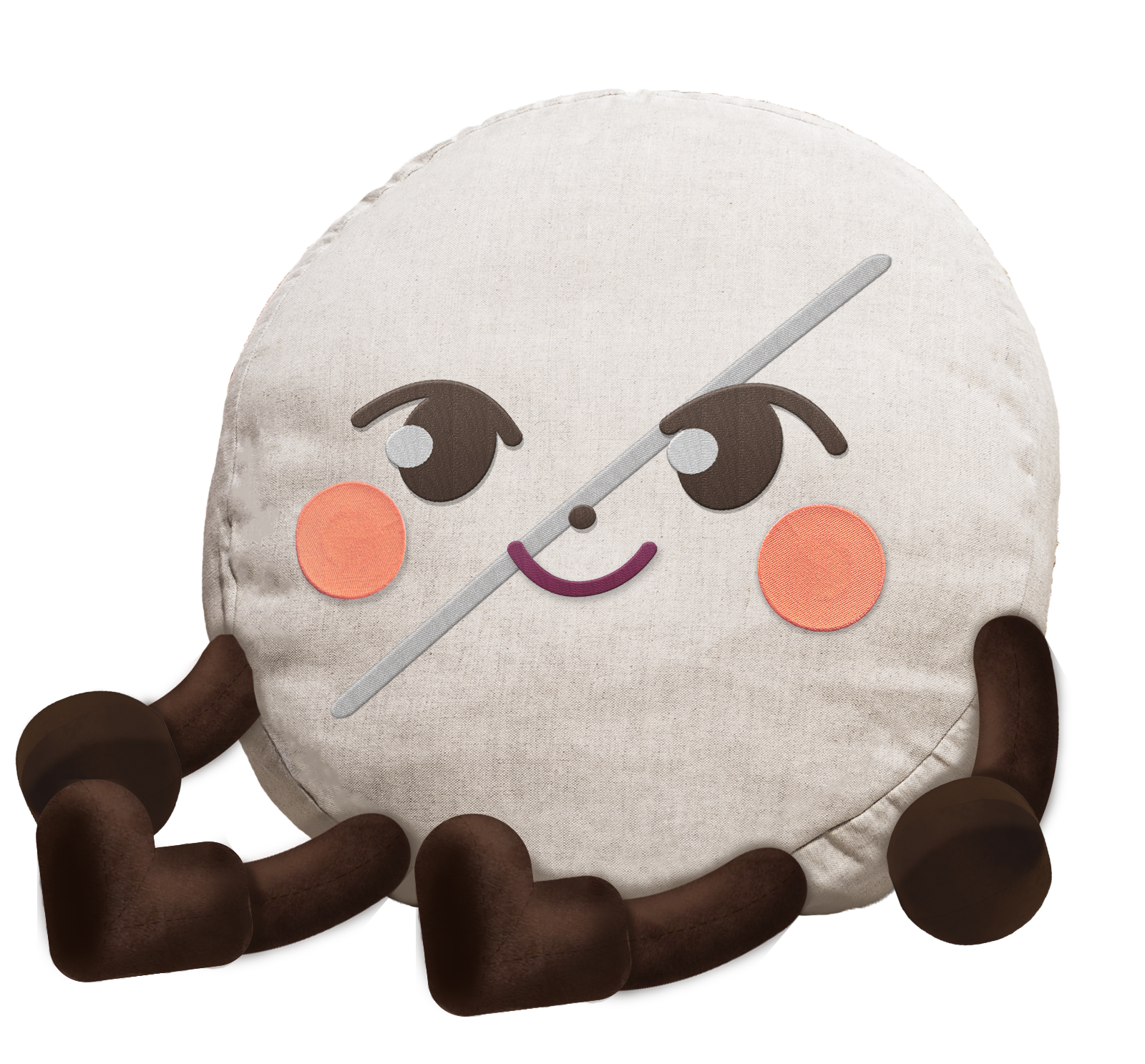
Merchandise Page: I customized mockups for each product and created the pill plushie by scratch which was one of my favorite parts when working on the Jane's Care shop.
Product Preview Page: This page features the gift box which could come in a variety of styles such as furoshiki wrapping, regular wrapping paper, etc. This gift box is meant to go to loved ones or those who struggle with periods and in need of a care package. These options are for the own customers choosing and the proceeds from the sales would help fund Jane's Care and would partially go to donation. The mockups here are also customized.
Checkout Page: Visitors of the website are again given the option to donate to Jane's Care if they wish, and could choose the amount they are willing to donate. The checkout cart is simple so that the user doesn't feel overburdened and confused.


Closeup Of Merchandise
Pill-o, Pillow Plushie
Tote Bag Style 1
Tote Bag Style 2
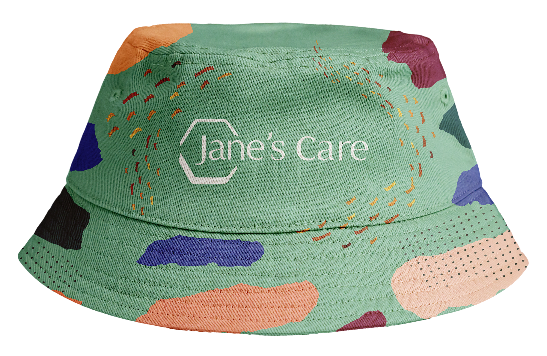
Bucket Hat Style 1
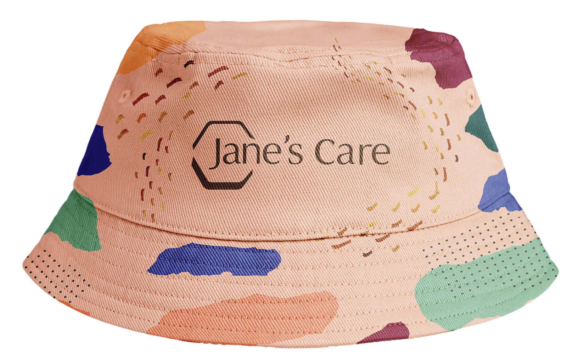
Bucket Hat Style 2
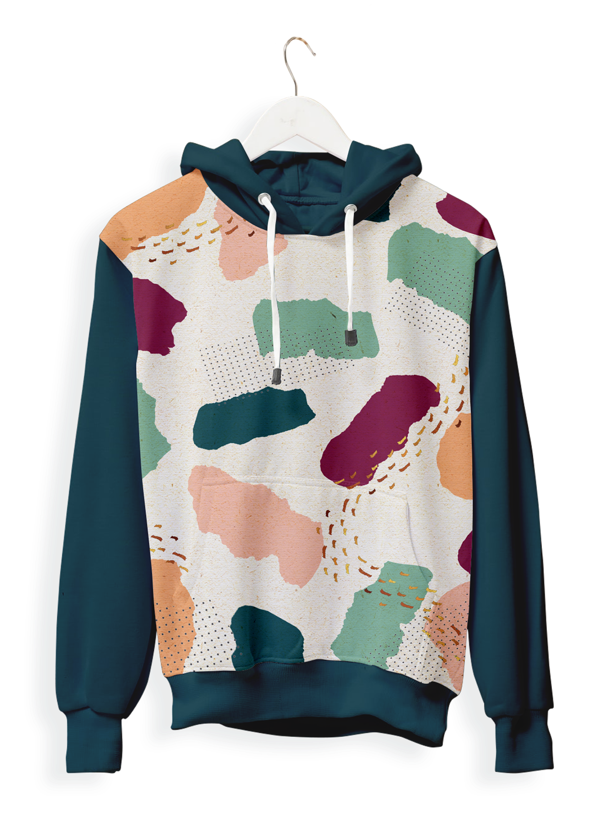
Jane's Care Sweater

Jane's Care T-Shirt
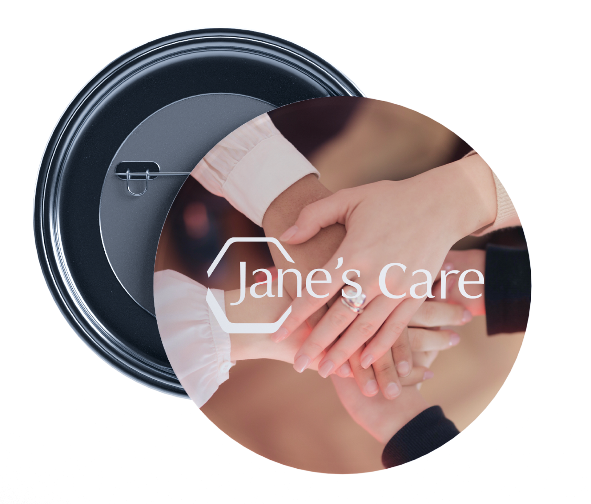
Style 1
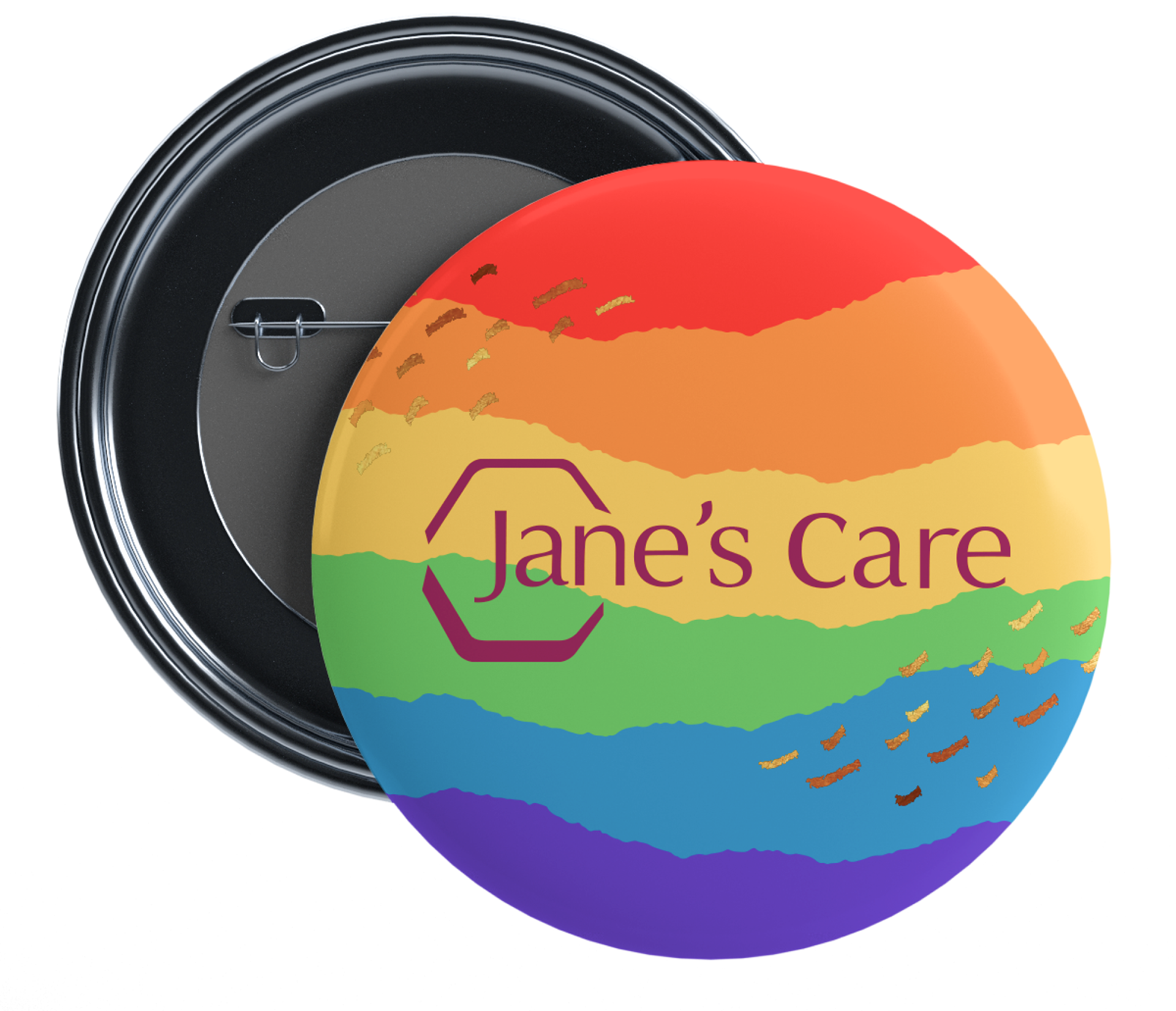
Pin Style 2
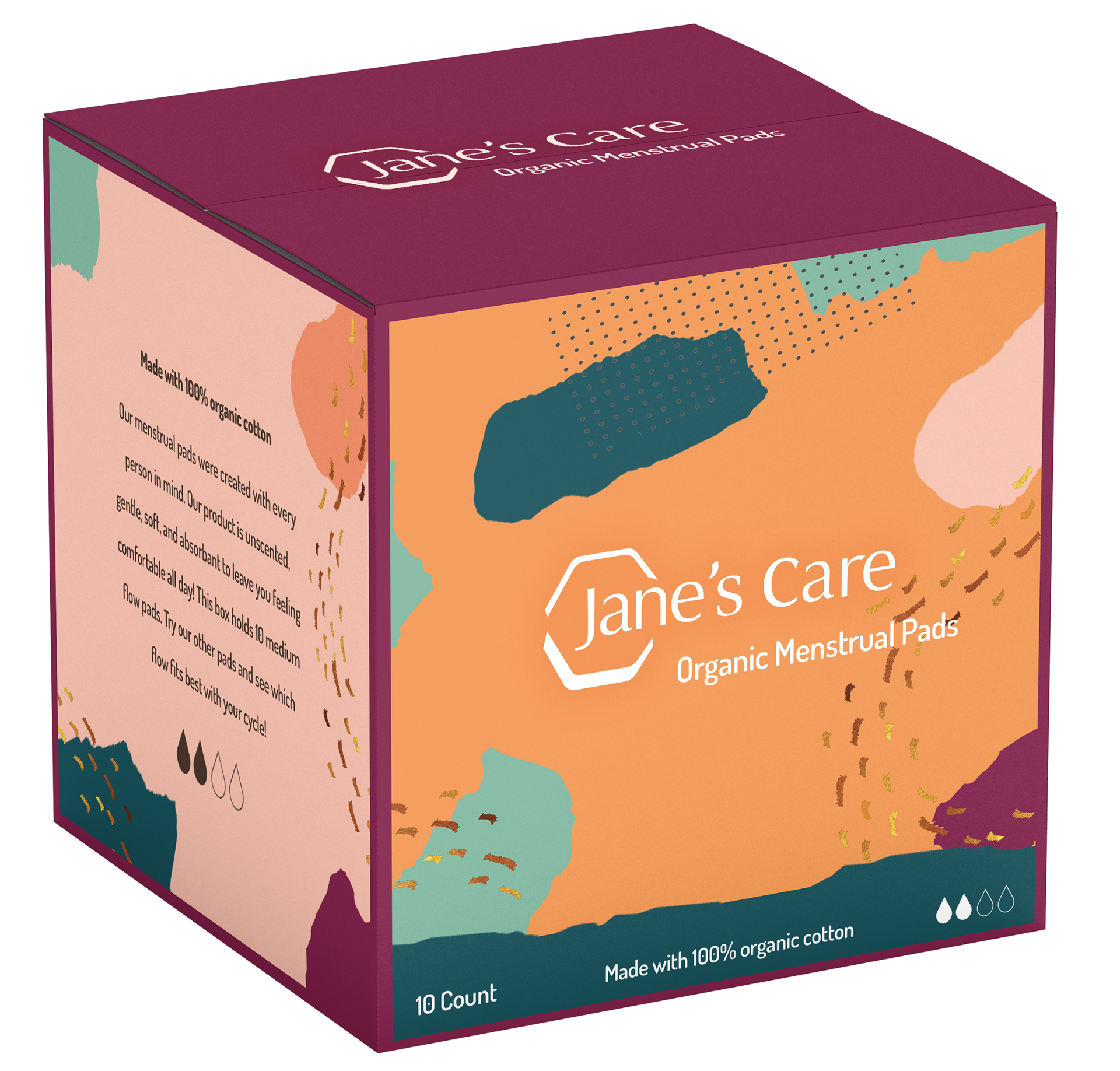
Organic Menstrual Pads
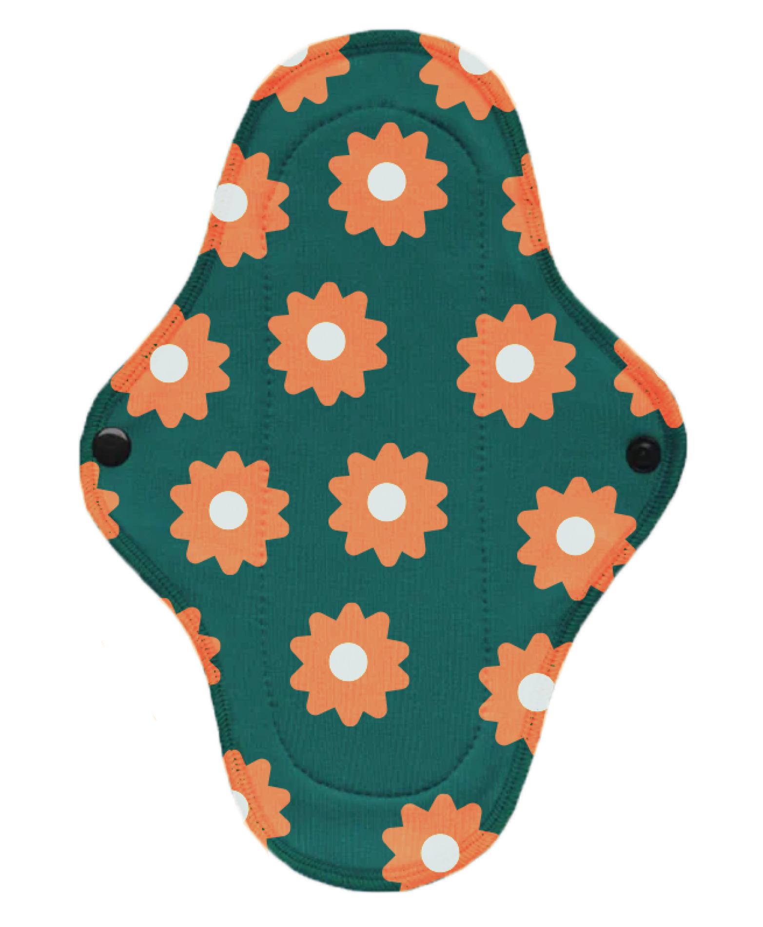
Reusable Eco-Friendly Menstrual Pads
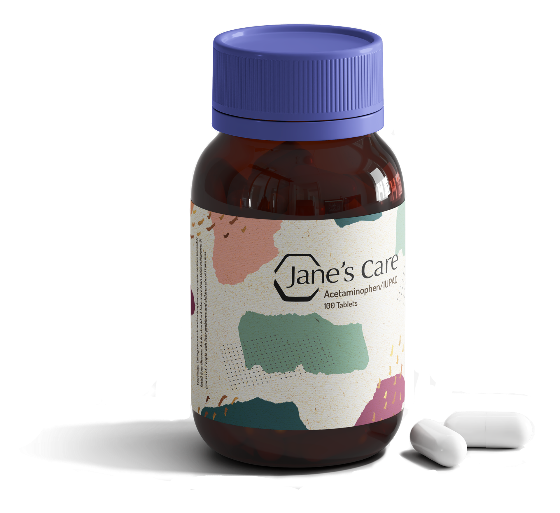
Medicine Bottle

Unscented Dant
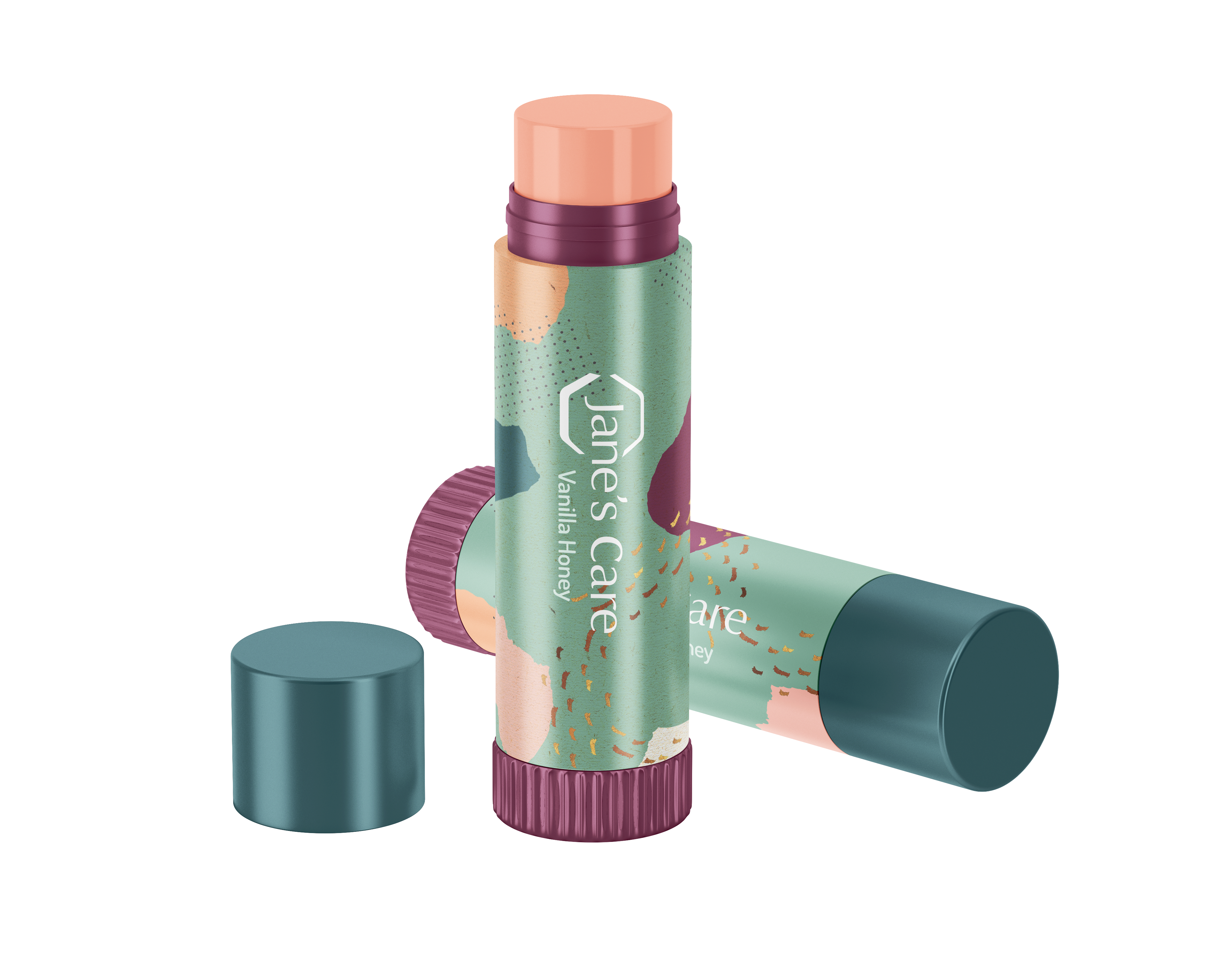
Lip Balm
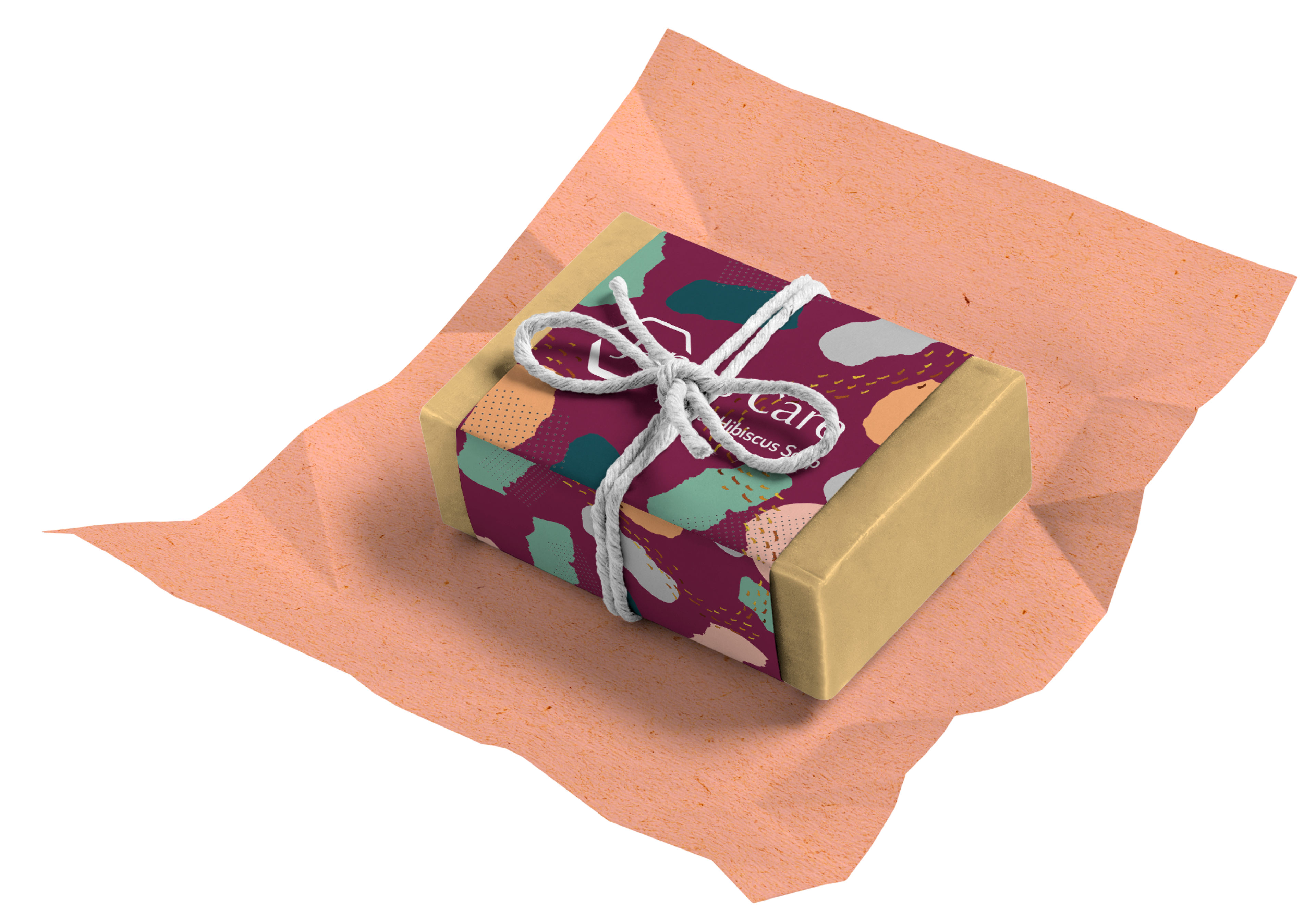
Hibiscus Soap
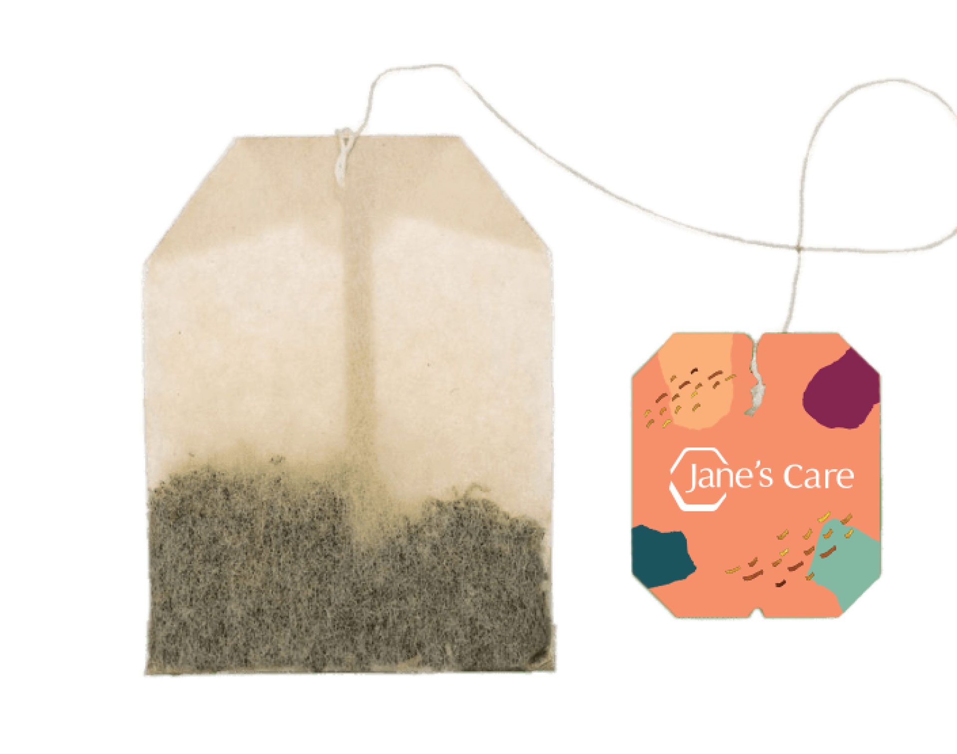
Tea/ Tea bag
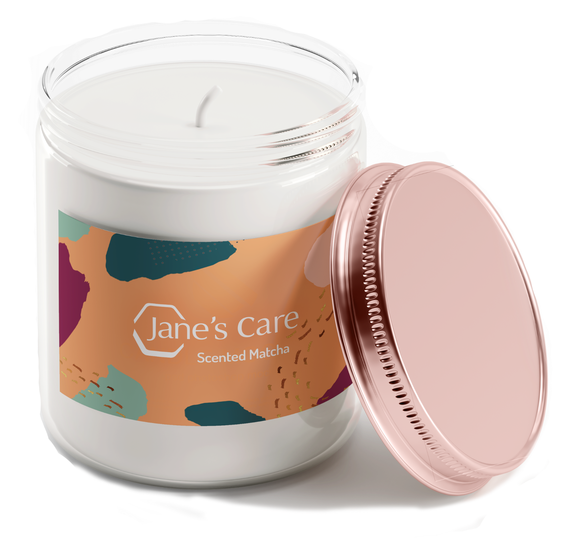
Matcha Candle
Outcome + Reflections + Next Steps
I did find this project difficult, but not for the reasons I'd have thought. The project itself was enjoyable and I was really proud of the outcome. I love the style I had decided to go with, which was an aesthetic I always dreamed of creating. The difficulties of this project was due to the time constraints I was given, as well as the fact that I completed this project on my own without help from my teammate. This was the first time I had come across a situation in which my teammate ( their role was supposed to be copywriting & video editing ) avoided working and had left me to struggle on my own devices. Instead of reaching out to a professor for help or advice from the get-go, I instead relied on my abilities alone, which put way more pressure and strain on myself than was necessary. By the time I had gone to my professor for help, it was close to the due date and my teammate was nowhere to be seen except when I had to submit the project under their account they had made for our entry. What this situation taught me was to always ask for help at an earlier stage, to delegate better, hold my future teammates accountable for their work, to have patience for myself, to handle frustration in a better way, and to never allow others to take credit for work they had not done. This situation was incredibly stressful, but I had grown and learned a lot from this, even with all the growing pains that had come from it.
Overall this project was a huge success and due to the hurdles I had to cross to finish it, I found myself feeling more confident in my abilities in UX/UI and video editing than I had previously. If I had to continue this project, I would redo the copy as I had a limited amount of time to make everything sound more fluid, and the small additions of my teammates copy felt different from the general tone of the project. I would also expand this project to other social platforms, potentially create an app version, and create the other tabs on the website.

