FIG x Benjamin Moore x FIT
The Overview
FIT paired up with The FIG Agency so we could help them, help Benjamin Moore connect with their customers. This was our first (and last) class project where we were able to work directly with a real agency. This was also our first exposure to formal briefs and an understanding of the actual presentation process at an agency. This project really helped ease our transition into our internships/careers after graduation.
The Problem
Benjamin Moore is having trouble directing customers to their shop locations. Customers tend to assume that Benjamin Moore paints are located inside big box shops such as Home Depot, rather than independently owned hardware and paint stores.
The Solution
Connect Benjamin Moore to people, the places they love, the food or objects they enjoy, and the mom and pop shops they loyally frequent and support.
Original Concept (Scrapped)
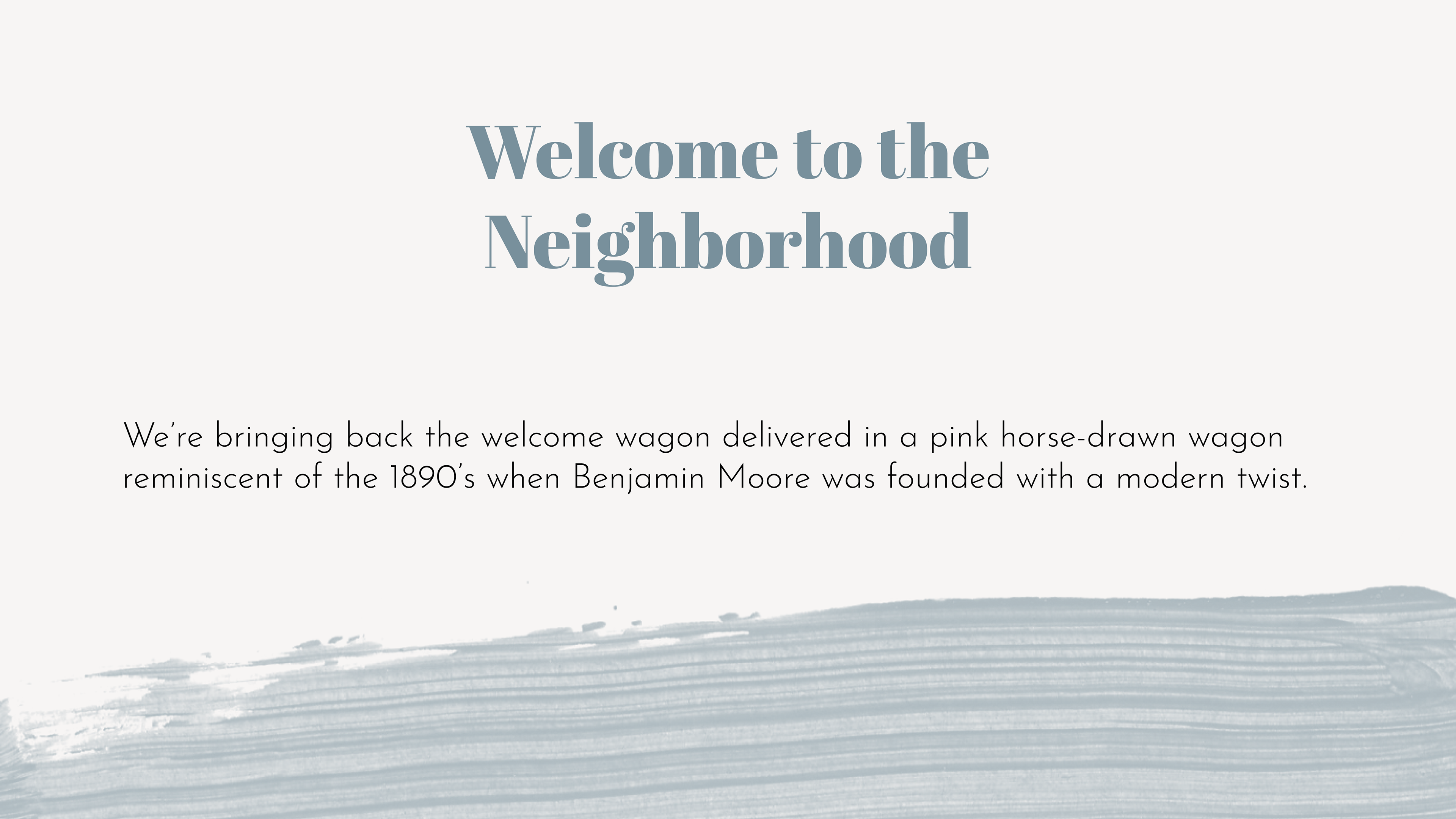
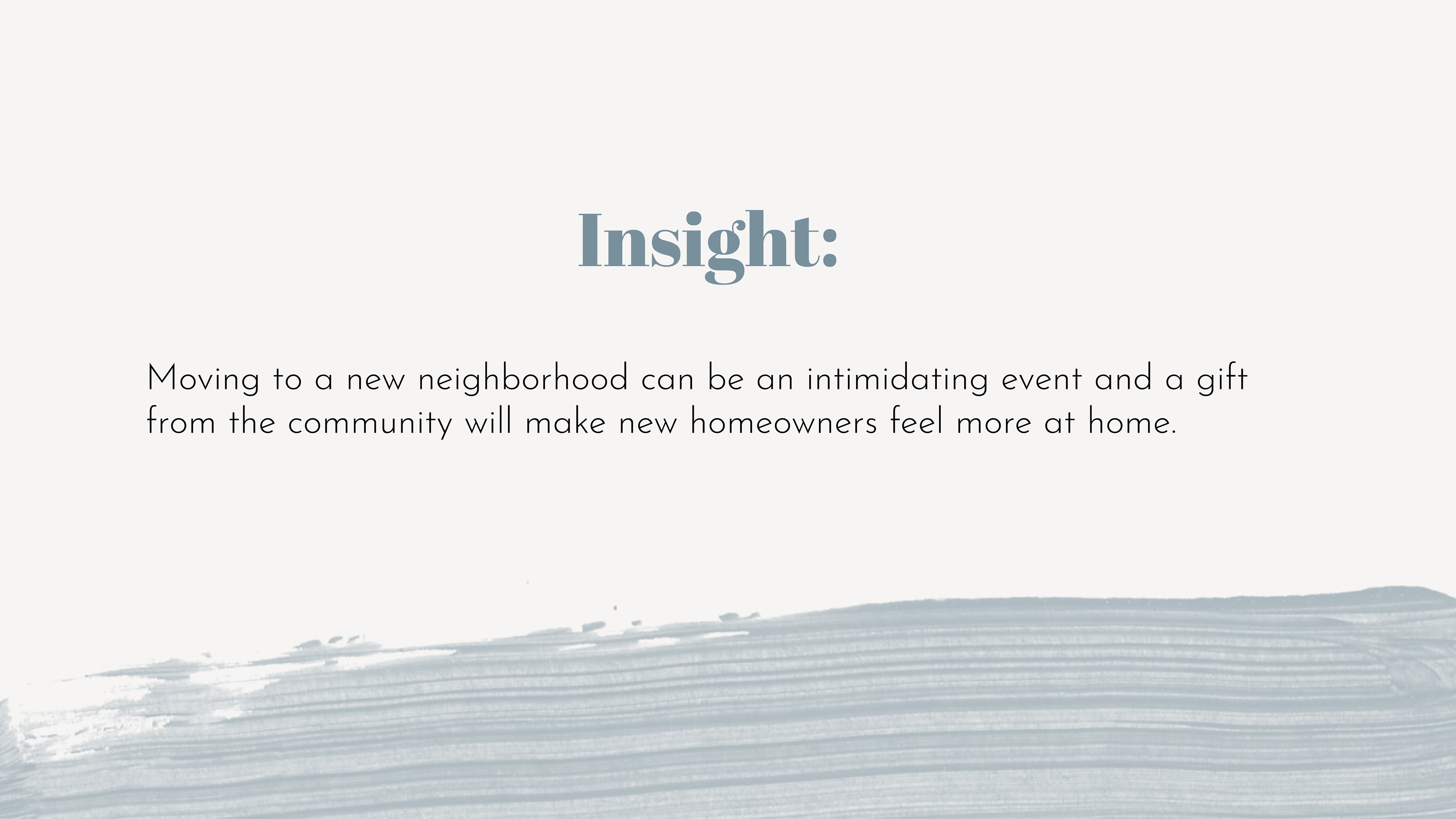
We had originally wanted to connect Benjamin Moore to new homeowners by giving them a welcome gift full of Benjamin Moore sample paints, painting supplies, and goods and produce from local shops. We realized that this idea would not be sustainable in the long run, the homeowners might not like the paint colors chosen, and it would potentially put a strain on smaller businesses so we scrapped the idea.
Final Idea
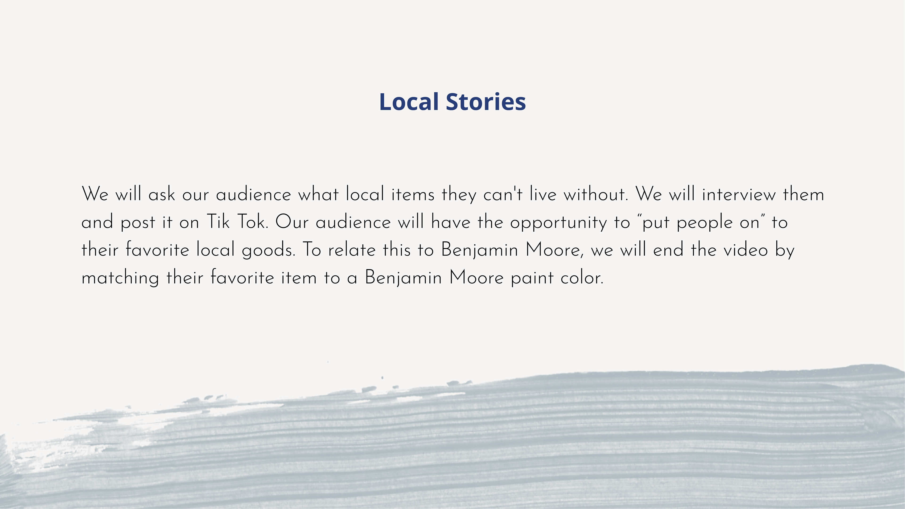
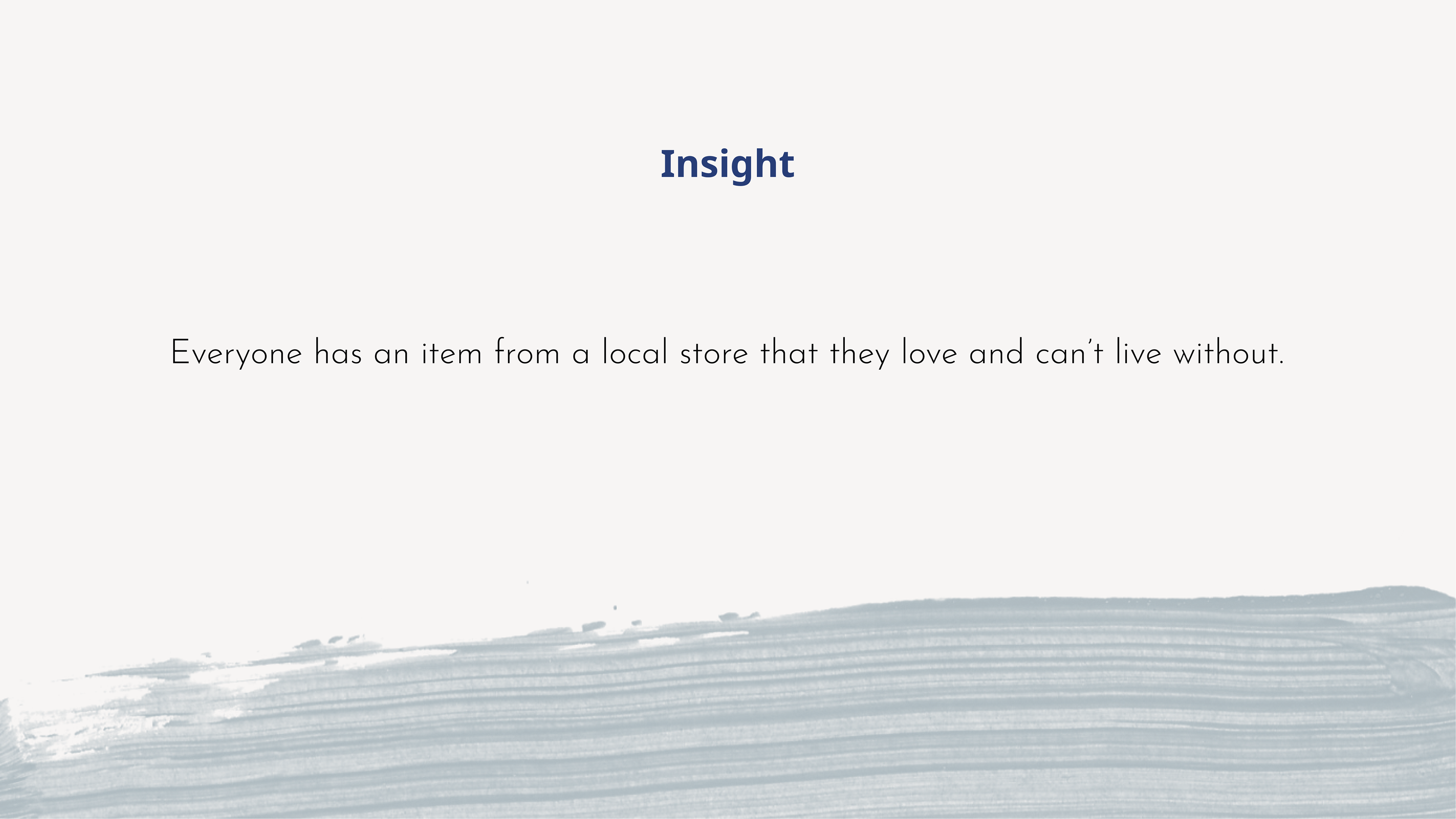
We wanted to touch the hearts of the customers and those of the mom and pop shops to really bring people together. Our plan was to introduce the idea of the food or objects people couldn't live without and how Benjamin Moore could take those colors and apply it to their homes. The idea was also to get small local mom and pop shops involved by having their business featured on the carousels on the Benjamin Moore Instagram page, and in return their Instagram page would feature Benjamin Moore on a post about the chosen color. It would be a win-win for both shops!
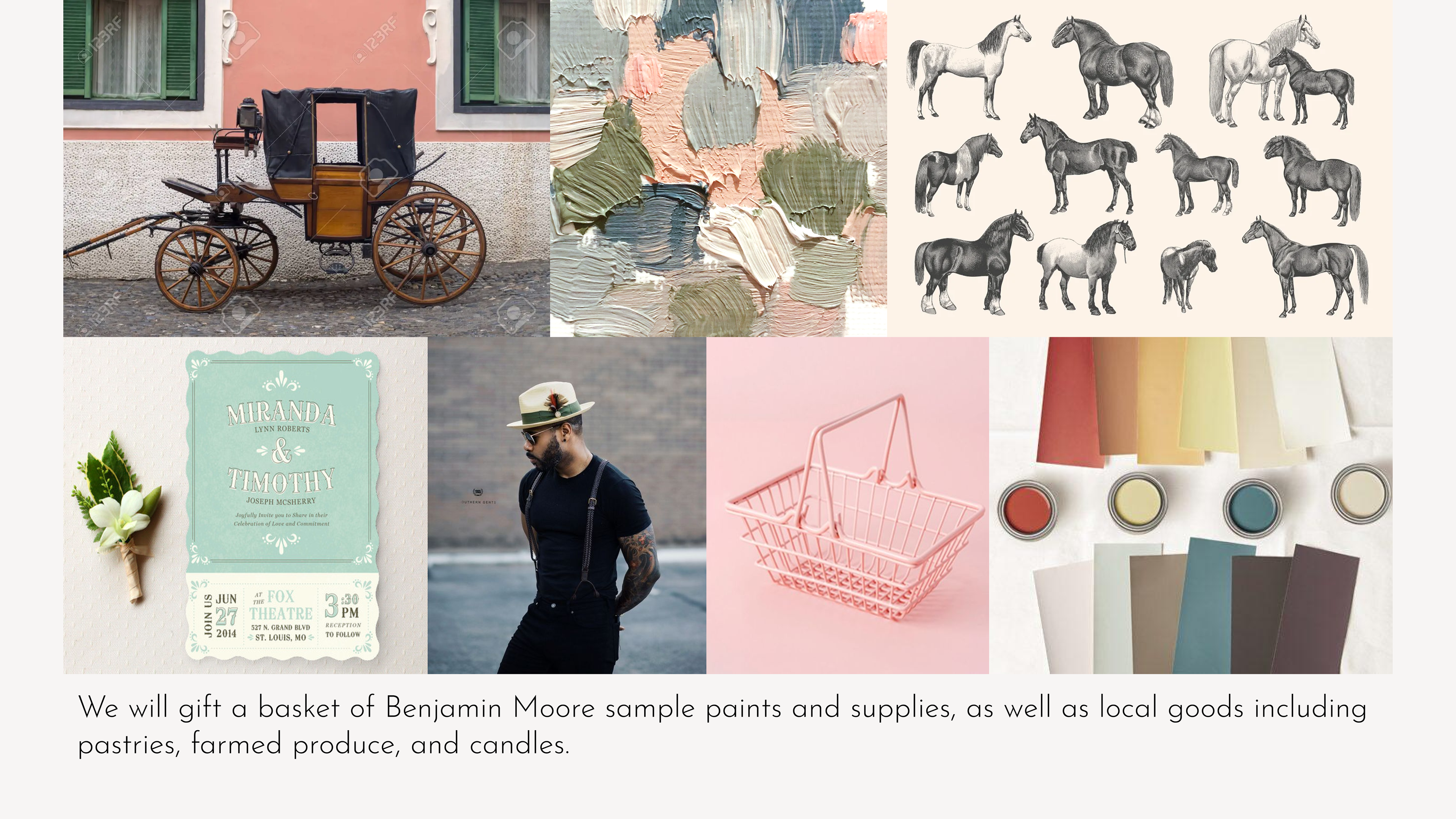
The Aesthetic/ Idea
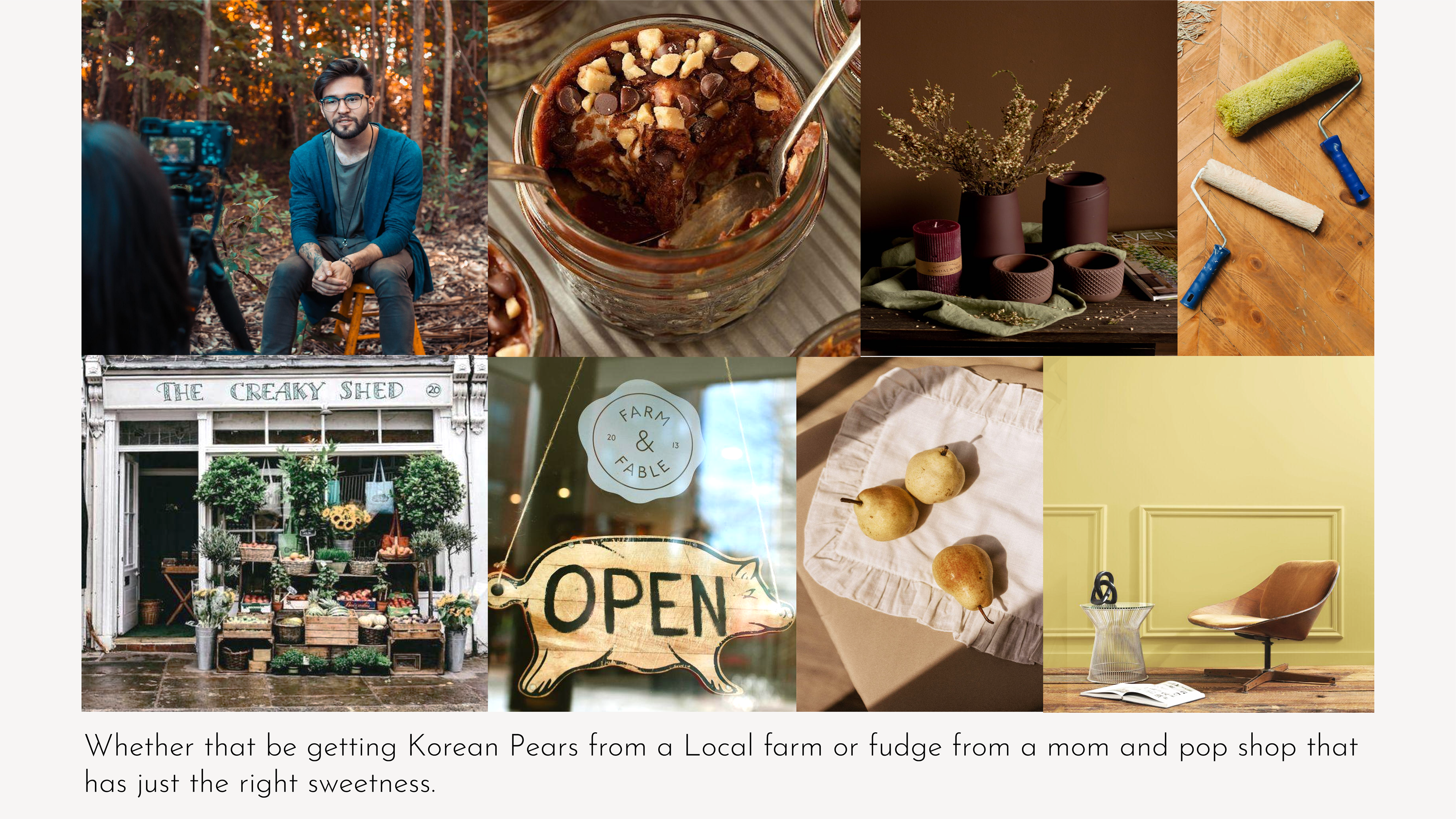
This was our idea of what we wanted the aesthetic of the project to look like.
Chosen Customer Favorites
These are the chosen customer favorites that would be added to both Benjamin Moore and the mom and pop shop's page. I created the first two ads from scratch through the use of Illustrator and Photoshop, and partially worked on the last one with my teammate. I wanted each one to be a little different from each other, ie: the sticker, the bread, the foam, and wanted it to stand out aesthetically, along with true Benjamin Moore paint colors that could be applied to customers' walls.
Images from left to right: (korean pear, strawberry bagel, matcha latte).
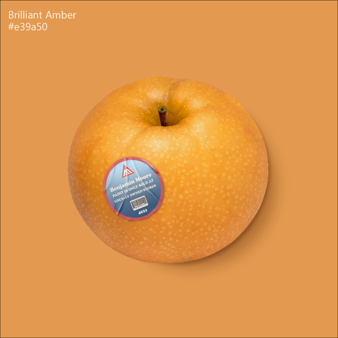
Korean Pear | Design by Myself
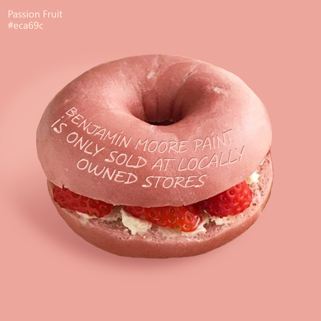
Strawberry Bagel | Design by Myself
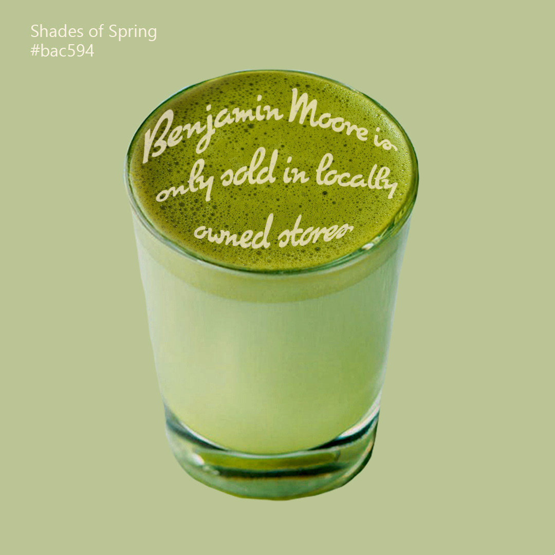
Matcha Latte | Design by Myself & Ava Herrera
Instagram Feed Mockups
Here are the examples of what Benjamin Moore's Instagram feed would look like. First the video of a customer explaining their favorite food/object would appear on the left of the feed, followed by the middle square with the food/object described and the paint color from Benjamin Moore, and finally would be a panel that describes the small mom and pop business that the color hails from.
The mockups on the right show what the feed would potentially look like on the Instagram pages of those mom and pop stores promoting Benjamin Moore.
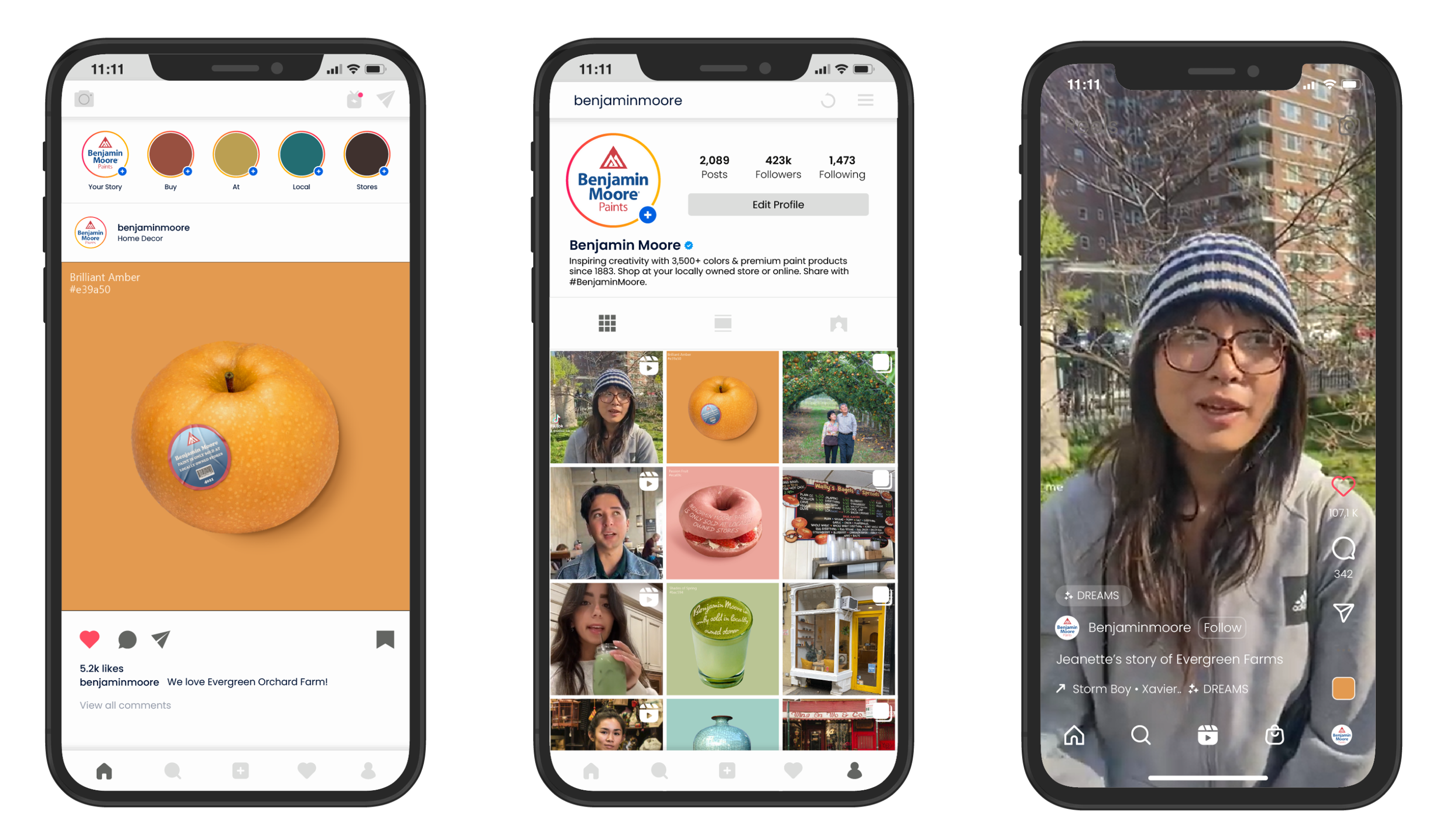
Benjamin Moore Social media Look
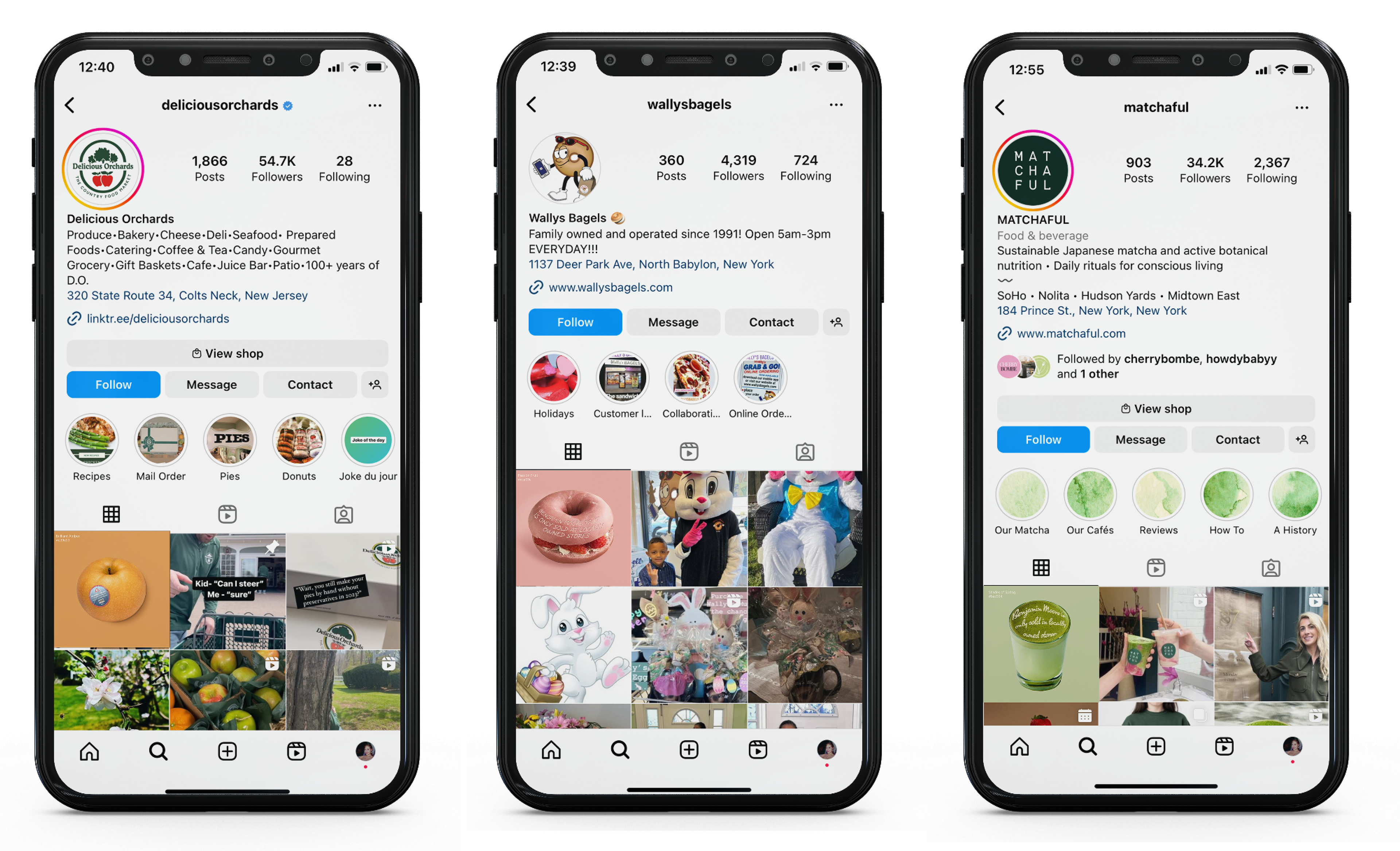
Benjamin Moore featured on small business social pages
The Carousel
The carousel contains images from the mom and pop shops, as well as their location on the map/how to find them!
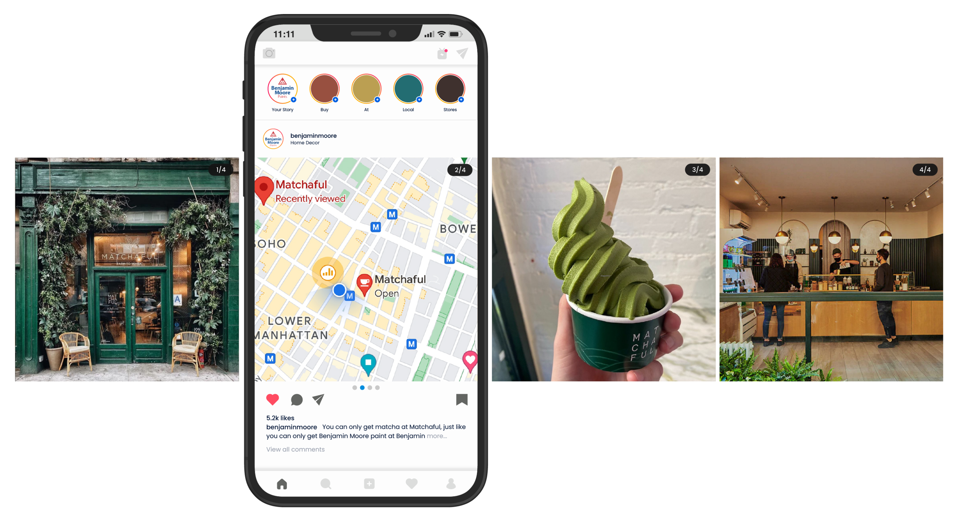
Green Tea Matchaful Instagram
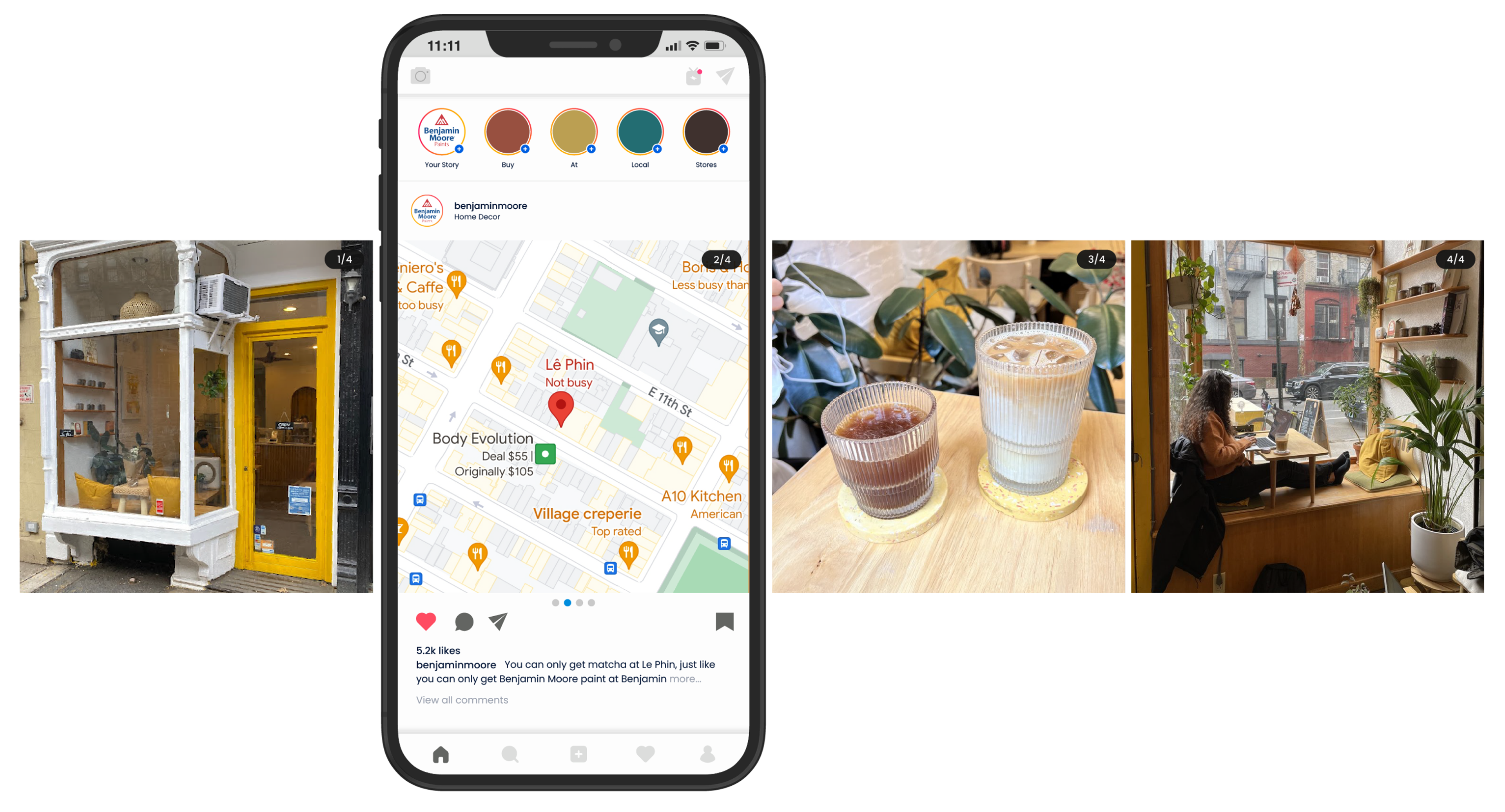
Le Phin Coffee House Instagram
Tiktok & Instagram Interview Videos
These videos will have a Benjamin Moore customer describing their favorite food/object, their story behind it, and why they love it so much. Content like this would help engage consumers with Benjamin Moore and also spread word about the love they have for their local businesses.
Outcome + Reflections + Next Steps
This project was something that I was quite nervous about due to the pressure of creating something for a real agency. I knew this was to gain experience so I trudged on, but did find myself intimidated by the brief and ask. After brainstorming with my team however, we were able to find a middle ground for all of our ideas and wound up creating something that felt impressive to FIG. I truly enjoyed creating the different social posts with the favorite food paired with Benjamin Moore colors. We had originally wanted to create other objects to color match Benjamin Moore paints, but unfortunately ran out of time to do so and were concerned that a single object amongst food would look strange so we cut that out. If I were to revisit this project or create something similar in the future, I would love to deep dive into different textures I could create with typography in Photoshop. Overall this project was a success and taught me that I should not have to worry about being too serious with a project. That not all agencies are alike, and to let go and have fun with the work I create!

