The Overview
I was tasked with choosing a brand that needed revamping and was considered mostly defunct. After a while of research, I found myself disappointed to learn that the Ripley's location in Broadway had closed down. I had lots of great memories there when I visited as a child, and I decided to base my project on it. Ripley's is a non-conventional brand that boasts itself as a museum that houses strange artifacts and historical objects. Originally a newspaper column, they eventually moved onto comic books, TV series, a chain of museums, posters, and video games.
The Problem
Ripley's has become viewed as outdated due to its "freakshow" attraction which goes against the body positivity and health awareness movement. Because of this, and due to the pandemic, Ripley's has closed its doors on many of its attractions.
The Solution
Refresh the Ripley's brand with a new look, color palette, logo, and website design. For this project I was only tasked with giving Ripley's a much deserved glow up rather than work on the social issues behind the brand.
The Design Process
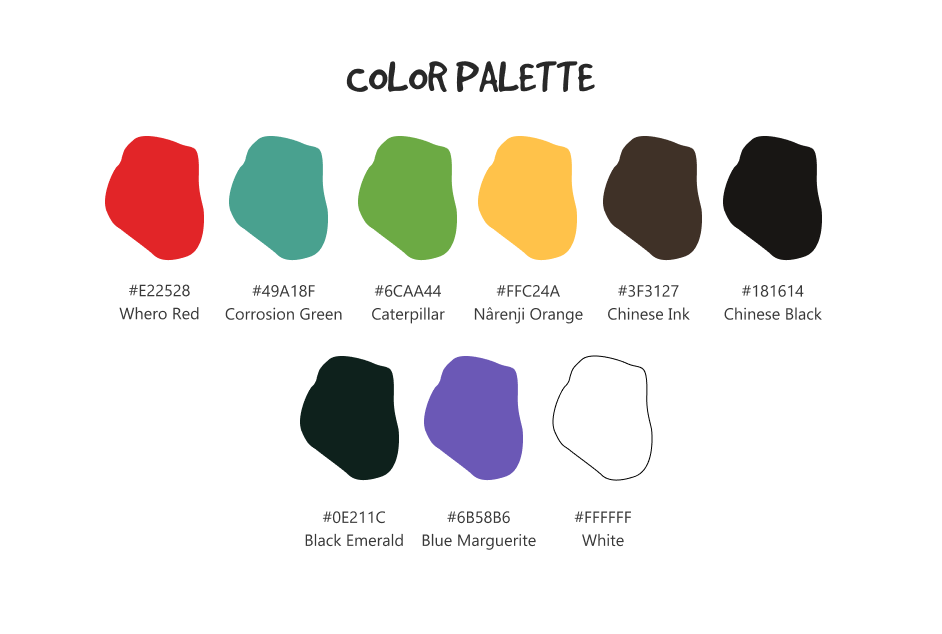
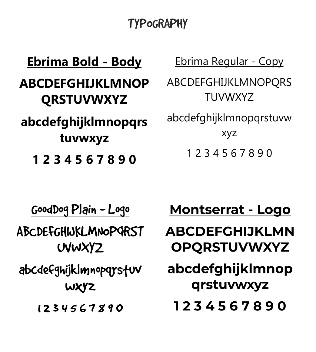
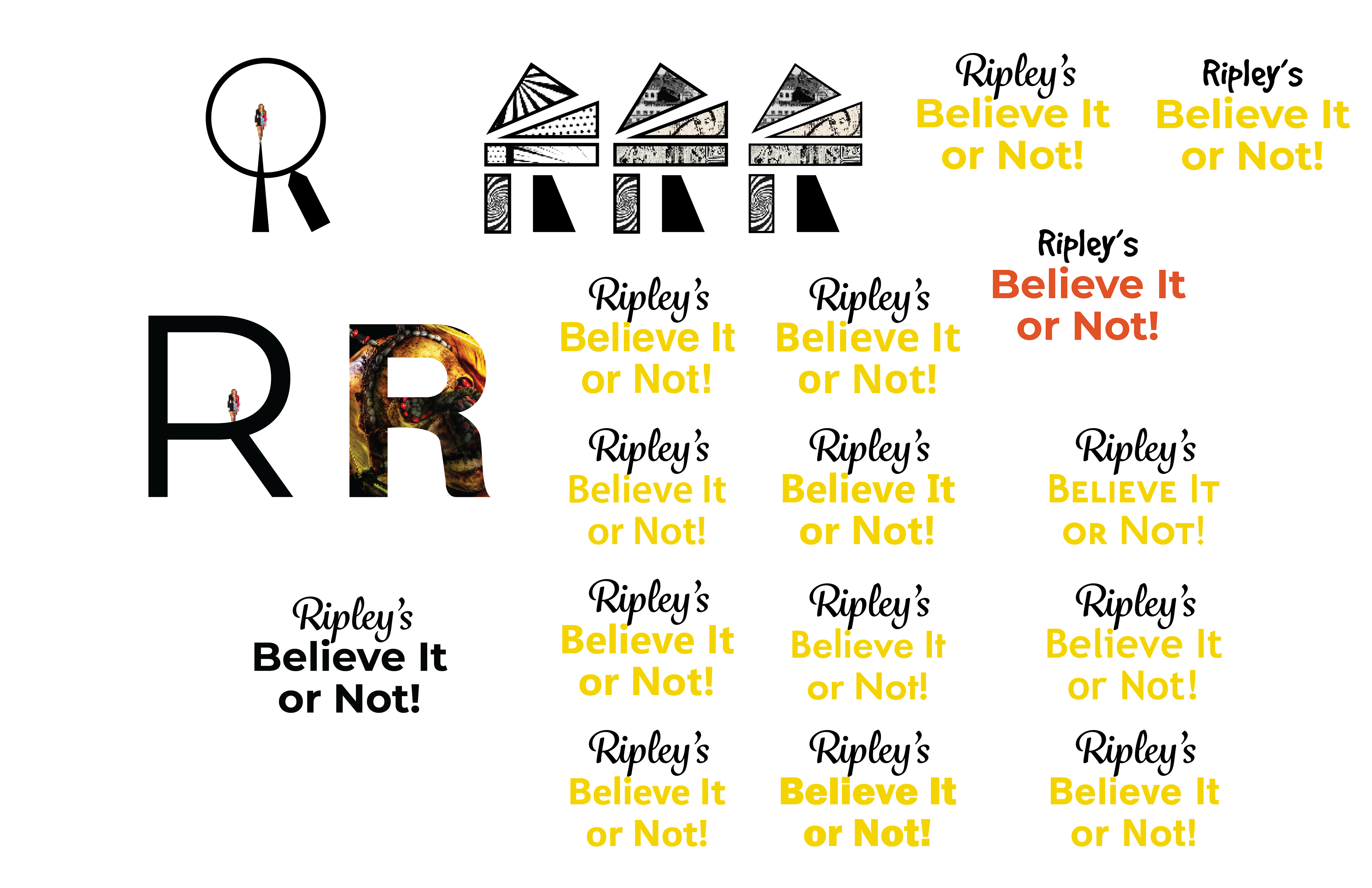
The color palette was chosen based off of picked colors from the Ripley website, logo, and actual artifacts from their museum collection. The typography direction was to combine a sort of playful and bold comic style with a wacky font that reminded me of books like Goosebumps.
The Logo Process
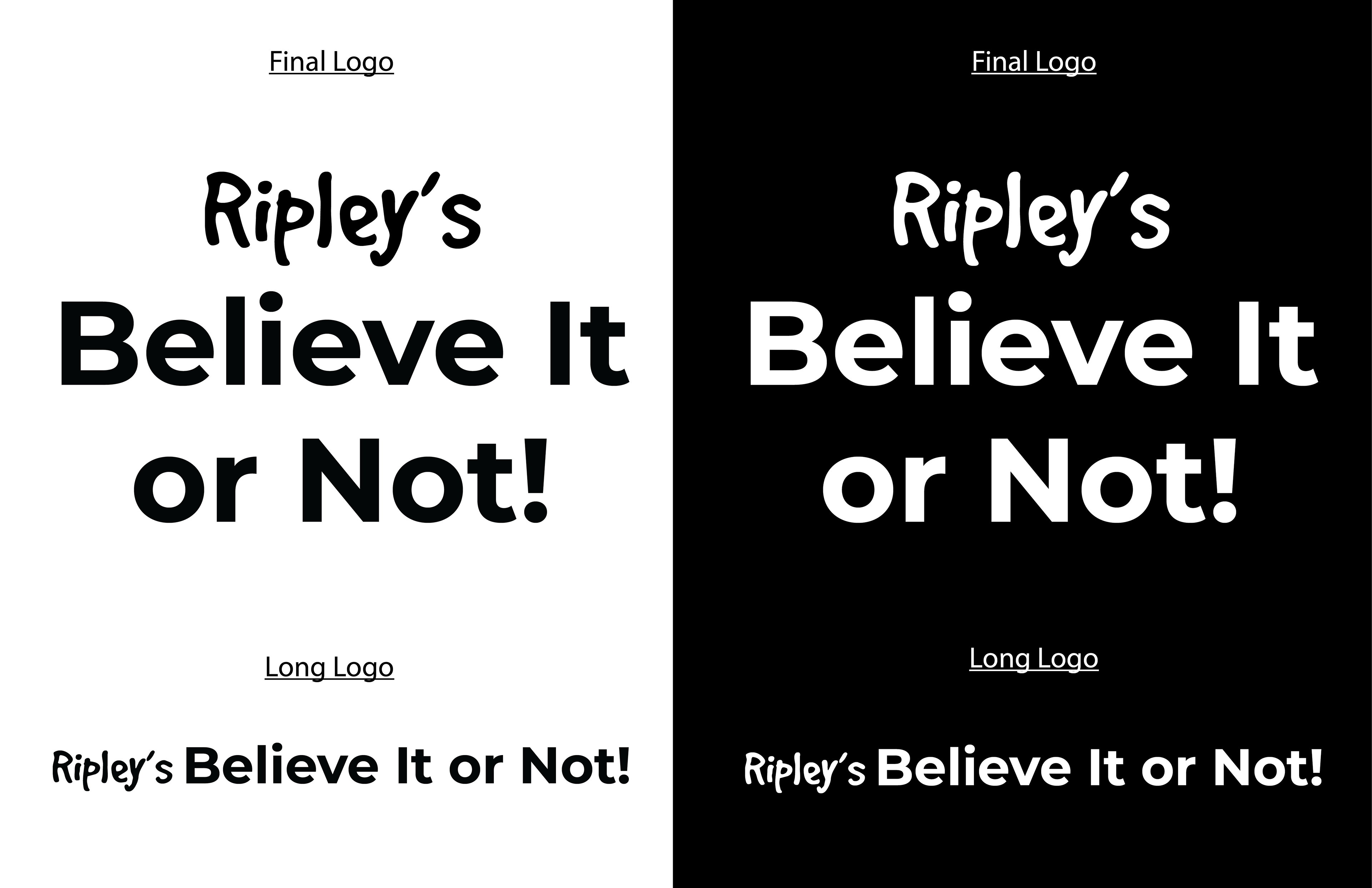
I I originally wanted to play around with the R in the Ripley's logo. Having actually visited the Ripley's New York location before it was shut down, I loved seeing the figurines carved on the tip of a piece of lead or needle head. I then moved onto using images and a comic style based off of Robert Ripley's comic series. I eventually landed on simple typefaces that left a feeling of strangeness and playfulness
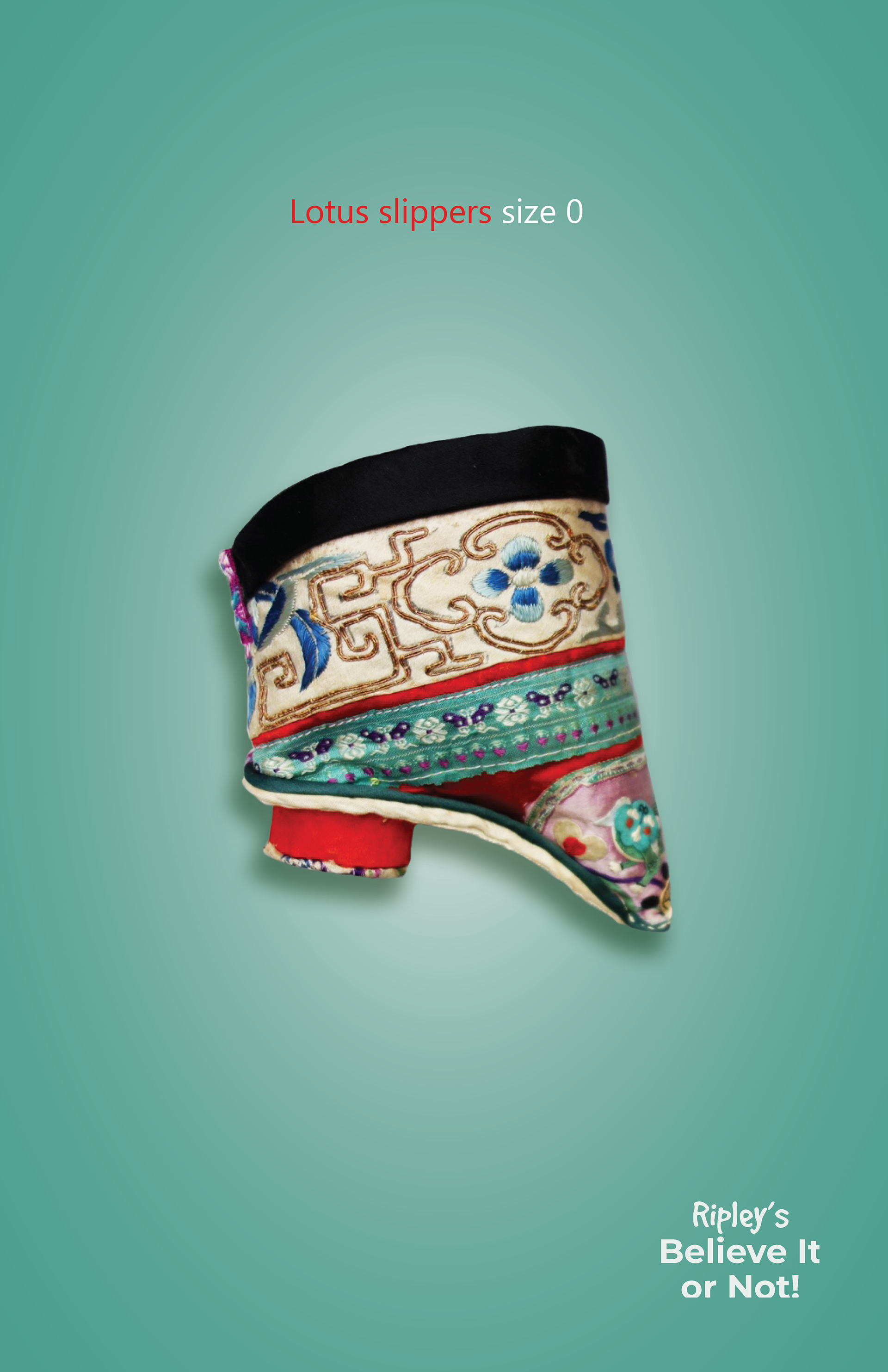
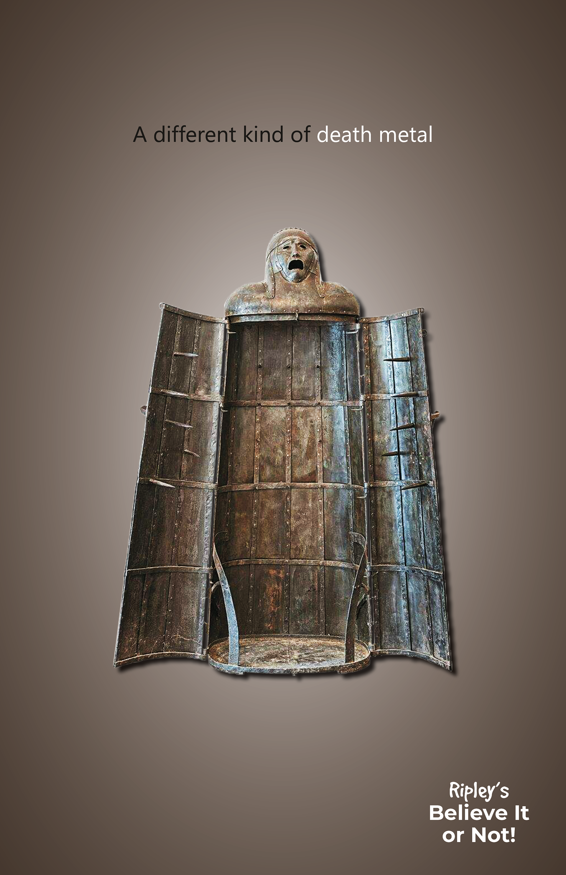
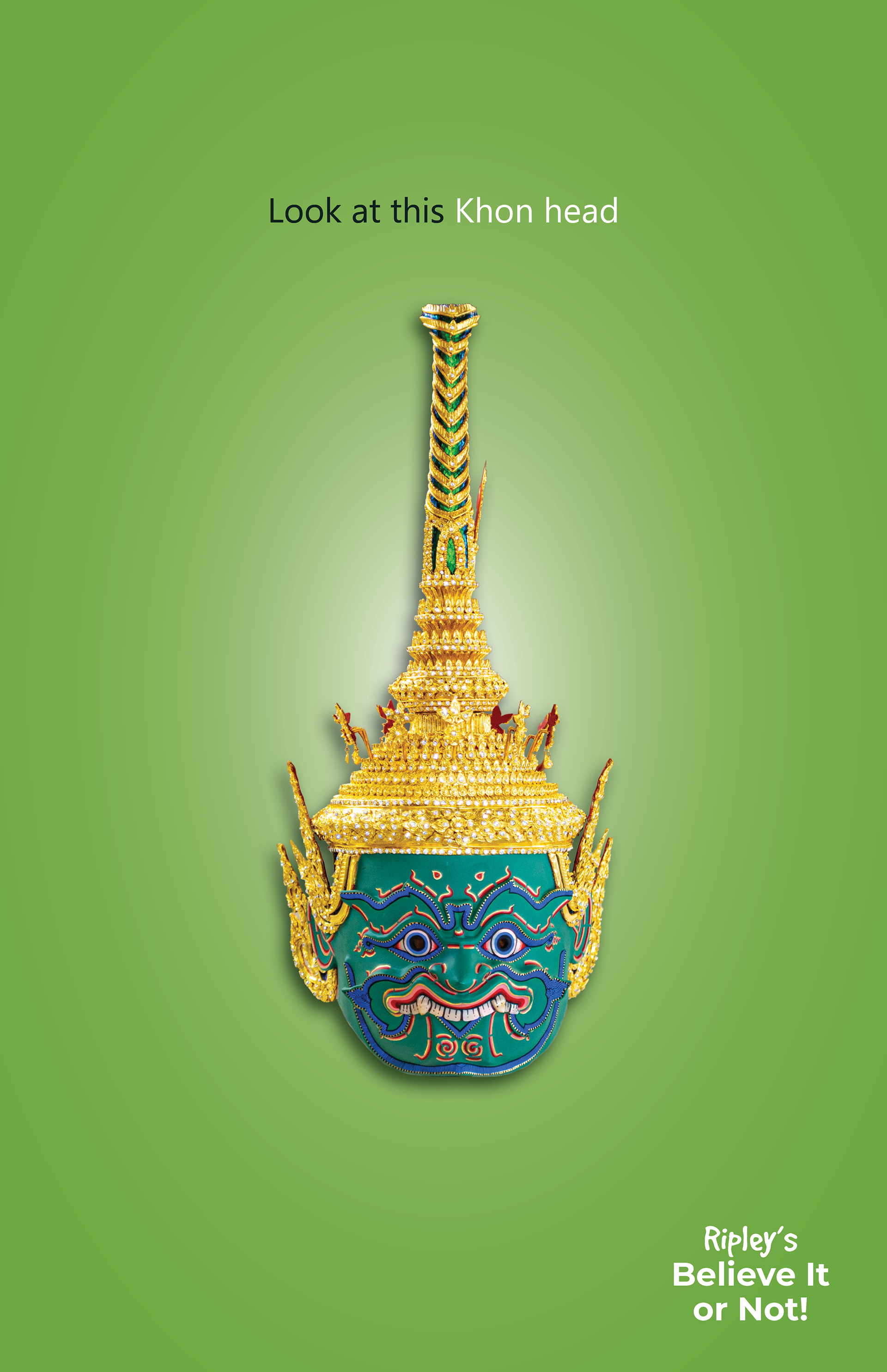
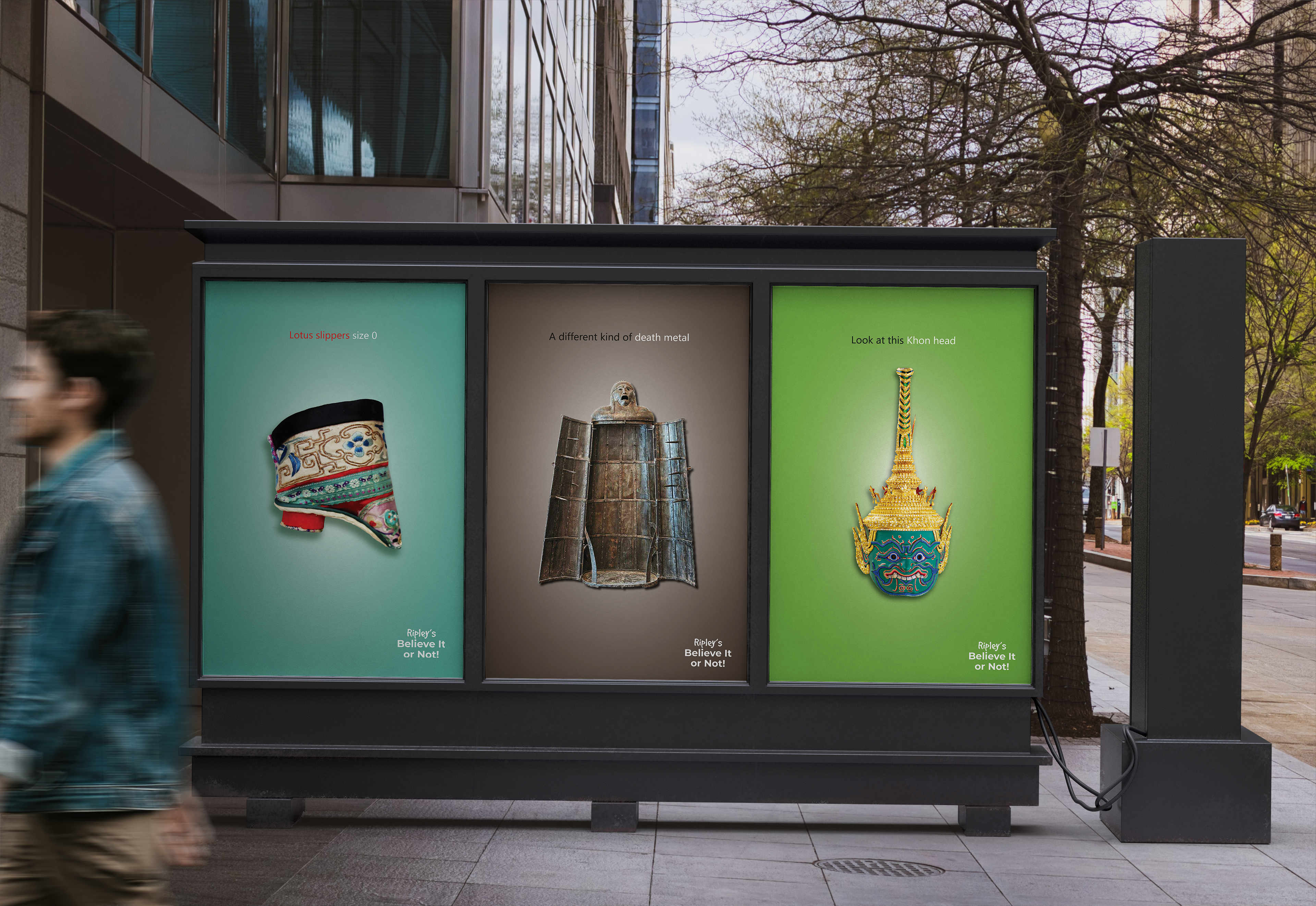
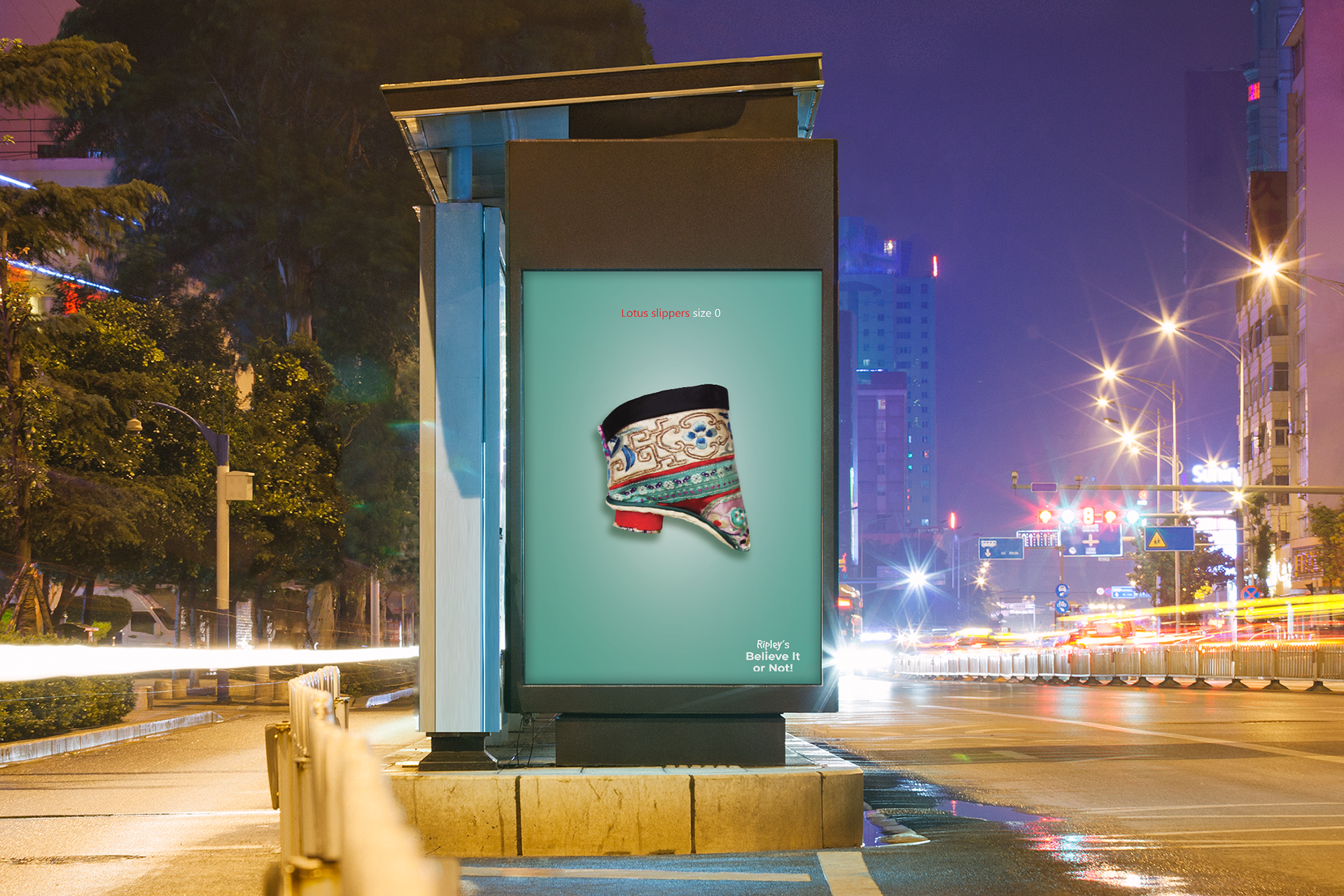
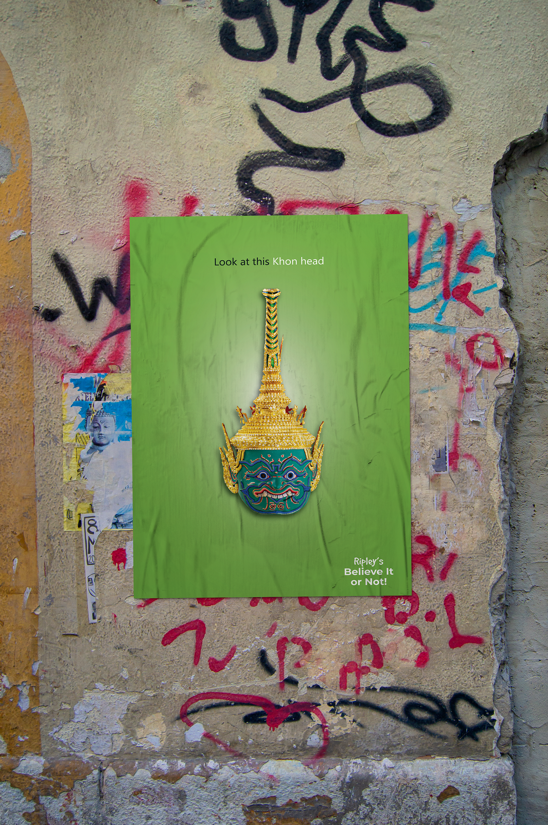
Museum Posters
I wanted to be playful with the copy and make the museum object more interesting to visit. Although I'm not a copywriter, and I struggled a lot with the text, I think I have achieved something that stands out at the very least!
Museum Merchandise
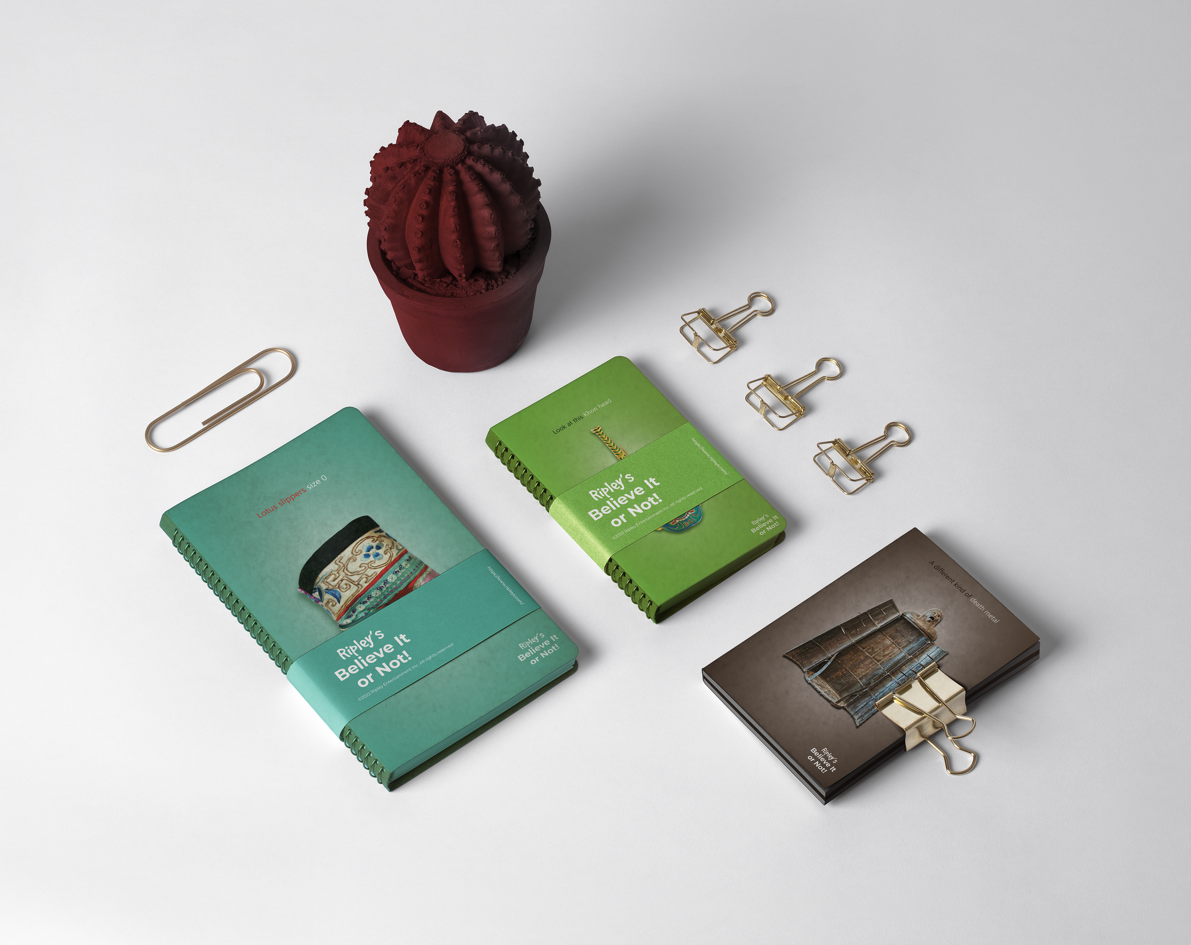
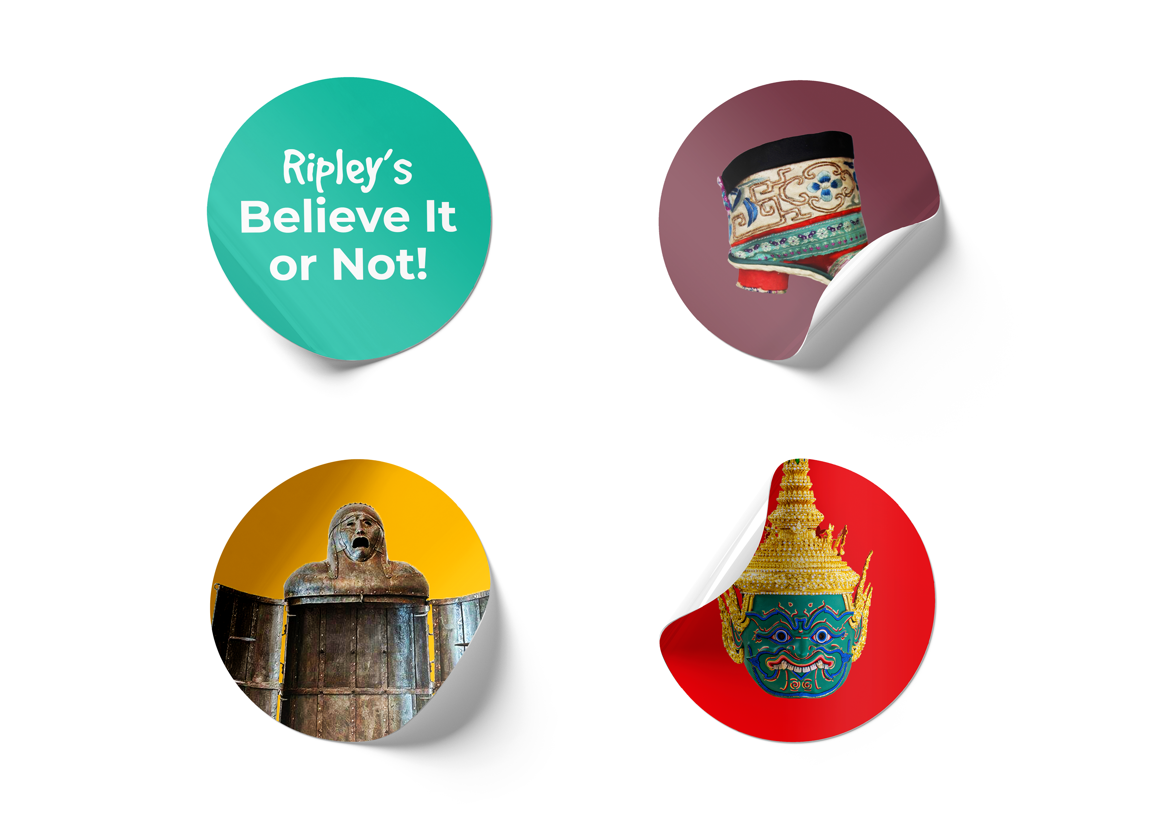
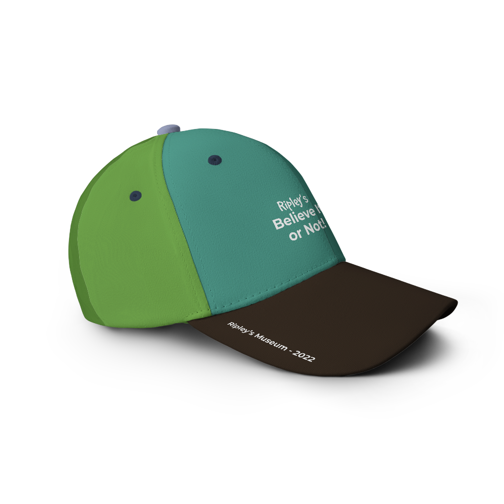
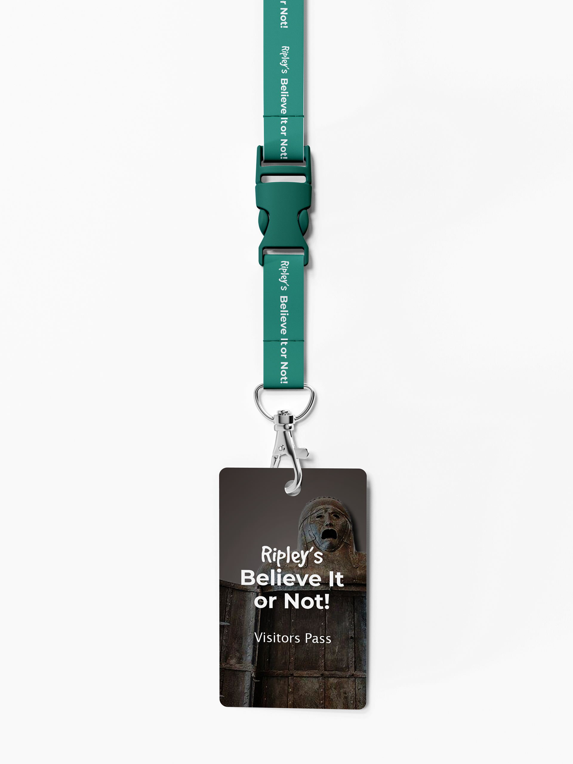
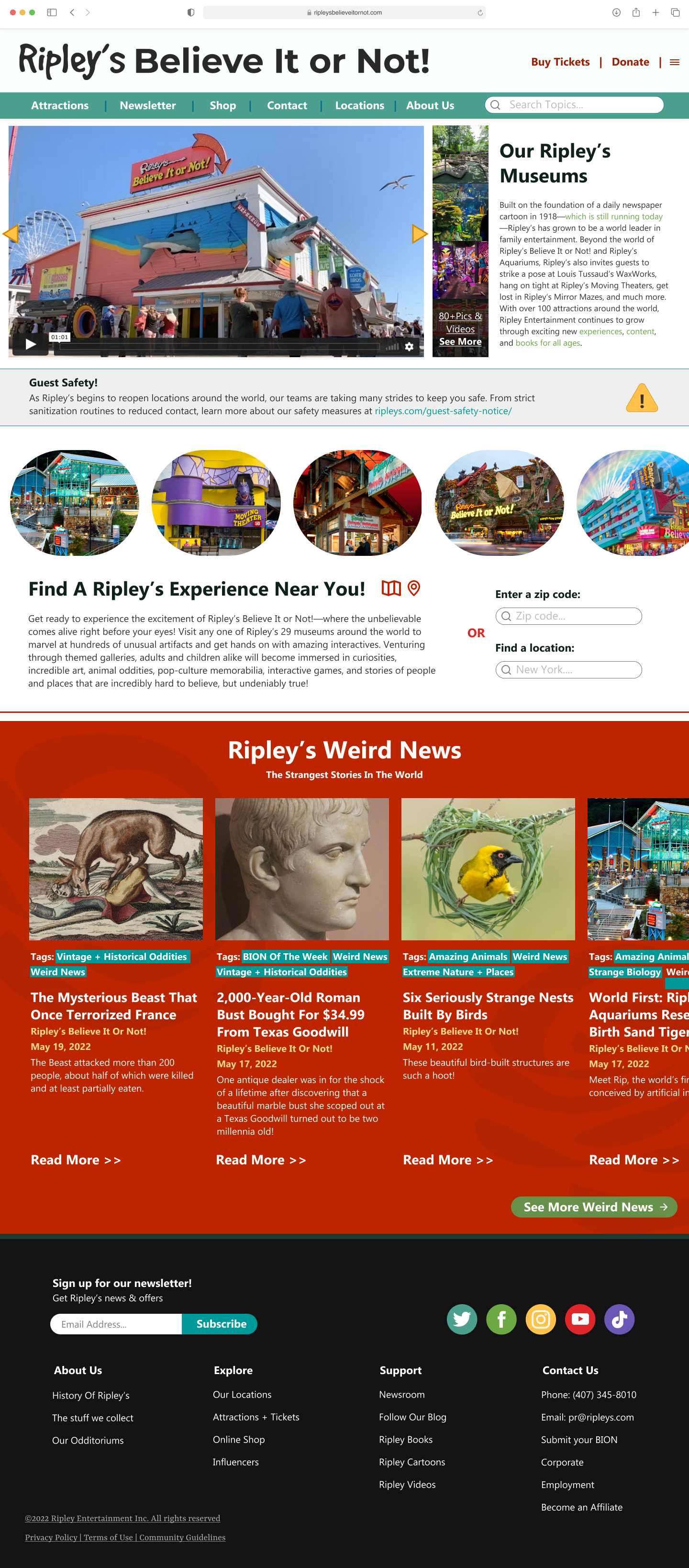
Ripley's Believe It or Not! Website
Although Ripley's website was well done, I felt that it took forever for visitors to scroll down to find information. I wanted visitors to get all of their information as easily as they could so that it would entice them to book a ticket to the museum. I decided to go for a simple style with a specific color palette that would be easy on the eyes. I also used different museum sites as inspiration for the design, as Ripley's is still a museum, albeit a non-traditional one.
The oval images of Ripley's experiences are made to look like portals that you could get sucked into, with each of its 29 location being as unique as the rest.
In the Weird News section, I had designed a subtle swirl in the background that is reminiscent of the rotating tunnel that a guest would first see as they entered Ripley's. This hypnotic spinning tunnel would begin their journey into the strange and wondrous odditorium, where they would experience all that Ripley's has to offer.
Project Overview
Outcome + Reflections + Next Steps
Although I had a lot of fun designing the website for Ripley's, I actually found myself struggling with this project when it came to the poster designs. I had revised the posters multiple times over a span of weeks until I found myself satisfied with the result, and even then I am hesitant to love the finished product. If I had to continue this project, I would love to add more pages to the website, create more merchandise that would fit the wacky weird world of Ripley's and also redo the posters into something more strange. Overall this project was definitely something out of my comfort zone and style, but I think I have achieved something fun and cohesive!

