OVERVIEW
This project was my very first freelance graphic design client after graduating college. Although I was very inexperienced with client work at the time, I was eager to learn and had grown a lot as a designer as a result of this project. Although I was tasked with solely creating emojis and redesigning the logo in 3D, my work ended up helping the client more than I expected, and helped me feel more confident in my abilities in art direction. For this project I was mainly tasked with creating emojis for the client & co.'s environmental brand, which would represent environmental issues going on around the world. These emoji would be featured on Snapchat's map, as well as other platforms, and would help with spreading environmental messages around the globe. Ultimately the project wound up being either cancelled or put on the back burner by the client, but still impacted me as a designer to this day.
THE PROBLEM
The client needed emojis for their new environmental brand project. These new emojis would be geared towards all ages, and would range from being featured in small and luxury brands. I was also tasked with recreating their logo in a 3D style on Blender (which I will not display due to the project not being released).
THE SOLUTION
I noticed that the client & co. was struggling with a lack in art direction and I felt that it would make things easier if I provided moodboards for the emojis. I also designed a variety of samples for the client to choose from so that they would feel more confident in my abilities and could visualize the direction I was heading in.
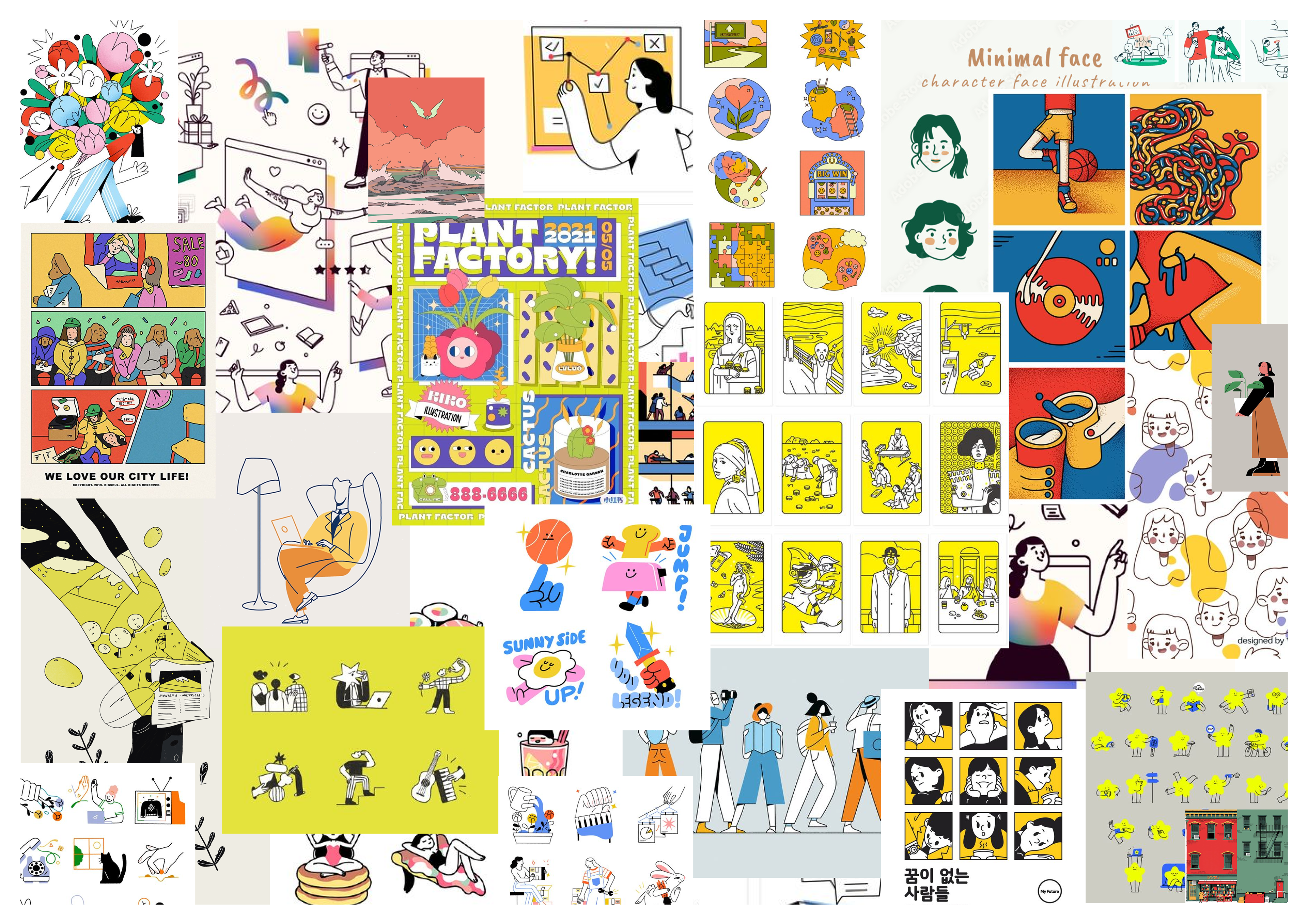
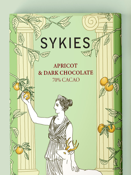
Moodboard 1 - Lineart
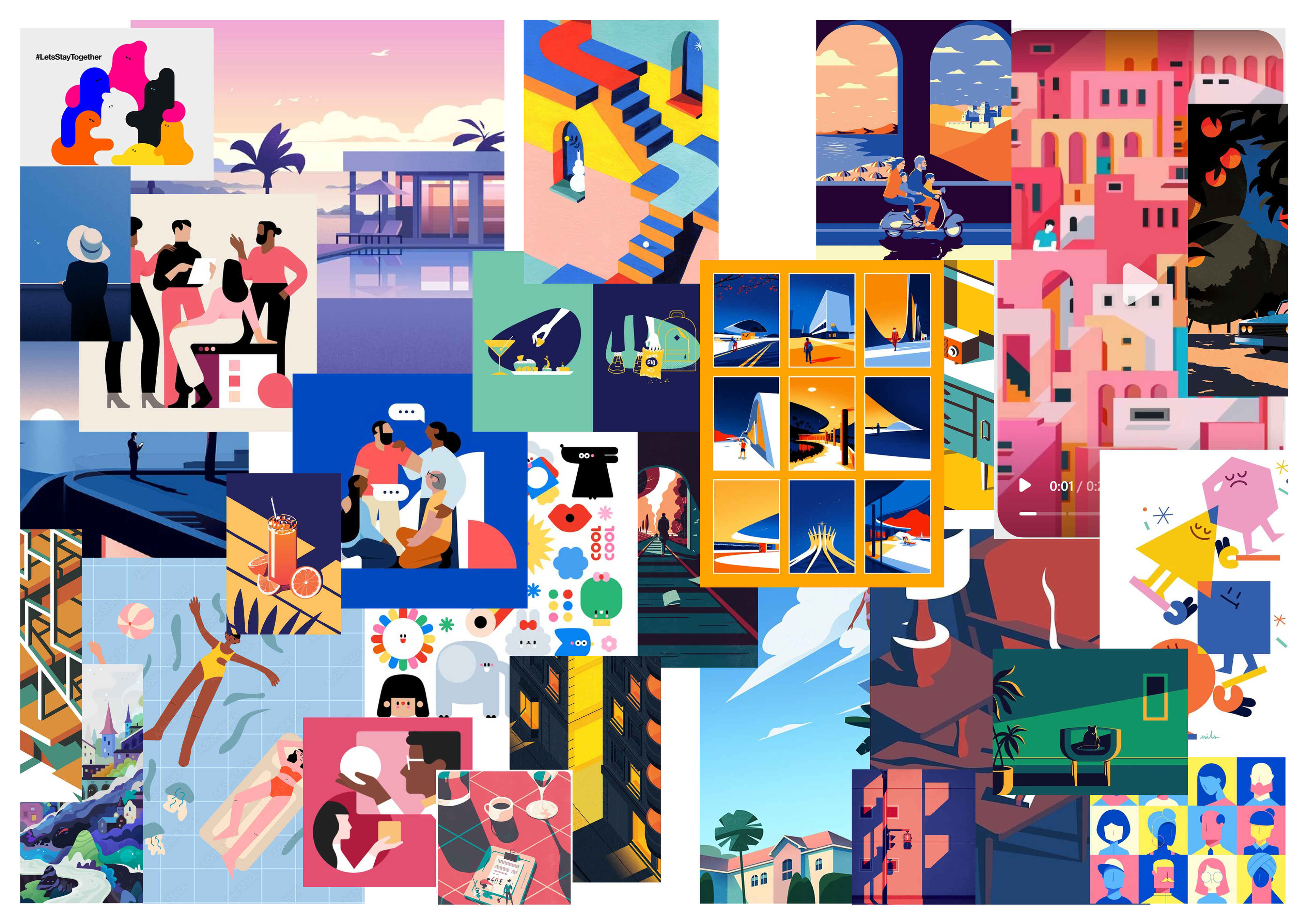
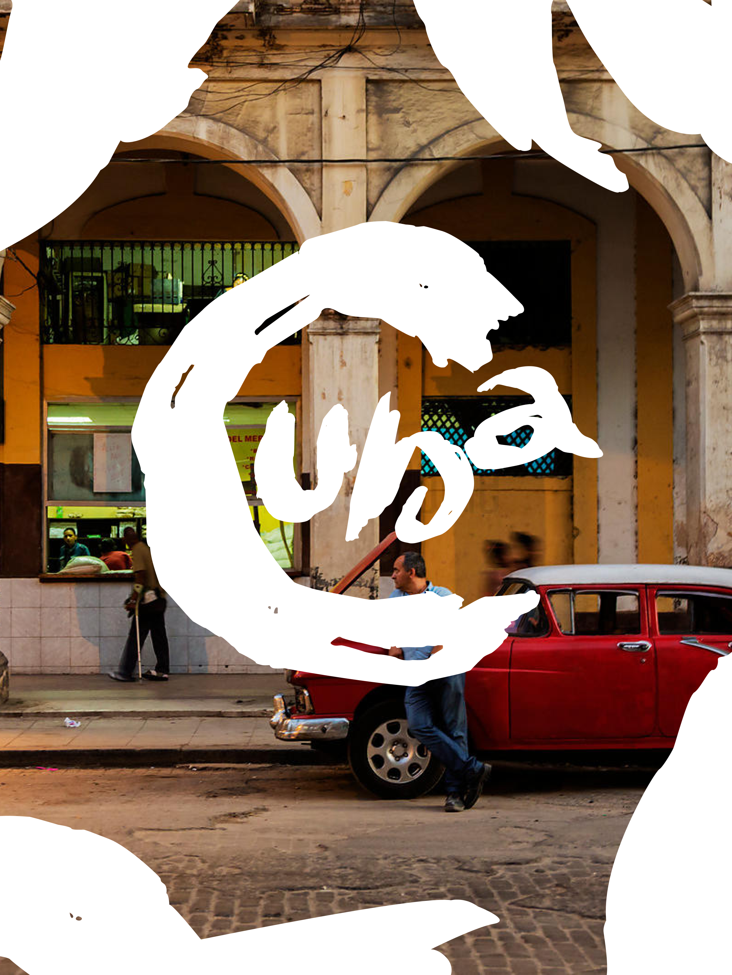
Moodboard 2 - Solid Colors
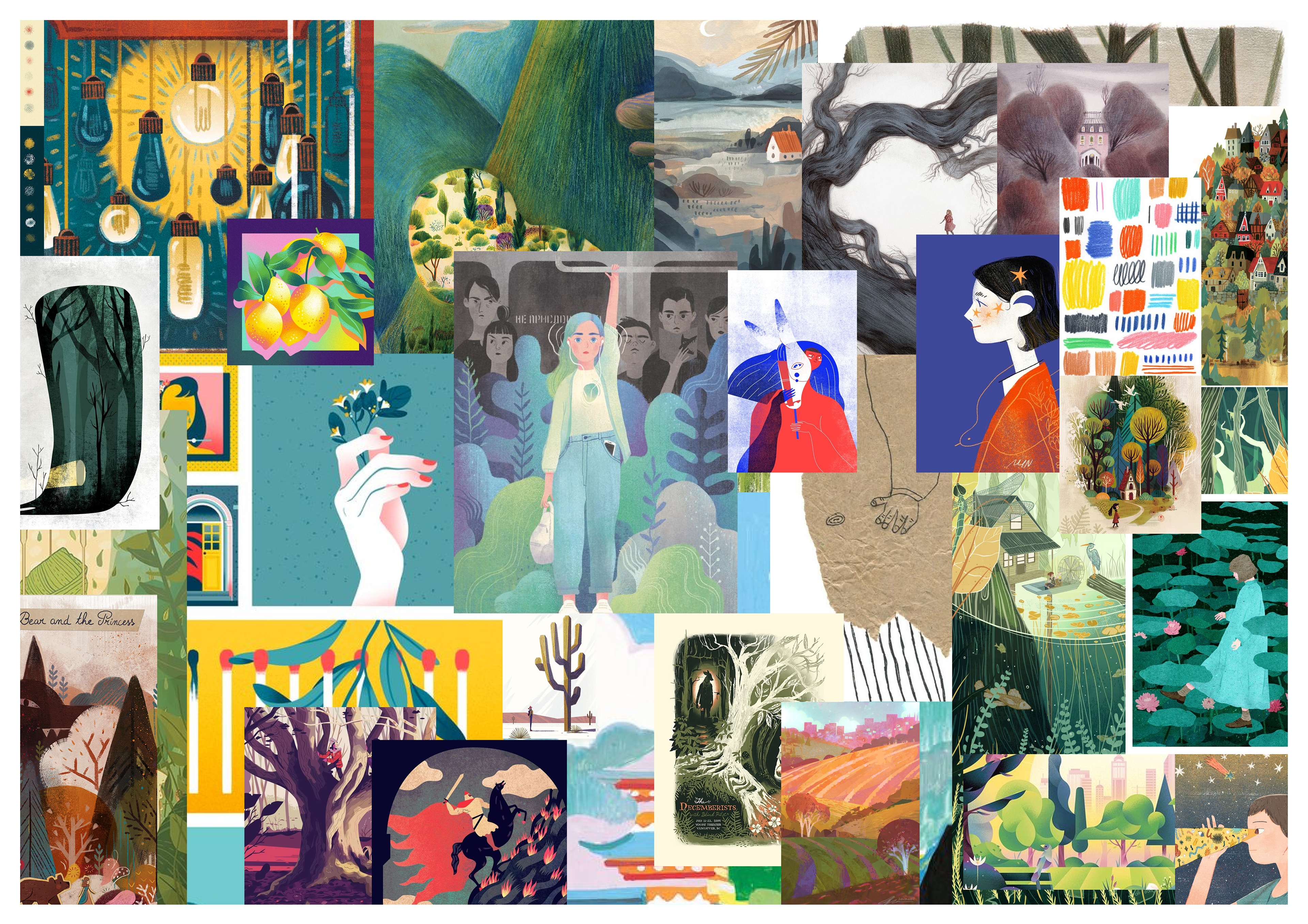
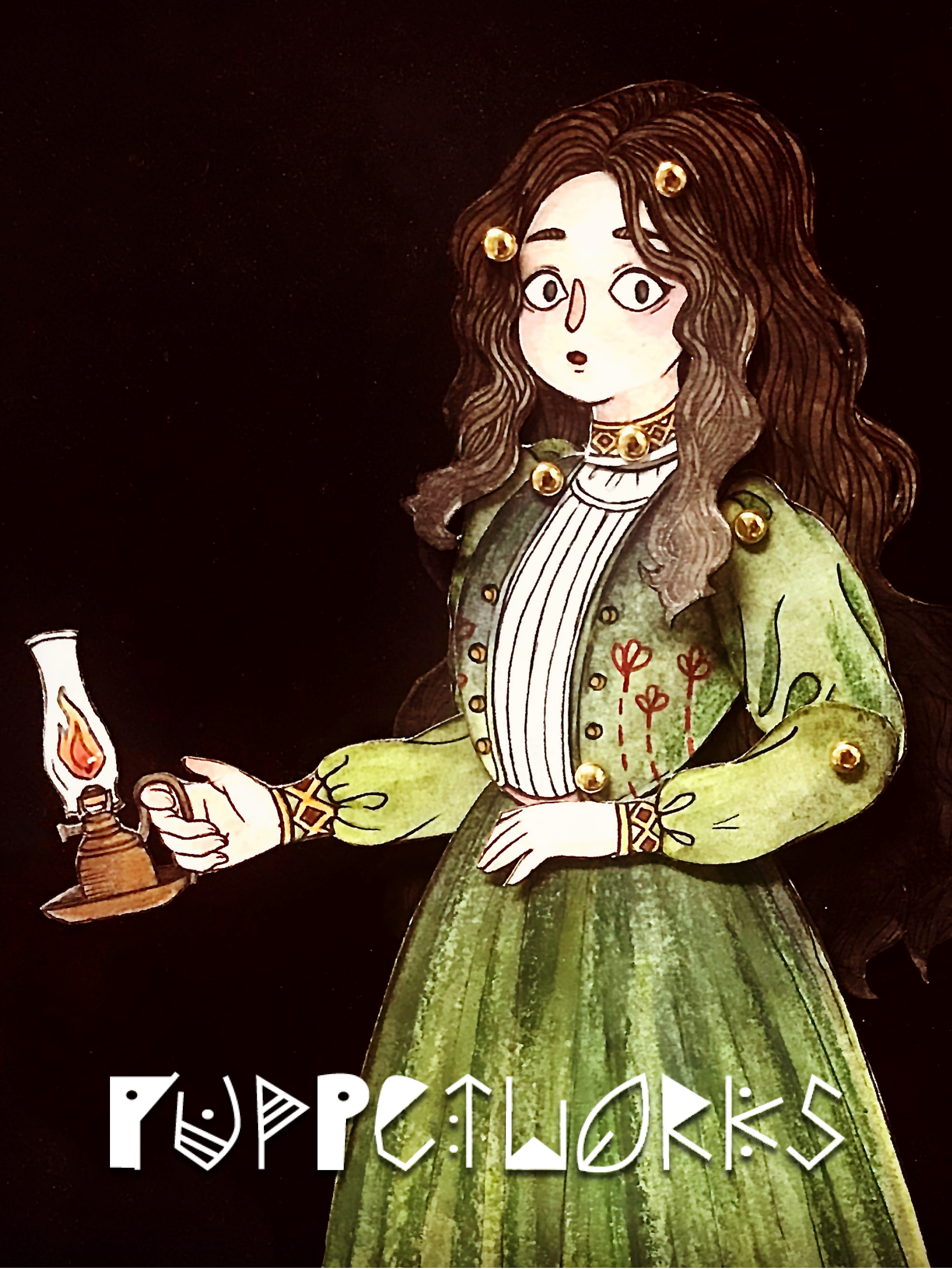
Moodboard 3 - Textures
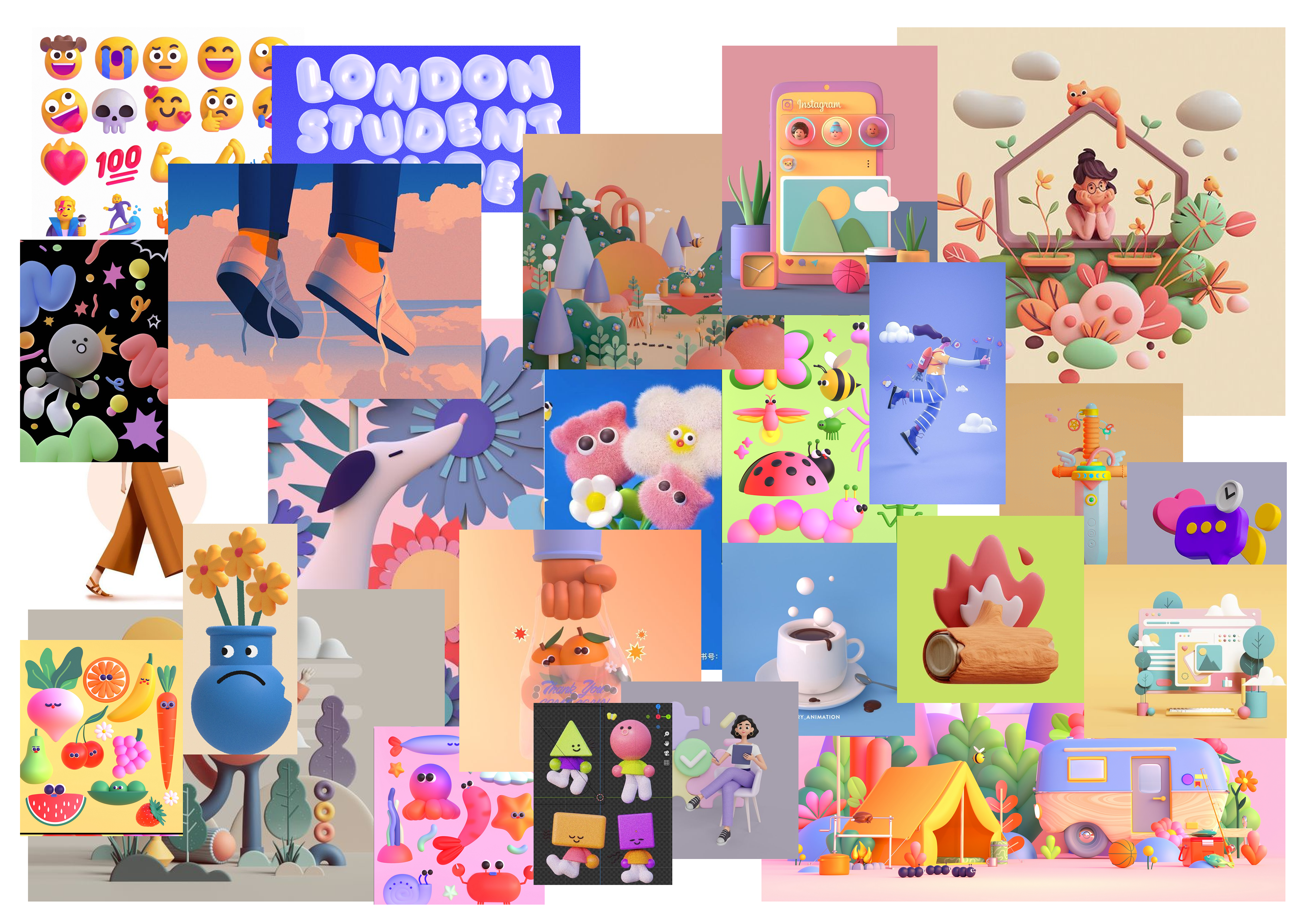
Moodboard 4 - 3D-esque
EMOJI MOODBOARDS
These moodboards were created for a client's company in order to help them choose an aesthetic style that I would recreate with my sample emojis. In the long run these moodboards ended up helping the client choose the color palette and direction they wanted their entire project to go in, although it was eventually cancelled. Each image was carefully curated from Pinterest and is a big part of my imagination process. Overall moodboards 3 and 4 were favored by the company.
Moodboard 1- Lineart
This moodboard is based around lineart, bold and simple color palette, and a playful/ whimsical illustrative style which would be perfect for emojis. The colors are mostly primary colors with a dash of neon to make it feel more lively and youthful.
Moodboard 2 - Solid Colors
This moodboard is based on blocks of solid colors and lack lineart, something that is a little more uncommon for emoji and would be a little more difficult than lineart to define, but would be fun and stand out. The colors are a mix between vibrant and somber, something that feels a little more mature but could still be used in a children's art.
Moodboard 3 - Textures
This moodboard is based around textures, something that is unusual for emojis but would be an interesting direction to head in. The moodboard primarily has color pencil textures, although paper textures is a huge part of this moodboard as well. The colors are very earth toned and warm with pops of colors here and there. I wanted this moodboard to feel like a children's book or folk art.
Moodboard 4 - 3D-esque
This moodboard is based on a semi-3D art style, where the 3D object simultaneously seems flattened. Because I lacked the ability to use 3D softwares, I knew I could at least simulate the sense of 3D, and decided this could be a challenging growth opportunity. The style is very playful and cutesy which could appeal to both adults and children alike. Most emojis nowadays use this 3D style, and I thought it would be a no-brainer to include this style as a suggestion.
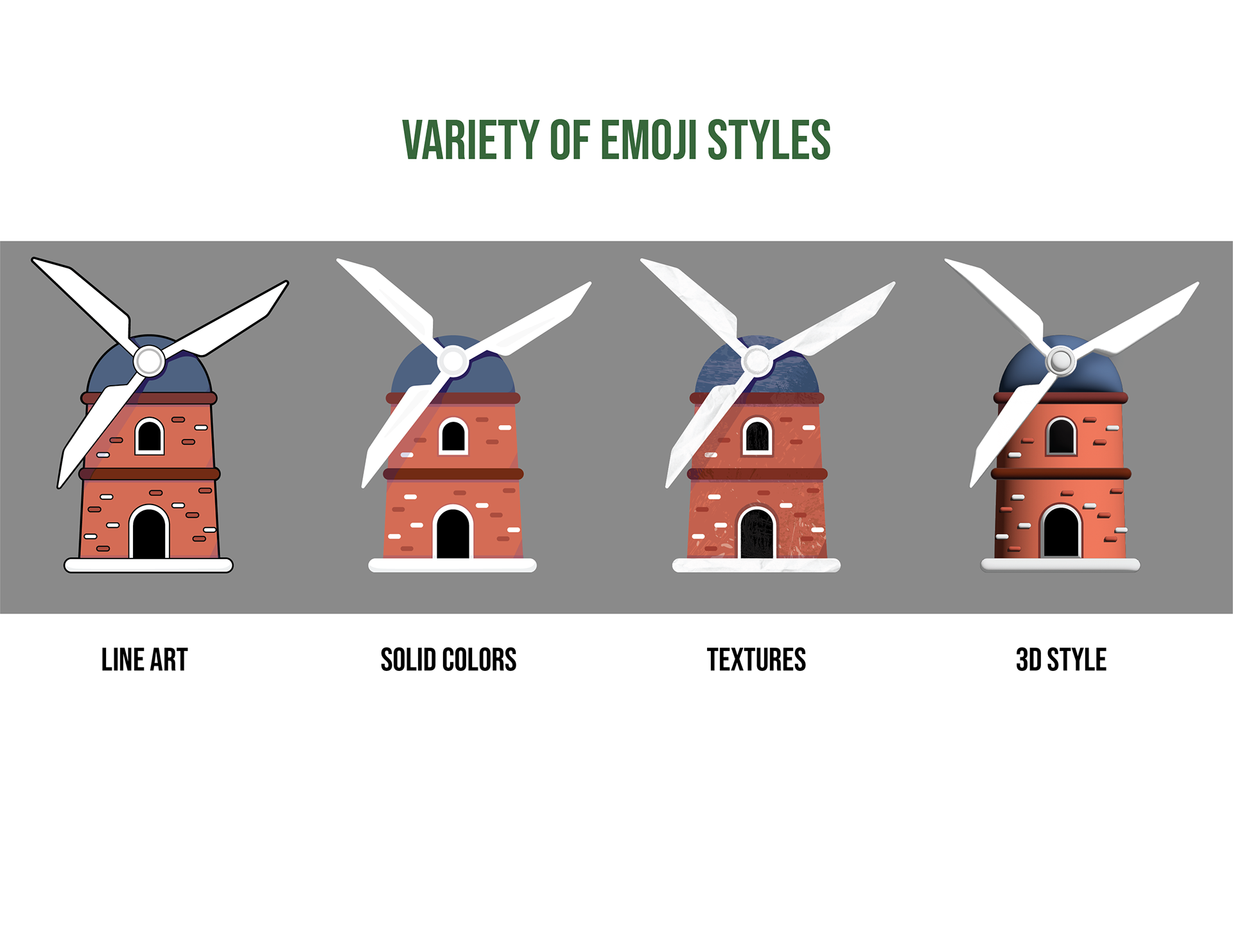
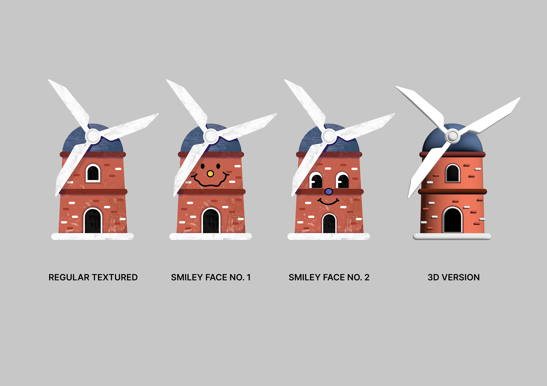
CLIENT SAMPLE EMOJIS
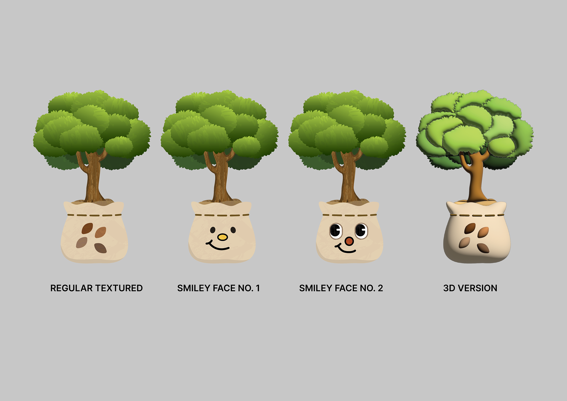
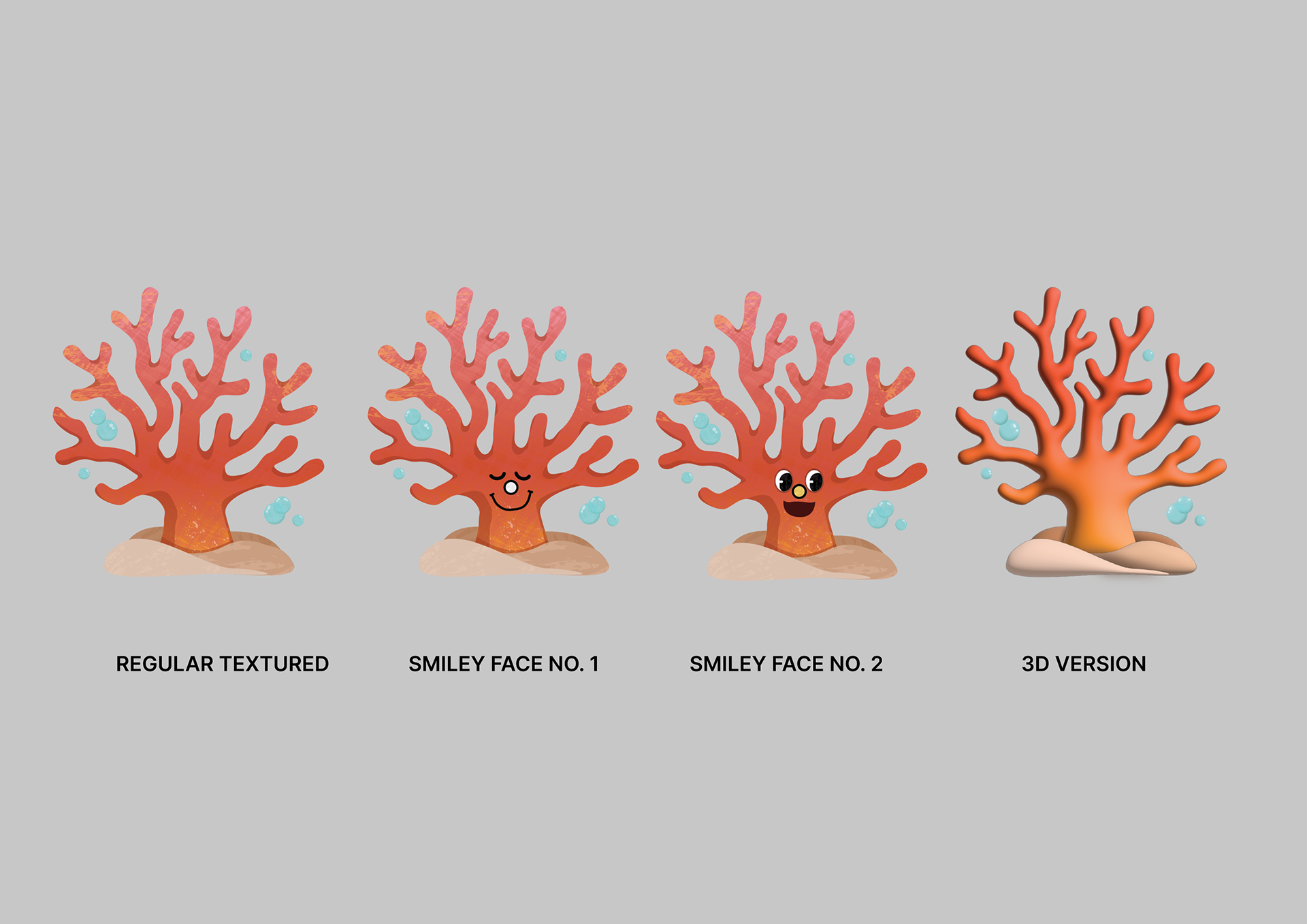
The client had given me a categorical list of the emojis I could make (windmill, tree, coral, etc) based on environmental causes and asked me to make a sample to present to the company. I wanted to give the client a clearer image of what the emojis would look like based on the previous moodboards I provided, so I went beyond the ask and recreated the windmill in the different styles. The client and their company would up loving the textured and 3D emojis, just as they had loved those particular moodboards, and asked me to continue making variations of this emoji including samples with faces on them.
OUTCOME + RELFECTIONS + NEXT STEPS
I found this project to be admittedly a little difficult due to the fact that the client & co. did not have a direction for this project at the beginning when I was assigned to it. Aside from not having a logo completed, there was also the challenge of a lack of color palette and brand identity which was more than my emojis could solve, and was not what I was hired to do. Although my moodboards had helped the company ultimately decide their brand identity and stylistic choice on the project moving forward, In the end they believed the project was too big and decided not to continue with this work. Overall I think this project helped me to grow a lot as a designer and I learned a lot of what comes with freelance work. These are things I wouldn't have learned in school, and could only be taught by getting out into the world and freelancing. The next time I work on a client project, I think I would make sure a direction was in place so that I could move forward more smoothly on the project, and or suggest an art direction team for the clients who need the foundation for their branding.

